1 About this manual
1.1 Version history
| Version | Date | Status | Who | Comment |
|---|---|---|---|---|
| R1.9 | 2005-06-05 | Released | Johan Persson | Additional info for JpGraph 1.18 |
1.2 How was this manual produced?
The bulk of the text was written directly in Emacs on a GNU/Linux system in a mixture of PHP and HTML. A number of PHP functions were used to automate the handling of formatting example code and figures.
To generate the images automatically in the img directory a custom awk-script is used to extract all the used image script from the manual. The script then uses the client version of PHP generate the images from the scripts and stores them in the 'img' directory.
The final set of HTML files was then processes by HTMLDOC to construct table of contents and chapter links.
2 Introduction
2.1 Version
This manual covers versions up to 1.18 of JpGraph. A 2D graph plotting library for PHP.
Even though the library is known to work with version of PHP prior to 4.3 the library is not tested nor is it recommended to run with any older versions of PHP.
2.2 Software License
JpGraph is released under a dual license QPL 1.0 (Qt-License) for non-commercial (including educational) use of the library and the JpGraph Professional License for commercial use.
2.3 JpGraph Features
JpGraph library is an OO graph library which makes it easy to both draw a "quick and dirty" graph with a minimum of code and quite complex graphs which requires a very fine grain of control. The library tries to assign sensible default values for most parameters hence making the learning curve quite flat since for most of the time very few commands is required to draw graphs with a pleasing esthetic look.
Some highlights of available features are
- Flexible scales, supports text-lin, text-log, lin-lin, lin-log, log-lin and log-log and integer scales.
- Supports both PNG, GIF and JPG graphic formats. Note that the available formats are dependent on the specific PHP installation where the library is used.
- Supports caching of generated graphs to lessen burden of a HTTP server.
- Supports batch mode to only generate images to a file
- Supports client side image maps which makes it easy to produce drill down images.
- Intelligent auto-scaling which gravitates towards esthetic values, i.e. multiples of 2:s and 5:s
- Fully supports manual scaling, with fine grain control of position of ticks.
- Supports background images with different formatting options
- Supports color and brightness adjustments of images directly in PHP.
- User specified grace for auto-scaling
- Supports up to two different y-scale, it is possible to have different left and right y-scale and add plots to both
- Supports, line-plots, filled line-plots, accumulated line-plots, bar plots, accumulated bar plots, grouped bar plots, error plots, line error plots, scatter plots, gantt-charts, radar plots, 2D and 3D pie charts.
- Supports unlimited number of plots in each graph, makes it easy to compose complex graph which consists of several plot types
- User specified position of axis
- Supports color gradient fill in seven styles
- Designed as a flexible OO framework which makes it easy to add new types of plots
- Supports automatic legend generation
- Supports both vertical and horizontal grids
- Supports anti-aliasing of lines
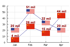
- Supports background images as well as unlimited number of icons in the graph
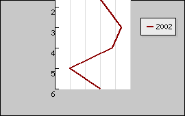
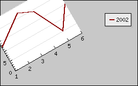
- Supports rotation of linear graphs
- More then 400 named colors
- Designed modularly - you don't have to include code which isn't used
- ...and many many more features
In addition to these high level features the library has been designed to be orthogonal and consistent in its' naming convention. For example, to specify color each object (i.e. axis, grids, texts, titles etc) within the graph implements the method SetColor() with the same signature.
2.4 Getting the latest version
The latest version of jpgraph can always be found on http://www.aditus.nu/jpgraph/
The current version as of this writing for branch 1.x is 1.18 and for the 2.x branch it is 2.0-beta.
Information on version numbering schema
- 1.x -> 1.x.y, Bug fix release 'y' for version 1.x does not introduce new features
- 1.x -> 1.(x+1), Added functionality. Mostly keeping backwards compatibility unless a very good reason not to. All SC breaks will be well announced in release notes and might be small things like a misspelled method name compared to the proper English spelling.
- 1.x -> 2.0, Substantially new functionality which might break backward compatibility
2.5 Known bugs and omissions
- Background images does not work as expected for rotated graphs
- Image maps do not work properly for rotated images
2.6 Acknowledgments
The idea for writing this library grew out of our own need for a high quality graph drawing library for PHP. When evaluating potential existint libraries we found (at that time cirka 2001) these three were
- "chart 0.3" http://quimby.gnus.org/circus/chart/chart-0.3.tar.gz, by Lars Magne Ingebrigtsen
- "ykcee.php", http://ykcee.sourceforge.net
- "phplot.php", http://www.phplot.com
All these libraries implements some fine graphic features but unfortunately none of those completely fulfilled our needs either for available functionality (for example none of these supported both two Y-scales, auto-scaling, and logarithmic scales), or general flexibility. We especially needed the option of two Y-scales, which none of the above packages supported. Our own preferences for design was closest to "chart 0.3" so we started by fixing some bugs in that package and adding some new features. However It was soon realized that to add all the features and flexibility we needed to "chart 0.3" it would require a complete rewrite since the original design wasn't flexible enough, especially adding a second Y-scale would require a more flexible OO architecture.
2.7 Reporting bugs and suggesting improvements
Defects or suggestion for new features can be entered using the JpGraph BugTracker available at http://www.aditus.nu/bugtraq/
Before reporting bugs or feature suggestions may we ask that the following facts are considered.
- The 1.x version of the library does not work with PHP 5.x
- The 1.x version of the library is only guaranteed to work with PHP versions >= 4.3
- The 2.x version of the library does not work with PHP 4.x
2.8 Getting support
Customers who have aquired the pro-version of the library are entitled to prioritized e-mail support for a specific time after the purchase. Support tickets may be created by first logging in to http://www.aditus.nu/jpgraph/pro_login.php and then create a support ticket.
For other users a public community forum is available at http://jpgraph.intellit.nl/ where many common questions are answered and discussed among the community of JpGraph. Please note that there is no guarantee that a specific questions will be naswered on thi forum. The forum is for-users-by-users.
In addition there is a collection of FAQs available at http://www.aditus.nu/jpgraph/jpgraphfaq.php
Finally, we regret that we are unable to provide general support regarding PHP/GD/TTF/Apache installation outside the specific scope of the JpGraph library. Please see the corresponding documentation and relevant FAQ for those products.
3 Installation
3.1 Preparation
In order to make use of the library it is necessary to ensure that the script files can correctly access the library include files (as described below) and that the PHP installation supports at least one graphic format, i.e. it supports the "image" extension in PHP.
This is easiest verified by eiether checking the output of the phpinfo() standard PHP function or by making sure the PHP installation make the 'imagecreate()' function available.
This means that the insrtallation must have a working GD-library together with PHP before the library JpGraph can be used. Please make sure you have version 4.3.x or above of PHP since JpGraph is not actively tested with versions prior to PHP 4.3.x Ideally you should use at least PHP 4.3.8
Please note that the 1.x version of the library do not support PHP 5.x
3.1.1 Verifying that you have the GD library installed
In order to make sure that the GD installed the following example whould be run. The example creates a very simple image using just pure GD calls and outputs an image in PNG format. This could be considered a smoke-test to see that the GD libary is available from PHP. Please note that this is an absolute pre-requisite in order for the JpGraph library to work at all.
Store the code snippet below somewhere in the document root and make sure it runs correctly.
 $im = @
ImageCreate (
150, 100)

    or die ("Cannot create a new GD
 image.");

$background_color
 = ImageColorAllocate
 ($im, 255,
 255, 255);

$text_color
 = ImageColorAllocate
 ($im, 233,
 14, 91);

ImageString
 ($im, 1,
 5, 5,  "A Simple Text String", $text_color
);

header ("Content-type: image/png");

ImagePng
 ($im);
If the above script does not work or some error or warnings are printed on the screen then it is necessary to correct those problems before proceeding with the installation.
3.1.2 Verifying that you have GD2 installed
To access the more advanced features of JpGraph needs the GD 2.x library. This will allow the use of features such as alphablending and trucolor images.
The GD 2.x libary is included in all standard PHP versions from 4.2.x and above. To make sure that the GD 2.x libary is installed the following script must be working.
 $im =
 imagecreatetruecolor (
300, 200);

 $black
 = imagecolorallocate
 ($im, 0,
 0, 0);

 $white
 = imagecolorallocate
 ($im, 255,
 255, 255);


 imagefilledrectangle
($im,0,
0,399,99
,$white);

 imagerectangle
($im,20,
20,250,190
,$black);


 header
 ("Content-type: image/png"
);

 imagepng
 ($im);
After running this script you should now see a black rectangle in your browser.
3.1.3 Preparing True Type Font Files
JpGraph contains as default a standard set of bitmap fonts which only supports the standard ASCII 7-bit character set. In order to use accented characters, UTF-8, Chinese, Japanes, etc You need to download TTF fonts. Due to various legal issues no TTF fonts are supplied in the JpGraph package. To enable TTF fonts there are three alternatives:
- If you are on a Windows platform you can just point to the TTF directory in JpGraph to the standard fonts directory (e.g C:\windows\fonts\)
- If you are on a Unix platform you can download and install the core MS WEB-initiative fonts from http://corefonts.sourceforge.net/
- It is also possible to use the Vera Bitsream TTF fonts available from http://www.gnome.org/fonts/
It is also necessary to make sure that the PHP installation supports TTF fonts (either through FreeType 1 or FreeType 2 libraries). I n addition some suitable TTF font files must also be available. To make the font files available for the library the directory path to the location of the font files must be specified in the configuration file, jpg-config.inc
JpGraph uses a standard naming convention for the TTF font files in order to be able to find the correct font files. This naming convention follows the standard naming of the available font files.
If the installation of the library is made on a computer running MS Windows then it is recommended to use the already available font files in Windows (usually located in C:\WINDOWS\FONTS).
If the installation is made on a UNIX derivate running X11 then the font location can differ between versions and UNIX brands. One commonly used path is "/usr/X11R6/lib/X11/fonts/truetype/".
Finally we note that it is possible to install additional fonts not natively supported by the library. Since this requires augmenting the library files this is considered advanced use and not further discussed in this introduction.
3.1.4 Using non-latin based fonts with JpGraph
In addition to European font it is also possible to use non-latin based fonts such as Cyrillic, Japanese and Chinese.
In all cases a suitable TTF font that supports the non-latin based language must be available.
For Cyrillic support the define LANGUAGE_CYRILLIC in jpg-config.php must be set to true. It is then possible to use a suitable Cyrillic font as replacement for the ordinary fonts.
For Chinese charcter set JpGraph supports both BIG5 and GB2312 encoding. For BIG5 encoding the PHP installation must have support for the "iconv()" function. Furthermore the define CHINESE_TTF_FONT must be set to the name of the Chinese BIG5 font that is to be used. By default this is set to "bkai00mp.ttf". To use the Chinese BIG5 font in the scripts one must then specify the font family as FF_CHINESE.
To use the alternative font files "simsun.ttc" and "simhei.ttf" (which uses the GB2312 encoding) the only step needed is to install those fonts in the normal TTF font directory and then specify the font family as FF_SIMSUN, the "simhei.ttf" is used when the font style is specified as FS_BOLD.
3.2 Customizing the installation
In order for JpGraph to work it is necessary to adjust the cache and TTF directory to suit the specific installation. By default the TTF directory is "/usr/X11R6/lib/X11/fonts/truetype/" and for the cache "/tmp/jpgraph_cache/". These are defined as PHP defines at the top of jpg-config.inc
Please make sure that PHP has write permissions to the cache directory if the cache feature snhould be used. If this is not the case a "Can't write file xxx.yyy" error will occur when a graph that uses the cache feature are generate. More information regarding the cache feature of JpGraph is availble in the section Making sense of caching system in JpGraph
3.3 Required files
This is the base library files, which you must have
- jpgraph.php, base library, always needed
- jpg-config.inc, Configuration file
3.3.1 Plot extension modules
To add plots to the graph you will need one or more of the following files plot extension files depending on what kind of graph you need to create.
- jpgraph_log.php, Plot extension to support logarithmic X and Y scales
- jpgraph_line.php, Plot extension. Needed to draw various line plots
- jpgraph_bar.php, Plot extension. Needed to draw various bar plots
- jpgraph_error.php, Plot extension. Needed to draw various error plots
- jpgraph_scatter.php, Plot extension. Needed to draw scatter and impulse plots.
- jpgraph_spider.php, Plot extension. Needed to draw spider plots.
- jpgraph_pie.php, Plot extension. Needed to draw Pie plots
- jpgraph_pie3d.php, Plot extension. Needed to draw 3D Pie plots
- jpgraph_gantt.php, Plot extension. Needed to create gantt plots
- jpgraph_radar.php, Plot extension. Needed for radar plots
- jpgraph_polar.php, Plot extension. Needed for Polar plots
- jpgraph_gantt.php, Plot extension. Needed for Gantt charts
- jpgraph_regstat.php, Statistic extension. Needed to plot spline curves
- jpgraph_stock.php, Plot extension. Needed to plot stock charts
- jpgraph_antispam.php, Special extension to generate anti-spam images consisting of letters+images which are very hard to digitally read with an OCR program
- jpgraph_gradient.php, Internal module. Contains all color gradient
- jpgraph_gb2312.php, Handling of gb2312 font encoding (used for some Chinese fonts)
- jpgraph_plotmark.inc, Handling of plotmarks in line and scatter plot.
- jpgraph_iconplot.php, Handling icons (small images) that can be added to the plots
- jpgraph_plotband.php, Handling of plotbands added to the graphs
- jpgraph_flags.php, Handling of country flags used as plot marks or as backgrounds.
- imgdata_*.inc, Encoded images for plotmarks
- flags*.dat, Image data for flags. Pre-compiled data for country flags.
- jpgraph_canvas.php, Plot extension to make it possible to draw arbitrary graphic on a canvas.
- jpgraph_canvtools.php, Add on to the canvas graph to provide an easier way to draw arbitrary shapes.
In the pro-version the following additional modules are available
- jpgraph_windrose.php, Windrose plot extension
- jpgraph_odo.php, Odometer plot extension
- jpgraph_barcode.php, Linear barcode extension
- jpgraph_pdf417.php, PDF417 2-Dimensional Barcode extension
3.4 Image formats and external image libraries
Per default the standard GD image library supports PNG graphic formats. You will need to have that installed together with your PHP module for this library to work at all. Please refer to PHP documentation on specifics. Note that the newer versions of GD does not support the GIF format due to copyright problems. Hence by default only PNG is supported.
If you want JPEG support you will also need an additional library for PHP, again please see PHP documentation for specifics. For most practical purposes PNG is a better format since it normally achieves better compression then GIF (typically by a factor of 2 for the types of images generated by JpGraph). In comparison with JPEG format PNG is also better for the type of images generated by this library. So, the bottom line is, you should have a very good reason to choose any other format then PNG.
By default the image format is set to "auto". This means that JpGraph automatically chooses the best available graphic using the preferred order "PNG", "GIF", "JPG".
3.5 Detailed steps to install JpGraph
- If You are insatlling the 1.x branch then make sure the PHP version
used is at least 4.3.x (preferable 4.3.10 or higher) and that the PHP
version have compiled support for GD library. It is absolutely critical
that GD is fully working. Please see the earlier sections on how to
make sure. JpGraph supports both GD 1.x and GD 2.x However it is
strongly recommended to use GD 2.x since that will improve performance
and support true color images as well as alphablending.
If You are insatlling the 2.x branch then make sure the PHP version used is at least 5.0.1 (preferable 5.0.3 or higher) and that the PHP version have compiled support for GD 2.x library. Please note that the 2.x branch will not work with PHP 4.x
- Unzip and copy the files to a directory of your choice.
- Set up the directory paths in jpg-config.inc where the cache directory should be and where your TTF directory is. Note that Apache/PHP must have write permission in your cache directory.
- Check that all rest of the DEFINE in the top of JpGraph.php is setup to your preference. The default should be fine for most users. (See also Note 5. below) Specifically check that the settings of USE_GD2_LIBRARY reflects your installation, (should be true if you have GD2 installed, false otherwise).
- Make sure PHP have write privileges to your cache directory if you plan on using the cache feature.
- Some windows installations seems to have a problem with a PHP script ending in a newline (This newline seems to be sent to the browser and will cause a Header already sent error). If you have this problem try remove all trailing newlines in the jpgraph* files
- Read (really!) the JpGraph FAQ.
3.6 Troubleshooting your installation
For 99% of the users this library will work directly with a recent installation of PHP without any problem.
Experience shows that most of the trouble are caused by either an old buggy version of the free-type TTF library or using an old antiquated version of the GD library. In order to narrow it down the problem the following steps is helpfull.
- If no background images are disaplayed (instead a solid black box are displayed) chances are that GD 2.x is available but the jpg-config.inc has been changed so that true color images are disabled. Correct this by enabling the USE_TRUECOLOR define.
- If background images does not work make sure the settings of USE_GD2_LIBRARY corresponds to the actual installation, i.e. If the GD2 library is not available then this define must be false!
- If you are running IIS and Win2k and get the error "Can't find font" when trying to use TTF fonts then try to change the paths to UNIX style, i.e. "/usr/local/fonts/ttf/". Remember that the path is absolute and not relative to the htdocs catalogue.
- If no images and no error messages gets sent back to the browser then there is a big chance that HTTP-Server PHP module (e.g. Apache-PHP) has crashed. This is often due to a broken PHP installation and more than often a problem with the True Type libraries. The best way to track these types of problem down is to investigate the HTTP-Server logs or the general system logs for evidence of a PHP crash. The other reasons is that in some rare cases the auto detection of the GD library could fail. If only the GD1 library is available and the JpGraph library mistakenly detects the GD2 this could in rare cases cause PHP to crash. Please try re-run the example by setting the DEFINE USE_GD2_LIBRARY to "false".
- If the system is running IIS on Windows and some images which uses TTF fonts just return an empty page then try to set the TTF_DIR path manually (in jpg-config.php) to the directory where all the TTF fonts are stored (normally c:/WINDOWS/fonts)
- If the cache is enabled please make sure that the permissions are correctly set for the cache directory so that the process running Apache/PHP has write access to the cache directory.
- If the TTF fonts only shows up as yellow then you have a buggy installation of the freetype font library and the only thing to do is to re-install and setup PHP+GD again.
3.7 Compiling PHP 4
This is not meant to be a complete discussion about configuring or compiling PHP. It is meant as an example of a configuration of PHP that is known to work well with JpGraph.
Below is an example of a standard configuration that can be used to configure and compile PHP for use with the JpGraph Library
Please note that depending on the specific installation requirements other options might have to be specified, specifically the paths to external libraries might need to be adjusted.
./configure --prefix=/usr/share \
--datadir=/usr/share/php \
--with-apxs=/usr/sbin/apxs \
--libdir=/usr/share \
--includedir=/usr/include \
--bindir=/usr/bin \
--with-config-file-path=/etc \
--enable-mbstring --enable-mbregex \
--with-pdflib=/usr \
--with-mysql  \
--with-ttf-dir=/usr/lib \
--with-freetype-dir=/usr/lib \
--with-gd --enable-gd-imgstrttf --enable-gd-native-ttf \
--with-zlib-dir=/usr/lib \
--with-png-dir=/usr/lib --with-jpeg-dir=/usr/lib --with-xpm-dir=/usr/X11R6 \
--with-tiff-dir=/usr/lib \
--enable-ftp \
--enable-memory-limit --enable-safe-mode \
--bindir=/usr/bin \
--enable-bcmath -enable-calendar \
--enable-ctype --with-ftp \
--enable-magic-quotes \
--enable-inline-optimization \
--with-bz2 \
--with-iconv
4 Quick Start: Dynamic Image Generation
The purpose of this chapter is to put dynamic image generation in perspective and illustrate how HTML tags is used to call image generating scripts. Even if You are familiar with PHP it is stronly recommended to quickly browse through this chapter to make sure all concepts are known.
If You fully understand and can explain the concept of MIME types, HTTP streams and why the "Headers already sent error" error is very common when generating dynamic images with PHP it is probably safe to skip this chapter. Otherwise it might be wise to read through this chapter once.
4.1 Scope of this chapeter
4.1.1 What you will learn in this chapter
- The principle of generating dynamic images in PHP
- How to choose a specific image format (e.g. JPG, PNG, GIF)
- Various ways of using the generated image, streaming it back to the browser, sending it to a file or getting hold of the image handle for further post processing
- How to specify fonts (both bit-mapped and TTF) in JpGraph
- How to extend JpGraph with your own fonts
- How to work with Cyrillic fonts
- How to specify colors in JpGraph
- List all available named colors in JpGraph
- How to effectively use the built in cache schema in JpGraph
4.1.2 What you will NOT learn in this chapter
- Any details on how to generate graphs with the JpGraph library
4.2 How to generate images with PHP
As a general rule each PHP script which generates an image must be specified in a separate file which is then called in an HTML <IMG> tag. For example, the following HTML excerpt includes the image generated by the PHP script in "fig1.php".
 <img src="fig1.php"
 border=0
 align=center
 width=300
 height=200>
Strictly speaking the "align", "width" and "height" are not necessary but helps the browser position the image correctly before the image has been fully sent back to the browser.
The library will automatically generate the necessary headers to be sent back to the browser so that it correctly recognize the data stream received as an image of either PNG/GIF/JPEG format. The browser can then correctly decode the image
Observe that you can't return anything else than an image from the image script. By definition each HTML page (or more correctly each HTTP stream) can only consist of one mime type which is determined by the header for that particular stream.
A common mistake is to have a space in the beginning of the image script which the HTTP server will send back to the browser. The browser now assumes that the data coming back from this script is text since it hasn't received an explicit header. When then the image headers get sent back to the browser to forewarn the browser of the forthcoming image the browser will not like that as it has already assumed the data stream was a text stream. The browser will then give the infamous "Headers already sent error".
To include several images together with text on a page you need to have a parent page with several <IMG> tags which each refers to an image script (or the same image script with GET/POST data).
4.2.1 Using the JpGraph library to send back images
To get access to the JpGraph library you will need to include at least two files, the base library and one or more of the plot extensions. So for example to create a basic line plot the top of your PHP file must have the lines:
 include (
'jpgraph.php');

include ('jpgraph_line.php');

...

 // Code that uses the jpgraph
 library

...
4.3 Using PHP directly
It is also possible to generate images directly using the command line version of PHP. This works the same way as the normal "through the browser" generation with the exception that no HTTP headers will be generated. Only the bianry image data.
Please make sure that you run the command line version of PHP (cli). Using the CGI SAPI version will not work since then the HTTP headers will be generated. You can easily check this by running
php --version
you should then get a response with something like
PHP 4.3.8 (cli) (built: Aug 29 2004 22:48:10)
Copyright (c) 1997-2004 The PHP Group
Zend Engine v1.3.0, Copyright (c) 1998-2004 Zend Technologies
The important thing here is the
(cli)
marker. The JpGraph library check from what SAPI API it is invoked from and adjusts the header generation accordingly.
If all the above requirements are met then images can be generated directly on the command line and stored in a suitable file. For example by
$> php myimage.php > image.png
Please note that the file extension on the image file must match the format in which the image is generated.
4.4 The basic principle of JpGraph and the creation of images
The common pattern for creating graphs is
- Create a script that constructs the image, type, colors size and so on.
- A wrapper script which contains one or more <IMG> tags to position the graphs on the proper HTML page.
Of course it is of perfectly possible to call the image script directly in the browser to just display the generated image in the browser.
You should remember that it is also possible to pass arguments to the image script via the normal HTTP GET/POST arguments. For example
 <img src
="showgraph.php?a=1&b=2"
>
This could for example be used to control the appearance of the image or perhaps send data to the image which will be displayed. Note that this is probably not the best way to send large amount of data to plot. Instead the only practical way, for large data sizes, is to get all the data in the image script, perhaps from a DB. Another alternative for large amount of data to be sent to the image script is by creating a POST request to the image script.
echo '<img src="myimagescript.php?dummy='.now().'">';It is also important to be aware of any internal caching the browser might do. The general problem with dynamically generated images is that the image generating script (file) remains the same. This makes the browser believe that the data hasn't changed and if the browser already has issues a previous GET request and has the data cached it will not send a new GET if the timestamp on the file is the same since it then believes it my use the old cached version.
When it comes to the structure of your imaging script they will generally have the structure
 // ... Include
 necessary headers


$graph =
 new Graph($width,
$height, ...);


// ... code to construct the graph
 details


$graph->Stroke();
JpGraph is completely Object oriented so all calls will be action on specific instances of classes. One of the fundamental classes is the Graph() class which represents the entire graph.
After the creation of the Graph() object all the code lines to construct the details of the graph are added.
The final method called in an image script will most likely be the Graph::Stroke() method. This will send the constructed image back to the browser. A variation of this is used if the graph are supposed to have image maps. In that case the final method will be Graph::StrokeCSIM()
In addition to this standard usage pattern you can also choose to
- ... send the graph directly to a file
- ... access the GD image handler for further image processing (also needed to include the image in an PDF file)
- ... make use of the builtin cache system to send back a previously generated image
The cache system, which lessens the burden of the PHP server, works by avoiding o run all the code that follows the initial Graph() call by checking if the image has already been created and in that case directly send back the previously created (and stored in a file) image to the browser. When using the cache system a filename must be specified in the initial Graph() call which is used to store the image in the cache system and possibly also a timeout value to indicate how long the image in the cache directory should be valid.
In many of the examples in this manual teh following pattern will be used
 $graph = new
 Graph(300,200
,"auto");
The two first parameters specify the width and height of the graph and the third parameter the name of the image file in the cache directory. The special name 'auto' indicates that the image file will be given the same name as the image script but with the extension changed to indicate the graphic format used, i.e '.jpg', '.png' and so on.
Please note that the cache system by default is disbled and must be enabled by setting the proper define in the file "jpg-config.inc"
4.5 Choosing the image format for JpGraph
By default JpGraph automatically chooses the image format to use in the order PNG, JPEG and GIF. The exact format depends on what is available on your system. There are two ways you can influence the way the graphic format is chosen.
- Change the default graphic format by changing the DEFINE
DEFINE ("DEFAULT_GFORMAT" ,"auto"); - Set the graphic format in your script by calling the method
SetImgFormat() For example, to force your script to use JPEG in one
specific image use
 $graph->
img->
SetImgFormat(
"jpeg")
4.6 Alternatives to streaming back the image
If you like to save the image directly to a file instead of streaming it back to the browser then you just have to specify an absolute filename in the final call to Graph::Stroke(), i.e.
 $graph->
Stroke(
"/usr/home/peter/images/result2002.png");
Please note that the user running as Apache/PHP must have write access to the specified directory.
There are also two predefined filenames which have special meaning.
- "auto", This will create a file in the same directory as the script with the same name as the script but with the correct image extension.
- _IMG_HANDLER, (This is defined in jpgraph.php). Specifying this
filename will not create a an image to file or stram it back to the
browser. Instead it will instruct the Stroke() method to just return
the handle for the GD image. This is useful if you later want to
manipulate the image in ways that are not yet supported by Jpgraph. For
example include the image in generated PDF files.
Example:$handle = $graph-> Stroke( _IMG_HANDLER);
4.7 Working with fonts in JpGraph
JpGraph supports both a set of built in bit-mapped fonts as well as True Type Fonts. For scale values on axis it is strongly recommended that you just use the built in bitmap fonts for the simple reason that they are, for most people, easier to read (they are also quicker to render). Try to use TTF only for headlines and perhaps the title for a graph and it's axis. By default the TTF will be drawn with anti-aliasing turned on.
In many of the example you can see examples of both TrueType and Bitmap fonts.
There are a number of subtle differences in the way builtin fonts and TrueType fonts are rendered to the screen. However, JpGraph, abstracts away 99.9% of the differences so it will be, for the user, completely transparent to switch between the different fonts.
4.7.1 Installing TrueType fonts
Since Internally TrueType fonts are rendered by locating a font specification file you must install the accompanying TrueType fonts in directory of your choice. You must then tell JpGraph where these fonts may be found by specifying the font-path in the FONT_PATH define (in jpg-config.inc). Please note that this must be the absolute file path and not relative to the htdocs directory. By default the path is set to
 DEFINE(
"TTF_DIR",
"/usr/local/fonts/ttf/");
Since JpGraph must be able to tell the difference between the italic and bold versions of the same font family a standard naming convention is used to name the files. The available fonts are also defined by DEFINES and hence you can't just copy your own TTF files to the directory and expect it to work. At the moment there is no "easy" way to add new fonts but to make some (small) mods to the code. However this is expected to change in future version of JpGraph.
4.7.2 Verifying that the TTF fonts work
In order to get TTF fonts working with JpGraph you should first check that the following pure GD scripts work correctly. Please adjust the font path according to your installation.
 DEFINE
("TTF_DIR","/usr/X11R6/lib/X11/fonts/truetype/"
);


 $im = imagecreatetruecolor (400,
 100);

 $black
 = imagecolorallocate
 ($im, 0,
 0, 0);

 $white
 = imagecolorallocate
 ($im, 255,
 255, 255);


 imagerectangle
($im,0,
0,399,99
,$black);

 imagefilledrectangle
($im,0,
0,399,99
,$white);


 imagettftext
 ($im, 30,
 0, 10, 40
, $black, TTF_DIR.
"arial.ttf",
 "Hello World!");


 header
 ("Content-type: image/png"
);

 imagepng
 ($im);
The above script assumes you have the GD2 library and will create an image with the classical "Hello World!" text printed in black.
4.7.3 Specifying fonts
All graph objects that uses text allows you to specify the font to be used by calling the SetFont() method and specifying three parameters
- Font family, Specified with a FF_ define
- Font style, Specified with a FS_ define
- Font size, Numeric value (only used for TTF fonts)
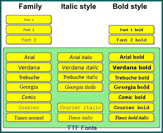
For the builtin fonts the third, size, parameter is ignored since the size is fixed for the three builtin fonts. The available font families and the corresponding name (in JpGraph 1.7) are listed in the table below.
| Font family | Type | Note |
| FF_FONT0 | Builtin font | A very small font, only one style |
| FF_FONT1 | Builtin font | A medium sized font |
| FF_FONT2 | Builtin font | The largest bit mapped font |
| FF_ARIAL | TTF font | Arial font |
| FF_VERDANA | TTF font | Verdana font |
| FF_COURIER | TTF font | Fix pitched courier |
| FF_BOOK | TTF font | Bookman |
| FF_COMIC | TTF font | Comic sans |
| FF_TIMES | TTF font | Times New Roman |
| FF_GEORGIA | TTF font | Georgia |
| FF_TREBUCHE | TTF font | Trebuche |
| FF_VERA | TTF font | Gnome Vera font, Available from http://www.gnome.org/fonts/ |
| FF_VERAMONO | TTF font | Gnome Vera Mono font, Available from http://www.gnome.org/fonts/ | FF_VERASERIF | TTF font | Gnome Vera Serif font, Available from http://www.gnome.org/fonts/ |
| FF_CHINESE | TTF font | Installed chinese font |
| FF_SIMSUN | TTF font | Installed chinese font |
| FF_BIG5 | TTF font | Installed chinese BIG5 font (needs iconv()) |
Please note that not all font families support all styles. The figure below illustrates each of the available font families and what styles you may use.
We finally show some example of valid font specifications
 $graph
->title->SetFont(
FF_FONT2);

$graph->title->
SetFont(
FF_FONT2,
FS_BOLD);

$graph->title->
SetFont(
FF_ARIAL);

$graph->title->
SetFont(
FF_ARIAL,
FS_BOLD,24);
4.7.4 Adding additional fonts to JpGraph
Note: This information is only given here for very advanced users. No free support will be given in the case you run into difficulties trying to add new fonts. At the moment adding new fonts require code modifications as outlined below.
In order to add you favorite fonts there are three steps you need to follow :
- Define a new "FF_" constant naming your font family with a suitable high index number
- Get the TTF file(s) and add it to your font directory. You need separate files for each of the styles you want to support. You then need to add the file names of the font as definitions in the class TTF. Use the previous defined "FF_" name as index in the font specification array.
4.7.5 Understanding text alignment in JpGraph
For everyday use of JpGraph understanding of the alignment of text strings in not necessary. However, if you like to add arbitrary strings to the graph (with Graph::AddText()) or when working directly on a canvas it will help understand this.
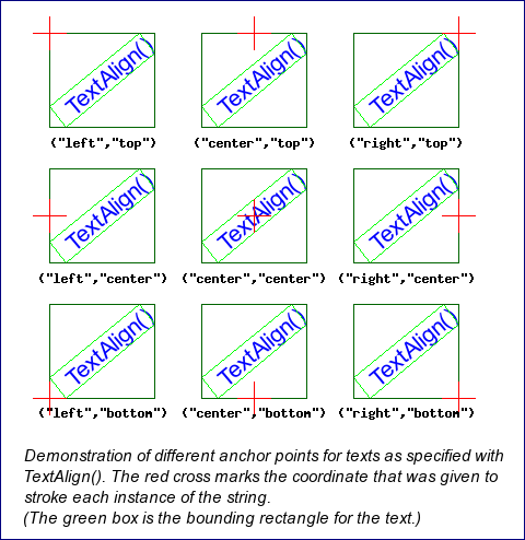
Text is added to a graph with the creation of a Text() object. And the alignment is specified with Text::Align() Text alignment might actually be a misguiding name. What you specify is rather the anchor point for the text, i.e. when you specify that a text should be positioned at position (x,y) how is that coordinate to be interpretated.
The image below shows a text string aligned in the 9 possible combinations. In the image the red crosses indicate what coordinate that text string was positioned at. The alignment used for each of the cases is shown below.
4.8 Specifying colors in JpGraph
Colors can be specified in three different ways
- By using one of the, roughly, 400 pre-defined color names, e.g
 SetColor
("khaki");
A named color can also be modified by adding a adjustment factor. An adjustment factor, 0 < f < 1, a smaller value will give a darker version and a value of 0 or 1 will return the original color. A value > 1 will make the color brighter. A few examples
SetColor ("khaki:0.5"); // A darker version of "khaki"
SetColor ("yellow:1.2" ); // A slightly lighter version of "yellow" - By specifying a RGB triple, e.g.
SetColor(array(65, 100,176)); - By specifying the color as a hex string value
 SetColor
("#A16BFF");
4.8.1 Adjusting the transparency
From version 1.10 JpGraph also supports the use of Alpha Blending together with GD2.x This lets you specify how much of the underlying color should be visible. You specify the amount of transparency for a color by adding an extra parameter to the color specification separated by an '@' (at) character.
For example to specify a red color which is 40% transparent you write
 SetColor(
"red@0.4");
or to specify 90% transperancy you write
 SetColor
("red@0.9");
Below is an example of how a bar graph with a background image can make use of transperancy
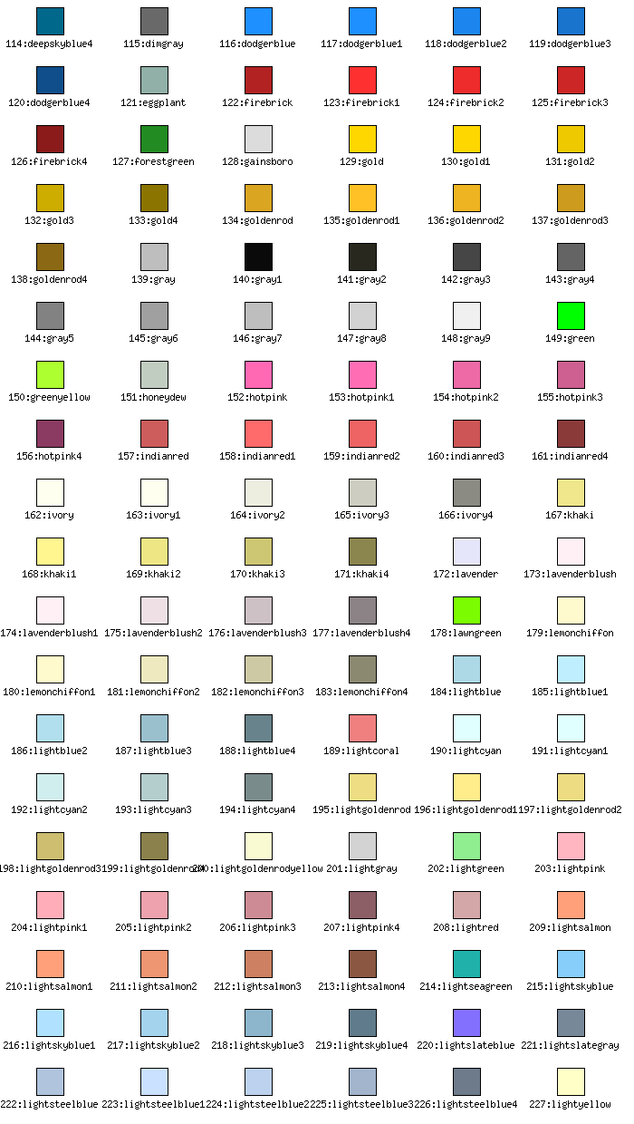
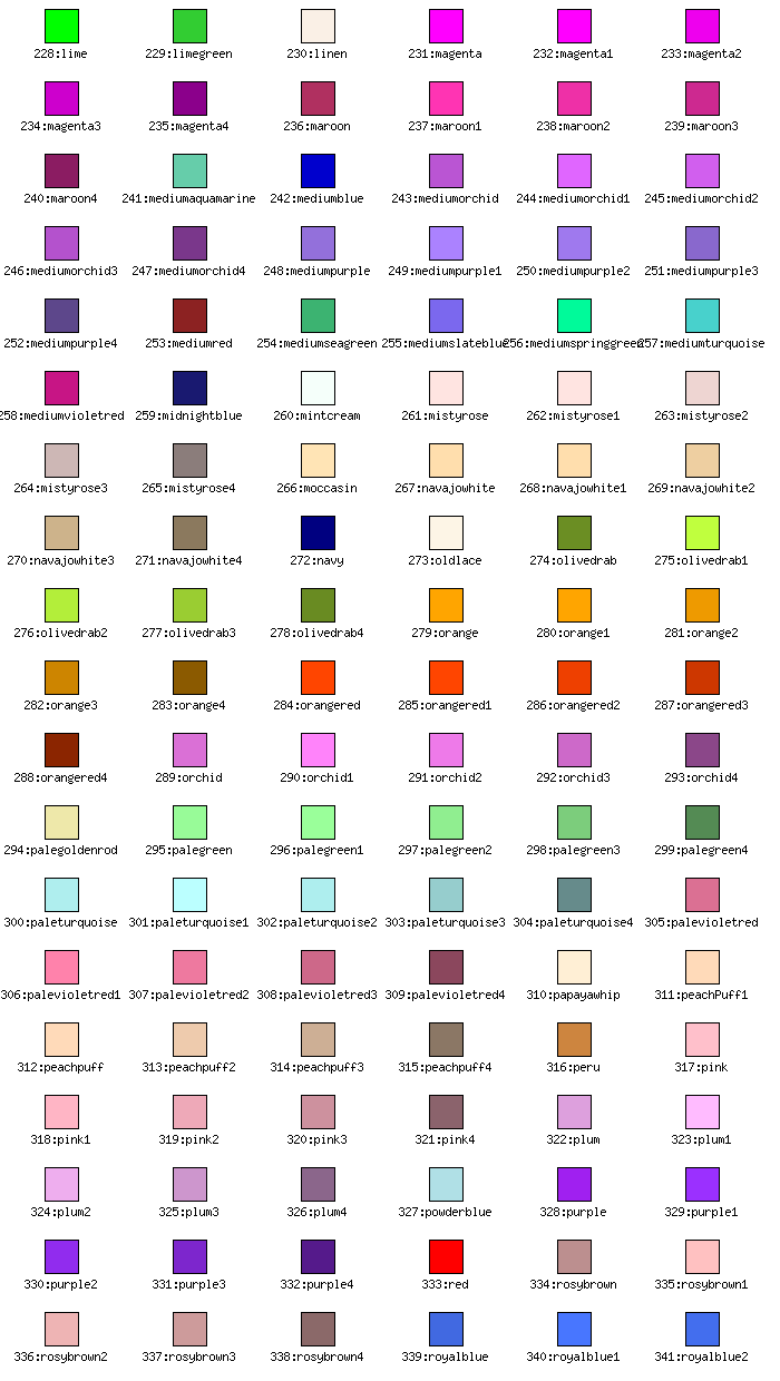
4.8.2 Available named colors
The chart below shows all available named colors. 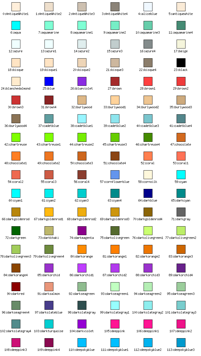
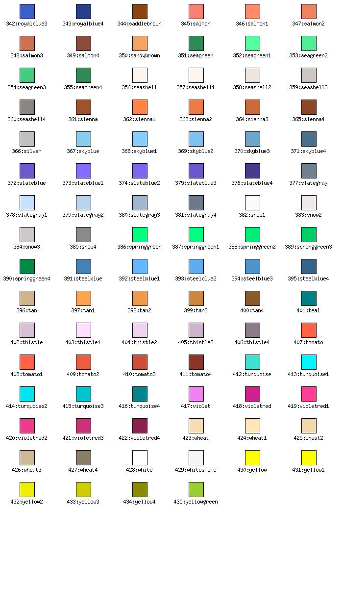
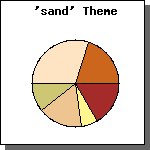
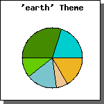
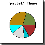
4.8.3 Theme colors for pie's
For more on how to use the different themes to set the colors of Pie plots please refer to "Working with 2D &3D pie plots"
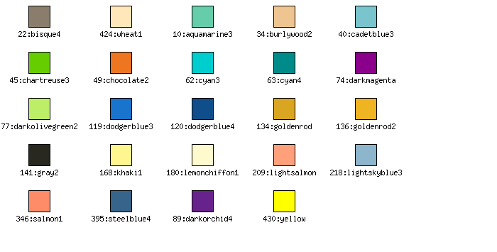
Theme 1: Earth
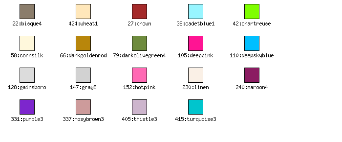
Theme 2: Pastel

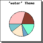
Theme 3: Water

Theme 4: Sand
5 Understanding the JpGraph caching system
To reduce load on the web server JpGraph implements an advanced caching system which avoids the burden of always having to run the full image script.
Depending on the complexity of the image script (for example if it is doing several DB lookups) this could significantly improve performance.
The rationale behind this is of course performance, and the observation that very few graphs are really real-time, i.e. needs to be updated absolutely every time the graphing script is called.
5.1 Enabling the cache system
The enabling disabling of the cache system is controlled by two defines (in jpg-config.php)
 DEFINE(
"USE_CACHE",
true);

DEFINE("READ_CACHE",
true)
The first of these, USE_CACHE, is the master-switch which must be set to true to enable the caching system. The second switch READ_CACHE very seldom needs to be changed.
This second switch basically tells whether or not JpGraph should ever look in the cache. Setting this to false and the master-switch to true would then always generate an new updated image file in the cache and this new image would be send back to the browser. The main use for this (admittedly) strange setting is if you like to have the side effect of the script that a fresh image is always stored in the cache directory.
Once you have enabled the cache you must also make sure that a valid cache directory is setup. The cache directory is specified with the define
 DEFINE(
"CACHE_DIR",
"/tmp/jpgraph_cache/");
You can of course change the default directory to whatever directory you fancy. But, you must remember one important thing. The cache directory must be writable for the user running Apache/PHP .
5.2 Using the cache in your script
To use caching in your script you must supply a suitable file name which will be used to store the image in the cache. You can also supply a timeout value indicating how many minutes the cached image should be considered valid.
These parameters are supplied in the initial Graph() method call which should be among the first in your script. Instead of manually specifying a file name to be used you could often use the special name "auto". If the filename is specified as "auto" the cashed image will then be named the same as the image script but with the correct extension depending on what image format have been chosen.
If you don't specify a file name no caching will be used no matter the settings of USE_CACHE (without a file name it is impossible!)
The following call to Graph() shows a typical use of the cache.
 $graph = new
 Graph(300,200
,"auto",60)
The above code will use the automatic filename and a make the cache valid for 60 minutes.
So, how does this all work now?
The first time you call your script (no cached image) everything will be as usual, the script will run and you will in the end send back the image to the browser. However if you have the caching enabled JpGraph will automatically have stored a copy of the generated image in the cache directory.
The next time you call the script the first thing that happens in the initial Graph() is that it will go and check in the cache directory if the named image exists there. If this is the case it will also checks that the image isn't too old (as compared to the specified timeout value). If the image is valid then the image will be streamed straight back from the image file to the browser and the script will end it's execution.
Hence, if the image is found in the cache no code lines after the initial Graph() call will be executed
The design decision behind this is that your image script code never has to include anything special to make full use of the cache. It will just automatically work.
5.3 Using the cache with Client Side Image Maps
You can also use the cache system for CSIM as well. The cache system interface is slightly different in this case since the cache needs to store both the cached image and the cached image-map. It also needs to change due to the way CSIM HTML paradigm work. The two major differences from the "standard" cache is
- The cached version will not be stored in the previous defined cache directory. See more below.
- You must call an extra method, CheckCSIMCache(), to check the cache, see more below.
The performance benefits even for simple CSIM images is around 50% if the cache can be used and can of course be several 1000% if construction of the image requires DB calls and other complex operations which can be avoided.
Before reading further you should have an understanding on how the CSIM works by reading the section "sing Client side image maps".
Please remember that when using CSIM you must end your script with a call to Graph::StrokeCSIM() method instead of the Graph::Stroke() used for non-csim.
To use the cache with CSIM you have to call the Graph::CheckCSIMCache(). As with the caching for non-CSIM you have to supply a name to be used for the cached version as well as an optional timeout value. The default timeout value if nothing else is specified is 60 minutes.
The name argument requires some more explanations. You must specify a relative name here. For example "myimage" or perhaps "firstpage/image3". Depending on your installation of JpGraph this will now end up in the directory specified in the CSIMCACHE_DIR define. This must also be a directory accessible by the normal web server. By default a directory called "csimcache" will be created in the same directory as the image script itself.
This has the drawback that the directory from where the script is executed must be writable by the process running PHP. Best practice for this is to keep the number of writable directory for PHP down to a minimum and re-use the same directory as is used for the standard cache. This however, require that your system administrator setup that cache directory so that it also accessible by the HTTP server from the htdocs root.
The CheckCSIMCache() method checks the cache for an existing cached version and if found it returns it and halts execution of the script. So, this call should be the first call after the creation of the Graph() and before any heavy work is done to create the image so that you can minimize the execution of the script in the case a match is found.
So, the general structure of a script that uses CSIM and the cache is
 $graph = new
 Graph(400,300
);


// Check cache, 10 min timeout

$graph->CheckCSIMCache(
"image1",10);


// !! If cached version exists,
 execution halts here !!


//

// ... Construct the image with heavy DB calls etc, etc

//


$graph->StrokeCSIM();
Please note that you do not need to pass any argument to the final call to StrokeCSIM() as you do when not using the cache.
5.4 Some final comments
- If you want the timeout value to be "forever" then you can specify a 0 as the timeout value (or leave the parameter blank). To regenerate the image you will have to remove the image files from the cache. This removal could for example be handled by a nightly cron-job
- If you use images where you have enabled the anti-aliasing you should strongly consider using caching since anti-aliasing is quite time consuming compared to standard line drawings.
5.5 Common feature for all graphs
This is a summary of the available feature for all Graph based charts, i.e. line plots, error plots, scatter plots, etc.
5.5.1 Clipping
By default all plots are clipped outside the plot area. This means that if you manually specify a scale and then try to plot which has values smaller/larger than the scale those values will not show.
The clipping algorithm is "perfect" in the sense that for example line plots where the plot area cuts the line between two data points the line will be drawn up to the edge of the plot area. The algorithm used is O(1) in number of data points.
The disabling/enabling of clipping manually is controlled by Graph::SetClipping()
5.5.2 Commonly used properties
- Each graph can have three titles accessed through the properties 'Graph::title', ''Graph::subtitle' and ''Graph::subsubtitle'
- Each graph have a legend accessed through the 'Graph::legend' property
- Each graph can have a left, center and right footer accessed through 'Graph::footer::left','Graph::footer::center' and 'Graph::footer::right'
- You access the axis through 'Graph::xaxis', 'Graph::yaxis' and 'Graph::y2axis'
- You access the grids through 'Graph::xgrid', 'Graph::ygrid' and 'Graph::y2grid'
5.5.3 Commonly used methods
- You add plot objects (bar plots, pie plots, texts, bands, lines etc) with the 'Graph::Add() method.
- Each graph can have a specified margin set by 'Graph::SetMargin()'
- Each graph can have a fill color in the plot area 'Graph::SetColor()'
- The plot areas may have a box around it 'Graph::SetBox()'
- Each graph can have a specified margin color 'Graph::SetMarginColor()'
- Each graph can have a frame or not 'Graph::SetFrame()'
- Each graph can have a specified drop shadow 'Graph::SetShadow()'
- The grid lines can be either behind or in front of the plots 'Graph::SetGridDepth()'
- The plot can be rotated an arbitrary angle with 'Graph::SetAngle()'
- You can add a background image with 'Graph::SetBackgroundImage'
- You can change the overall appearance of the axis with 'Graph::SetAxisStyle'
6 Using image maps with JpGraph
Image maps, or client side image (CSIM) as they are known is fully supported in JpGraph. It gives you the opportunity to create hot-spots in the graphs which allows you to build a set of "drill-down" graphs.
In the following section is based on the assumption that the reader is familiar with the basic concepts of client side image map in HTML.
To shortly recapitulate. Client side image maps consiste of two parts. The first part is the actual image and the second part is a mapping that gives the coordinates for areas in the image which should be marked as hot spots (i.e. clickabe by the user). The library can automatically generate these coordinate maps from a given graph.
Through out the manual areas of the graph that may be used as a hotspot is given in conjuction with the general description of that area.
6.1 The basic structure of an image map script
The standard structure for an HTML page using client side image maps would be something along the lines of
// Image map specification with name "mapname"
<MAP NAME=...>
... specification ...
</MAP>

// Image tag
<img src="..." ISMAP USEMAP="mapname">
This poses an interesting question.
Since we normally call the graphing script directly in the <img> tag how do we get hold of the image map (which is available only in the image script) in this "HTML wrapper" script?
In JpGraph there is actually two ways of solving this.
- Use the preferred "builtin" way using the modified Stroke() method Graph::StrokeCSIM() instead of the standard Graph::Stroke() method.
- Directly use the Graph::GetHTMLImageMap() which gives you fine control at the expense of more complex coding.
The first (and preferred) way modifies the stroke method so that instead of returning an image (like the standard Stroke() method) StrokeCSIM() actually returns an HTML page containing both the image map specification and the correct <IMG> tag.
This of course means that it is necessary to treat an image map returning image script differently from a non-CSIM image script, for example you can't use it directly as the target for the "src" attribute of the <IMG> tag since it sends back an actual HTML page containing both an image tag together with anj image map.
6.2 Specifying targets for image map plots
To turn a standard image script into a CSIM script the first thing needed to do is to supply the appropriate URL targets for the hotspots in the image.
What the hotspots represent depends on the type of plot you are doing. The following plot types and graph areas support image maps.
- Line plots. Markers are hotspots.
- Scatter plot. Markers are hotspots.
- Pie Plots and 3D Pie plots. Each slice is a hotspot
- All types of Bar graphs. Each bar is a hotspot
- Legends
- Text strings, for example titles and title of axis
To specify a link for each hotspot you have to use the SetCSIMTargets() method for each plot (or specific area) in the graph which should be a hotspot.
There are two arguments to this method
- $aTargets, an array of valid URL targets. One URL per hot spot, for example if you have a 10 values bar plot you need 10 URLs. If the SetCSIMTarget() is applied to, for example, a texte then of course only one URL target should be specified.
- $aAlts, an array of valid alt-texts. Many browsers (but not all) will show this text string if the mouse hovers over a hotspot.
6.3 Using StrokeCSIM()
The simplest way of creating a creating a CSIM image is with the StrokeCSIM() method. As mentioned before this method actually returns a (small) HTML page containing both the image-tag as well as the image map specification. Hence it is not possible to use a script that ends with this method in a standard image-tags src property.
There are two ways to create CSIM (or get hold of) the image maps
- Use the CSIM image script as the target in a standard anchor
reference, for example
<a href="mycsimscript.html">
- The other way will allow the image script to be included in an
arbitrary HTML page by just including the image script at the wanted
place in the HTML page using any of the standard "include" php
statement. For example
<h2> This is an CSIM image </h2>

<?php
include "mycsimscript.php"
?>
The process to replace Stroke() with StrokeCSIM() is straitforward. Replace all existing calls to Stroke() with the equivalent calls to StrokeCSIM().
The only difference is that it is necesasry ti supply a minmum of
ond file name in the StrokeCSIM() method. The first argument must be
the name of the actual image script file including the extension. So
for example if the image script is called "mycsimscript.php" it is
necessary to write
 $graph->
StrokeCSIM(
'mycsimscript.php')
However, it is possible to apply a small "trick" here. PHP maintain
a special variable called "__FILE__" which is always set to the current
file name. This means you could use the following construction:
 $graph->
StrokeCSIM(
basename(
__FILE__))
This is a better way since the script can now be renamed without having to change any code in the file which otherwise would be needed.
The other arguments to StrokeCSIM() are optional. Please note that if several CSIM images are used in the same HTML page it is also necessary to specify the image map name as the second parameter since all image maps must be unique to properly match each image map against each image. Please consult the class reference StrokeCSIM() for more details.
6.4 Examples of Image maps
In the Example/ directory there are a number of examples of how to setup the various types of image maps. The following examples are currently available
- bar_csimex1.php
- bar_csimex2.php
- bar_csimex3.php
- barline_csimex1.php
- barlinefreq_csimex1.php
- boxstockcsimex1.php
- ganttcsimex01.php
- ganttcsimex02.php
- imgmarkercsimex1.php
- pie3d_csimex1.php
- piec_csimex1.php
- pie_csimex1.php
- scatter_csimex1.php
- titlecsimex01.php
In order to easily access all of these examples it is possible to call the testsuit.php example with an additional argument "t=2". By following the link testsuit.php?t=2 a separate window will open with all the possible CSIM examples.
6.5 How does StrokeCSIM() work?
Knowledge of the exact technical details of the way StrokeCSIM() works is probably not needed by many people but for completeness we outline those details in this short section.
The fundamental issue we have to solve is that we must be able to call the image script in two modes. When the user includes the image script the StrokeCSIM() method should return the HTML page but when the image script is later called directly in the image tag it must not return an HTML page but rather the actual image.
The way this is solved is by using one HTTP argument which is passed on automatically when we use the image script name in the image-tag.
If you look at the generated HTML you will see that the argument to the src-property of the image tag is not simply the script name but the script name with a additional argument.
In the JpGraph internal code this pre-defined argument is checked for and if it exists the image is send back and not the HTML page.
The name of this argument is defined by a DEFINE() statement in JpGraph. The define is _CSIM_DISPLAY.
6.6 Getting hold of the image map
In the case where you want to store the image on disk and later use it in an img-tag you need to get hold of the image map. For this you will have to use the function Graph::GetHTMLImageMap()
An example of the use of this is shown below. With these lines the image will be written to a file. The script then returns a HTML page which contains the Client side image map and an img-tag which will retrieve the previously stored file.
 $graph->
Stroke(
"/usr/local/httpd/htdocs/img/image001.png"
);

echo $graph
->GetHTMLImageMap
("myimagemap001"
);

echo "<img src=\"img/image001.png\"
 ISMAP USEMAP=\"#myimagemap001\" border=0>"
;
6.7 Image maps and the cache system
For version 1.9 the cache system has been extended to include even the CSIM maps. For each CSIM graph two files are stored in the cache, the image file itself as well as the wrapper HTML with the actual image map. For further information see the chapter on "Understanding the Cache system"
7 Working with orthogonal X,Y-plots
The purpose of this chapter is to introduce the basic concepts of creating scripts with JpGraph that will generate various types of basic plots. Throughout the text it is possible to view the exact source for all the graphs by clicking on the "[src]" link in the caption of the image shown. This will open the image together with the source in a separate window. This way it is easy to compare the actual image with the script that generated the image.
7.1 Line plots
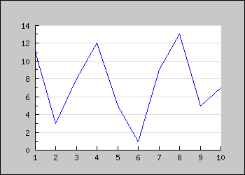
The first example draws a line graph consisting of 10 Y-values. In this first example we show the full code. In the following examples we will only show interesting piece of the code.
 <?php

include (
"../jpgraph.php");

include ("../jpgraph_line.php");


// Some data

$ydata =
 array(11,3,
8,12,5
,1,9,
13,5,7
);


// Create the graph. These two calls
 are always required

$graph =
 new Graph(350,
250,"auto");

$graph->SetScale(
"textlin");


// Create the linear plot

$lineplot
=new LinePlot($ydata);

$lineplot
->SetColor("blue");


// Add the plot to the graph

$graph->Add(
$lineplot);


// Display the graph

$graph->Stroke();

?>
You might note a few things
- Both the X and Y axis have been automatically scaled. We will later on show how you might control the auto scaling how it determines the number of ticks which is displayed.
- By default the Y-grid is displayed in a "soft" color
- By default the image is bordered and the margins are slightly gray.
- By default the 0 label on the Y-axis is not displayed
This is a perfect fine graph but looks a little bit "sparse". To make it more interesting we might want to add a few things like
- A title for the graph
- Title for the axis
- Increase the margins to account for the title of the axis
From looking at the previous example you can see that you access all properties of JpGraph through the objects you create. Graph(), LinePlot() and so on. In general all objects you can see in the graph is accessed through a named instance.
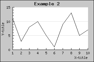
For example the title of the graph is accessed through the 'Graph::title' property. So to specify a title string you make a call to the 'Set()' method on the title property as in:
 $graph->title->Set
('Example 2');
So by adding just a few more lines to the previous code we get a graph as shown below.
To achieve this we just needed to add a few more lines. (We only show the part of example 1 we changed, to look at the full source just click the [src] link in the caption. )
 // Setup margin and
 titles

$graph->img->
SetMargin(40,20
,20,40);

$graph->title->
Set("Example
 2");

$graph->xaxis->
title->Set("X-title"
);

$graph->yaxis->
title->Set("Y-title"
);
Again there are a couple of things you should note here
- A default font and size is used for the text
- The default position for the title of the graph is to be centered at the top
- The default position for the title of the x-axis is the far right and for the y-axis centered and rotated in a 900 angle.
A nice change would now be to have all the titles in a bold font and the line plot a little bit thicker and in blue color. Let's do that by adding the lines
 $graph->
title->SetFont(FF_FONT1
,FS_BOLD);

$graph->yaxis->
title->SetFont(FF_FONT1
,FS_BOLD);

$graph->xaxis->
title->SetFont(FF_FONT1
,FS_BOLD);

$lineplot
->SetColor("blue");

$lineplot
->SetWeight(2);
// Two pixel wide
Again please note the consistent interface. To change font you just have to invoke the SetFont() method on the appropriate object. This principle is true for most methods you will learn. The methods may be applied to a variety of objects in JpGraph. So for example it might not come as a big surprise that to have the Y-axis in red you have to say:
 $graph->yaxis->SetColor
("red")
or perhaps we also want to make the Y-axis a bit wider by
 $graph
->yaxis->SetWidth(
2)
As a final touch let's add a frame and a drop shadow around the image since this is by default turned off. This is done with
 $graph
->SetShadow()
The result of all these modifications are shown below.
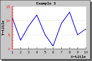
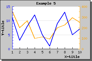
Figure 5: Making the image a little bit more interesting by adding som colors and changing the fonts [src]
7.1.1 Adding plot marks to line-plots XXX
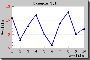
It might sometimes be desirable to highlight the data-points with marks in the intersection between the given x and Y-coordinates. This is accomplished by specifying the wanted plot mark type for the "mark" property of the line graph. A full list of all available marks is given in the class reference PlotMarks
For now let's just add a triangle shape marker to our previous graph by adding the line
 $lineplot->
mark->SetType(MARK_UTRIANGLE
);
This will give the graph as shown below
If you like you can of course both change the size, fill-color and frame color of the chosen plot mark.
The colors of the marks will, if you don't specify them explicitly, follow the line color. Please note that if you want different colors for the marks and the line the call to SetColor() for the marks must be done after the call to the line since the marks color will always be reset to the lines color when you set the line.
7.1.2 Displaying the values for each data point
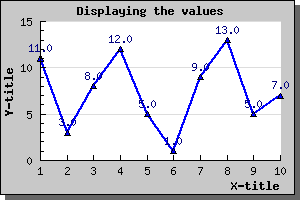
As a final easy modification we can enable the display of the data value above each data point. The value is represented by the 'value' property in the plot. (You can read more about the possibilities of the display value in the class reference.)
To enable the display of the value you just need to call the Show() method of the value as in
 $lineplot->value->
Show()
Adding that line to the previous line plot would give the result shown below.
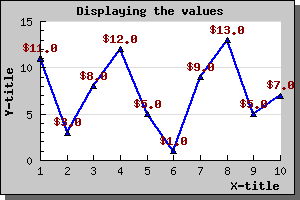
We can of course change both color, font and format of the displayed value. So for example if we wanted the display values to be dark red, use a bold font and have a '$' in front we need to add the lines
 $lineplot
->value->SetColor(
"darkred");

$lineplot
->value->SetFont(
FF_FONT1,
FS_BOLD);

$lineplot
->value->SetFormat(
"$ %0.1f");
This would then result in the following image
7.1.3 Adding several plots to the same graph
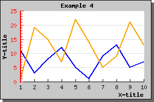
What if we want to add a second plot to the graph we just produced? Well, this is quite straightforward and just requires two simple step:
- Create the second plot
- Add it to the graph
To create the second plot we need some data (we could of course use the same data as for the first plot but then we wouldn't be able to see the new plot!)
The following lines show how to create the new plot and add it to the graph (we only show the new lines - not the full script)
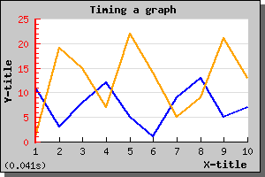
 $ydata2
 = array(1,19,
15,7,22
,14,5,
9,21,13
);

$lineplot2
=new LinePlot($ydata2);

$lineplot2
->SetColor("orange");

$lineplot2
->SetWeight(2);


$graph->Add(
$lineplot2);
Making these changes to the previous graph script would generate a new graph as illustrated below.
There is a few things worth noting here
- The Y-scale has changed to accommodate the larger range of Y-values for the second graph.
- If you add several plots to the same graph they should contain the same number of data points. This is not a requirement (the graph will be automatically scaled to accommodate the plot with the largest number of points) but it will not look very good since one of the plot end in the middle of the graph.
7.1.4 Adding a second Y-scale
As you saw in the preceding example you could add multiple plots to the same graph and Y-axis. However what if the two plots you want to display in the graph has very different ranges. One might for example have Y-values like above but the other might have Y-values in the 100:s. Even though it is perfectly possible to add them as above the graph with the smallest values will have a very low dynamic range since the scale must accomplish the bigger dynamic range of the second plot.
The solution to this is to use a second Y-axis with a different scale and add the second plot to this Y-axis instead. Let's take a look at how that is accomplished.
First we need to create a new data array with large values and secondly we need to specify a scale for the Y2 axis. This is done by the lines
 $y2data = array(
354,200,265
,99,111,
91,198,225
,293,251);

$graph->SetY2Scale(
"lin");
and finally we create a new line plot and add that to the second Y-axis. Note that we here use a new method, AddY2(), since we want this plot to be added to the second Y-axis. Note that JpGraph will only support two different Y-axis. This is not considered a limitation since using more than two scales in the same graph would make it very difficult to interpret the meaning of the graph.
To make the graph a little bit more esthetic pleasing we use different colors for the different plots and let the two different Y-axis get the same colors as the plots.
The resulting graph is shown below. source)
7.1.5 Adding a legend to the graph
With more than one plot on the same graph it is necessary to somehow indicate which plot is which. This is normally done by adding a legend to the graph.
You will see that each plot type has a 'SetLegend()' method which is used to name that plot in the legend. SO to name the two plots in the example we have been working with so far we need to add the lines
 $lineplot
->SetLegend("Plot 1");

$lineplot2
->SetLegend("Plot 2");
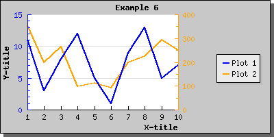
to the previous code. The resulting graph is shown below As you can see the legend gets automatically sized depending on how many plots there are that have legend texts to display. By default it is placed with it's top right corner close to the upper right edge of the image. Depending on the image you might want to adjust this or you might want to add a larger margin which is big enough to accompany the legend. Let's do both.
First we increase the right margin and then we place the legend so that it is roughly centered. We will also enlarge the overall image so the plot area doesn't get too squeezed.
To modify the legend you access the 'legend' property of the graph. For a full reference on all the possibilities (changing colors, layout, etc) see class legend in the class reference
For this we use the legends 'SetPos()' method as in
 $graph
->legend->Pos(
0.05,0.5,"right"
,"center");
Doing this small modification will give the result shown below
The above method 'SetPos()' deserves some explanation since it might not be obvious. You specify the position as a fraction of the overall width and height of the entire image. This makes it possible for you to resize the image within disturbing the relative position of the legend. We will later see that the same method is just to place arbitrary text in the image.
To give added flexibility one must also specify to what edge of the legend the position given should be relative to. In the example above we have specified "right" edge on the legend for the for the horizontal positioning and "center" for the vertical position.
This means that the right edge of the legend should be position 5 % of the image width from the right. If you had specified "left" the the legends left edge would be positioned 5 % of the image width from the image left side.
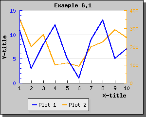
By default the legends in the legend box gets stacked on top of each other. The other possibility is to have them sideways. To adjust this you use the SetLayout() method. Using a horizontal layout with the previous example give the following result.
7.1.5.1 Adjusting the layout of the legend
For more advanced fomatting of the legend it is possible to adjust
- The number of columns in the legend
- Specify vertical / horizontal margins for legend columns
In order to adjust the number of columns used in the legend the method Legend::SetColumns is used. So for example to have the legend lined up using three columns the follwing lines have to be added to teh script
 $graph->
legend->
SetColumns(3);
7.1.6 Handling null-values in line plots
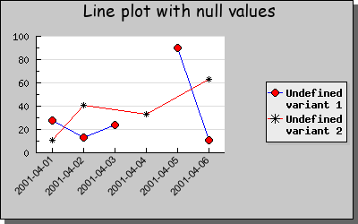
JpGraph offers two ways of handling null values (or discontinuities) in the data. You can either have a "whole" in the data or the line may be extended between the previous and next data point in the graph.
If the data value is null ("") or the special value "x" then the data point will not be plotted and will leave a gap in the line.
If the data value is "-" then the line will be drawn between the previous and next point in the data ignoring the "-" point.
The following example shows both these possibilities.
7.1.7 Using the step-style to render line plots
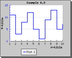
Step style refers to an alternate way of rendering line plots by not drawing a direct line between two adjacent points but rather draw two segments. The first segment being a horizontal line to the next X-value and then a vertical line from that point to the correct Y-value. This is perhaps easier demonstrated by an example as seen below.
You specify that you want the plot to be rendered with this style by calling the method SetStepStyle() on the lineplot.
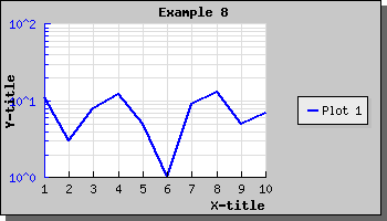
7.1.8 Using logarithmic scale
Using a logarithmic scale requires you to include the logarithmic add on module in "jpgraph_log.php". So you must have the line
 include("jpgraph_log.php"
);
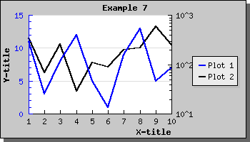
on the top of your code. To Illustrate how to use a logarithmic scale let's make the right Y scale in the previous example a logarithmic scale. This is done by the line
 $graph->
SetY2Scale(
"log");
This will then give the following result
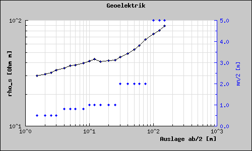
You can of course also use a logarithmic X-scale as well. The following example shows this.
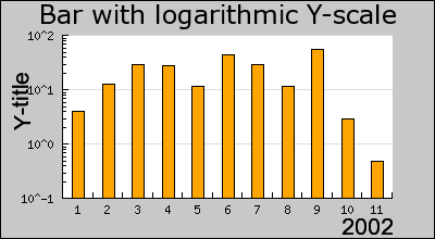
Even though we have so far only shown line graphs logarithmic scale can also be used for bar, error, scatter plots as well. Even radar plots supports the use of logarithmic plots. The following example shows how to use a logarithmic scale for a bar graph.
7.1.9 More on scales
As you saw in the previous example it is possible to use different types of scales. In JpGraph you can use the following scales
- Linear scale, the standard "scale"
- Logarithmic scale
- Integer scale, very similar to linear scale but restricts the scale values (and labels) to integer values.
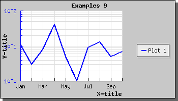
- Text scale, Similar to integer scale and used when only the numbering of items is relevant. A text scale is almost exclusively used for the X-axis. A typical example for this is the X-axis for a bar plot. The labels for the text scale is usually replaced by user supplied texts. Text scales can only be used for the X-axis (it doesn't make sense for the Y-scale).
Any combination of these may be used. Linear and logarithmic scales are pretty straightforward. The text scale might deserve some explanation. The easiest way to think of the text scale is as a linear scale consisting of only natural numbers, i.e. 0,1,2,3,4,... . This scale is used when you just have a number of Y-values you want to plot in a consecutive order and don't care about the X-values. For the above example it will also work fine to use a linear X-scale (try it!). However, the scale is now treated as consisting or real numbers so the auto scaling, depending on the size of the image an the number of data points, might decide to display other labels then the natural numbers., i.e. a label might be 2.5 say. This is not going to happen if you use a text scale.
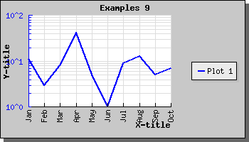
The normal practice for text scale is to specify text strings as labels instead as the default natural numbers. You can specify text strings for the labels by calling the SetTickLabels() method on the Axis.
To specify the scale you use the SetScale() method. A few examples might help clarify this.
- "textlin", text-scale for X-axis, Linear scale for Y-axis
- "linlin", linear-scale for X-axis, Linear scale for Y-axis
- "linlog", linear-scale for X-axis, Logarithmic scale for Y-axis
- "loglog", Logarithmic scale for X-axis, Logarithmic scale for Y-axis
- "textint", text-scale for X-axis, Integer scale for Y-axis
- "textlog", Text scale for X-axis, Logarithmic scale for Y-axis
As you can see all your graphs will require at least one call to SetScale() in the beginning of your script. Normally it will come right after the creation of the Graph().
To specify the scale for the Y2 axis you use the SetY2Scale() Since you only specify one axis you only specify "half" of the string in the previous examples. So to set a logarithmic Y2 scale you will call SetY2Scale("log");'; ShowCodeSnippet($t); ?>
7.1.10 Adjusting the grid lines in the plot
By default only the Y-axis have grid lines and then only on major ticks, i.e. ticks which have a label. It is of course possible to change this. Both the X , Y and Y2 can have grid lines. It is also possible to let the gridlines also be drawn on the minor tick marks, i.e. ticks without a label. Lets see how we can apply this to the graph above.
The grid is modified by accessing the xgrid (or ygrid) component of the graph. So to display minor grid lines for the Y graph we make the call
 $graph->ygrid->Show
(true,true)
The first parameter determines if the grid should be displayed at all and the second parameter determines whether or not the minor grid lines should be displayed.
If you also wanted the grid lines to be displayed for the Y2 axis you would call
 $graph->
y2grid->Show(true
,true)
Note. In general it is not a good idea to display both the Y and Y2 grid lines since the resulting image becomes difficult to read for a viewer.
We can also enable the X-grid lines with the call
 $graph
->xgrid->Show(
true)
In the above line we will of course only just enable the major grid lines.
To bring all this together we will display a graph with grid lines for both Y and X axis enabled.
7.1.11 Using filled grid lines
Another option for the grid lines is the possibility to have the area between the grid lines filled with alternating two colors. The example below illustrates this.
In the example above we have also made use of alphablending (requires GD 2.x or higher). By default the filled grid lines are disabled. To enable this style you have to call the Grid::SetFill() method.
7.1.12 Specifying text labels for the X-axis
You might want to have specific labels you want to use for the X-axis when this has been specified as a "text" scale. In the previous example each Y-point might represent a specific measurement for each of the first 10 month. We might then want to display the name of the months as X-scale.
To specify the labels on the scale you make use of the SetTickLabels() method.
To get a localized version of the name of the month you can use a nice feature in JpGraph, the global '$gDateLocal' object which is an instance of the DateLocale
This class has a number of methods to get localized versions of relevant names for dates, (months and weekdays).
So to specify the X-axis with the short form of the month names we use the construction
 $a =
 $gDateLocale->
GetShortMonth();

$graph->xaxis->
SetTickLabels(
$a);
This will, now result in the image displayed below
7.1.13 Adjusting the ticks on a text scale
As can be seen in the previous example the X-axis is slightly cluttered with the labels very close to each other. We might rectify this by either enlarging the image or just displaying fewer tick label on the x-axis.
Specifying that we only want, for example, to print every second label on the axis is done by a call to the method SetTextLabelInterval() Which would result in the graph
If the text labels are long (for example full dates) then another way might be to adjust the angle of the text. We could for example choose to rotate the labels on the X-axis by 90 degrees. With the help of the SetLabelAngle()
Which would then result in the image below
7.1.14 Using filled line graphs
Using a filled line plot is not much different from using a normal line plot, in fact the only difference is that you must call the method SetFillColor() on a normal line plot. This will then fill the area under the line graph with the chosen color.
In the example below we have also, as an example, specified plot marks (see previous sections).
Note 1. If you add multiple filled line plots to one graph make sure you add the one with the highest Y-values first since it will otherwise overwrite the other plots and they will not be visible. Plots are stroked in the order they are added to the graph, so the graph you want front-most must be added last.
Note 2. When using legends with filled line plot the legend will show the fill color and not the bounding line color.
Note 3. Filled line plots is only supposed to be used with positive values. Filling line plots which have negative data values will probably not have the appearance you expect.
As you can see from the graph above the grid lines are below the filled line graph. If you want the grid lines in front of the graph you can adjust the depth with call to Graph::SetGridDepth() As the following example shows
7.1.15 Using accumulated line graphs
Accumulated line graphs are line graphs that are "stacked" on top of each other. That is, the values in the supplied data for the Y-axis is not the absolute value but rather the relative value from graph below. For example if you have two line graphs with three points each, say [3,7,5] and [6,9,7]. The first graph will be plotted on the absolute Y-values [3,7,5] the second plot will be plotted at [3+6, 7+9, 5+7], hence the values of the previous graphs will be used as offsets.
You may add any number of ordinary line graphs together. If you want to use three line plots in an accumulated line plot graph you write the following code
 // First create the individual plots

$p1 =
 new LinePlot($datay_1);

$p2 =
 new LinePlot($datay_2);

$p3 =
 new LinePlot($datay_3);


// Then add them together to form a
 accumulated plot

$ap =
 new AccLinePlot
(array($p1,$p2,
$p3));


// Add the accumulated line plot to
 the graph

$graph->Add(
$ap);
You might of course also fill each line plot by adding the lines
 $p1
->SetFillColor
("red");

$p2->SetFillColor(
"blue");

$p3->SetFillColor(
"green");
Using some appropriate data this might then give a graph perhaps like the one showed in the figure below
7.1.16 Constructing smooth line plots with Cubic Splines
If you only have access to a few data points but still want a smooth curve between those data points JpGraph can help you achieving that by letting you construct cubic splines. If you never have heard of cubic splines before, don't worry. You only have to supply the data points you know tell JpGraph how many interpolated points in total you want in the graph. JpGraph will now take care of constructing a smooth curve between all you data points. The new, smooth, curve will be made up of exactly as many interpolated points as you have specified.
To construct a spline you need both the X and Y coordinates for the known data points.
You start by constructing a new Spline instance. To get access to the Spline class you must first remember to include the file "jpgraph_regstat.php". You instantiate this class by calling it with your two known data arrays (X and Y) as follows.
 $spline
 = new Spline($xdata,
$ydata);
This call initializes the spline with the data points you have. These data points are also known as Control points for the spline. This helper class doesn't draw any line itself. Instead it is merely used to get a new (larger) data array which have all the interpolated values. You then use these new value in your plot. This way give you great flexibility in how you want to use this interpolated data.
Continuing the above line we now use the Spline::Get() method to get an interpolated array containing a specified number of points. So for example the line
 list(
$sdatax,
$sdatay) =
 $spline->Get(50
);
Will construct the two new data arrays '$sdatax' and '$sdatay' which contains 50 data points. These two arrays are constructed from the control point we specified when we created the '$spline' object.
You would then use these two new data array in exactly the same way as you would form ordinary data vectors.
The following example illustrates this
In order to make the example more interesting we actually use two plots. First a line plot to get the smooth curve and then a standard scatter plot which is used to illustrate where the control points are.
7.1.17 Adding plot marks to a line plot
To emphasize the specific data points it is possible to add plot marks at each data point. Plot marks can be either
- Simple shapes, (e.g. square, circle, cross, etc)
- Arbitrary images loaded from a file
- One of the built-in images
You access the plot mark through the "mark" instance variable in the plot, as in
 $lineplot->
mark->SetColor("red"
);
To choose between the different plot marks you call the PlotMark::SetType() method with the correct define to choose the plot type you want to use.
The simple shape type of plot marks are
- MARK_SQUARE
- MARK_UTRIANGLE
- MARK_DTRIANGLE
- MARK_DIAMOND
- MARK_CIRCLE
- MARK_FILLEDCIRCLE
- MARK_CROSS
- MARK_STAR
- MARK_X
- MARK_LEFTTRIANGLE
- MARK_RIGHTTRIANGLE
- MARK_FLASH
To specify an arbitrary image you use the special define
- MARK_IMG
In this case you must also specify a image file name and an optional scaling constant. For example as in
 $lineplot->mark->
SetTYPE(
MARK_IMG,
"myimage.jpg",
1.5);
If you want to use one of the built-in images the following images are available. Please note that not all images are available in all possible colors. The available colors for each image is listed below.
The following shape (the first class) plot marks are available
- MARK_SQUARE, A filled square
- MARK_UTRIANGLE, A triangle pointed upwards
- MARK_DTRIANGLE, A triangle pointed downwards
- MARK_DIAMOND, A diamond
- MARK_CIRCLE, A circle
- MARK_FILLEDCIRCLE, A filled circle
- MARK_CROSS, A cross
- MARK_STAR, A star
- MARK_X, An 'X'
- MARK_FLASH, A "flash" shape
- MARK_IMAGE, Use the image specified with the filename and scale as the second and third argument as the mark.
For the second class (built-in images) the following table list the different images as well as what color they are available in. For the built-in images you specify the color with the second argument.
Note that some of the images are available in different sizes. The reason is that even though you can scale them by the third argument there is a visual degradation to scale an image larger than it's original size since some pixels needs to be interpolated. Reducing the size with a scale < 1.0 gives much better visual apperance.
The scaling works with both GD 1 and GD 2 but with GD 2 the quality of the scaling is much better.
Built-in images and available colors:
| Type | Description | Colors |
|---|---|---|
| MARK_IMG_PUSHPIN, MARK_IMG_SPUSHPIN | Push-pin image | 'red','blue','green','pink','orange' |
| MARK_IMG_LPUSHPIN | A larger Push-pin image | 'red','blue','green','pink','orange' |
| MARK_IMG_BALL, MARK_IMAGE_SBALL | A round 3D rendered ball | 'bluegreen','cyan','darkgray','greengray', 'gray','graypurple','green','greenblue','lightblue', 'lightred','navy','orange','purple','red','yellow' |
| MARK_IMAGE_MBALL | A medium sized round 3D rendered ball | 'blue','bluegreen','brown','cyan', 'darkgray','greengray','gray','green', 'greenblue','lightblue','lightred', 'purple','red','white','yellow' |
| MARK_IMAGE_LBALL | A large sized round 3D rendered ball | 'blue','lightblue','brown','darkgreen', 'green','purple','red','gray','yellow','silver','gray' |
| MARK_IMAGE_SQUARE | A 3D rendered square | 'bluegreen','blue','green', 'lightblue','orange','purple','red','yellow' |
| MARK_IMG_STAR | A 3D rendered star image | 'bluegreen','lightblue','purple','blue','green','pink','red','yellow' |
| MARK_IMG_DIAMOND | A 3D rendered diamond | 'lightblue','darkblue','gray', 'blue','pink','purple','red','yellow' |
| MARK_IMG_BEVEL | A 3D rendered bevel style round ring | 'green','purple','orange','red','yellow' |
7.2 Bar graphs
Jpgraph also supports 2D vertical bar plots. Before you can use any bar plots you must make sure that you included the file "jpgraph_bar.php" in your script.
Using bar plots is quite straightforward and works in much the same way as line plots which you are already familiar with from the previous examples. Assuming you have a data array consisting of the values [12,8,19,3,10,5] and you want to display them as a bar plot. This is the simplest way to do this:
 $datay=array(12,
8,19,3
,10,5);

$bplot =
 new BarPlot($datay);

$graph->Add(
$bplot);
If you compare this to the previous line examples you can see that the only change necessary was that instead of creating a new line plot (via the new LinePlot(...) call) we used the statement new BarPplot().
The other change we should do is to make sure the X-axis have an text-scale (it is perfectly fine to use a linear X-scale but in most cases this is not the effect you want when you use a bar graph, see more below). With this two simple change we will now get a bar graph as displayed in the following image You can of course modify the appearance of the bar graph. So for example to change the fill color you would use the BarPlot::SetFillColor() method. Making this small change to the previous example would give the expected effect as can be seen in the next example.
7.2.1 Adjusting the width of the bars
JpGraph allows you to easy customize the appearance of the bar graph, for example to change the width of each bar. The width of each bar can be specified either as a fraction of the width between each major tick or as an absolute width (in pixels).
To set the width in fraction you use the method SetWidth() and to set the width in pixels you use the SetAbsWidth()
As an example let's take the previous example and set the width to 100% of the distance between the ticks. The example will now become
7.2.2 Displaying the value of each bar
You can easily choose to display the value (and it's format) on top of each bar by accessing the bar's 'value' property. So for example by just adding the line
 $barplot->
value->Show();
Will enable the values in it's simplest form and will give the result
You cane see a small nuisance in this graph. The auto scaling algorithm chooses quite tight limits for the scale so that the bars just fit. Adding the value on top of the bar makes it collide with the top of the graph. To remedy this we tell the auto scaling algorithm to allow for more "grace" space at the top of the scale by using the method SetGrace() which is used to tell the scale to add a percentage (of the total scale span) more space to either one end or both ends of the scale. In this case we add 20% more space at the top to make more room for the values with the line
 $graph->
yaxis->scale->SetGrace
(20);
This will then give the graph as shown below
You can also adjust the general position of the value in respect to the bar by using the BarPlot::SetValuePos() method. You can set the position to either 'top' (the default) , 'center' or 'bottom'. The graph below shows the value being positioned in the center. In this example we have also adjusted the format to just display the value as an integer without any decimals.
It is also possible to specify a more fine grained control on how you want the values presented. You can for example, rotate them, change font, change color. It is also possible to adjust the actual value displayed by either using a printf()-type format string or with the more advanced technique of a format callback routine.
To show what you can do we just give another example for you to examine without much further explanations. Just remember that to have text at an angle other than 0 or 90 degrees we have to use TTF fonts. Even though we haven't explained the SetFont() method it should be fairly obvious.
7.2.3 Adding a drop shadow to the bar
One simple way of making the bar graph more attracting is to add a drop shadow to each bar. This is done by calling the SetShadow() method. An example will clarify this.
7.2.4 Adjusting the alignment of bars on a text scale
As you have seen from the previous examples bar graphs are normally centered between the trick marks on a text scale. However, you can modify this behavior by calling the method BarPlot::SetAlign()
7.2.5 Using grouped bar plots
These types of bar graph is used to easy group two or more bars together around each tick (X-value). The bars will be placed immediately beside each other and as a group centered on each tick mark. A grouped bar is created by aggregating two or more ordinary bar graphs and creating a GroupBarPlot() From two ordinary bar graphs along the lines of
 // Create the bar plots

$b1plot
 = new BarPlot
($data1y);

$b1plot
->SetFillColor
("orange");


$b2plot
 = new BarPlot
($data2y);

$b2plot
->SetFillColor
("blue");


// Create the grouped bar plot

$gbplot
 = new GroupBarPlot
(array($b1plot
,$b2plot));


// ...and add it to the graPH

$graph->Add(
$gbplot);
The following example illustrates this type of graph
There is no limit on the number of plots you may group together.
If you use the SetWidth() method on the GroupBarPlot() this will affect the total width used by all the added plots. Each individual bar width will be the same for all added bars. The default width for grouped bar is 70%.
Setting the grouped with to 0.9 would result in the image below.
7.2.6 Using accumulated bar plots
The final variety of group bars you can have are accumulated bars. They work in much the same way as accumulated line plots described above. Each plot is stacked on top of each other.
You create accumulated bar plots in the same way as grouped bar plots by first creating a number of ordinary bar plots that are then aggregated with a call to AccBarPlot();
An example makes this clear. Let's use the same data as in the two examples above but instead of grouping the bars we accumulate (or stack) them. The code would be very similar (actually only one line has to change)
7.2.7 Using grouped accumulated bar graphs
It is perfectly possible to combine the previous bar types to have grouped accumulated bar plots. This is done by just adding the different accumulated plots to a group bar plot, for example the following code would do that.
 // Create all the 4
 bar plots

$b1plot
 = new BarPlot
($data1y);

$b1plot
->SetFillColor
("orange");

$b2plot
 = new BarPlot
($data2y);

$b2plot
->SetFillColor
("blue");

$b3plot
 = new BarPlot
($data3y);

$b3plot
->SetFillColor
("green");

$b4plot
 = new BarPlot
($data4y);

$b4plot
->SetFillColor
("brown");


// Create the accumulated bar plots

$ab1plot
 = new AccBarPlot
(array($b1plot
,$b2plot));

$ab2plot
 = new AccBarPlot
(array($b3plot
,$b4plot));


// Create the grouped bar plot

$gbplot
 = new GroupBarPlot
(array($ab1plot
,$ab2plot));


// ...and add it to the graph

$graph->Add(
$gbplot);
Putting this together in an example would then produce the graph as shown below
7.2.8 Horizontal bar graphs
It can often come in handy to have horizontal bar graphs especially if you have a large number of values to display. Even though JpGraph doesn't directly support horizontal bar graphs this is easy achieved by constructing a normal vertical bar graph which is then rotated 90 degrees.
The example below shows a simple example of this
In order to achieve this effect you should study the above example carefully and you might notice two things
- We don't simply rotate the graph we also specify that we want the rotation center to be the middle of the entire image. The reason for this is that by default (See the section on rotating plots) the pivot point for rotation is the center of the plot area. Since the center of the plot area is not necessary the center of the entire image the rotation might be a little bit difficult to predict since it will depend on the margins specified. <
- The size of the plot area is determined from the original width and
height of the image taking the specified margin into account. When the
the plot area is rotated 90 degrees clockwise what was the left margin
now in effect become the upper margin and so on. This is a small nuance
since we conceptually want to specify the margins directly in the
rotated plot.
In order to more easily handle the margin with rotated images it is recommended that the method "Set90AndMargin()" is used. This allows the image to be rotated as well as specifying the margins in an obvious way.
We finally show three more examples of horizontal bar plots. In the first plot we have hidden the Y-axus and in the second we have positioned the Y - axis at top as opposed to the bottom as the first example shows.
In the final example which is almost similar to the two first we illustrate the use of labels with more than one line.
7.2.9 Using gradient fill for bar graphs
It is possible to use color gradient fill for the individual bars in the bar graph.
Color gradient fill fills a rectangle with a smooth transition between two colors. In what direction the transition goes (from left to right, down and up, from the middle and out etc) is determined by the style of the gradient fill. JpGraph currently supports 8 different styles. All supported styles are displayed in the figure below.
To specify a gradient fill for the bar plots you make use of the method BarPlot::SetFillGradient() . See the class reference for details of this function.
When using gradient fills there are a couple of caveats you should be aware of:
- gradient filling is computational expensive. Large plots with gradient fill will take in the order of 6 times longer to fill then for a normal one-color fill. This might to some extent be helped by making use of the cache feature of JpGraph so that the graph is only generated a few times.
- gradient filling will make use of much more colors (by definition)
this will make the color palette for the image bigger and hence make
the overall image larger. It might also have some severe effect on
using anti-aliased line in the same image as color gradient filling
since anti-aliased lines also have the possibility to make use of many
colors. Hence the color palette might not be big enough for all the
colors you need. So if you use gradient fills you should also be using
a true-color image since you otherwise run out of colors.
This problem is often seen as that for no apparent reason some color you have specified in the image does appear as another color. (This is not a bug in JpGraph!) This is something to especially watch out for when enabling anti-aliasing since that also uses a lot of colors. Since the numbers of colors used with anti-aliasing depends on the angle on the lines it is impossible to foresee the number of colors used for this.
7.2.10 Creating semi-filled bar graphs
Semi filled bar graphs are in principle the same as normal filled bar graphs but with the additional feature that you can choose to only fill a specified range (or ranges) of X-coordinates. The figure below illustrates this
In this example we defined two areas along the X-axis to be filled. You can add filled areas by using the method AddArea() and specifying range and color for the filled area.
7.3 Error plots
Error plots are used to visually indicate uncertainty in data points. This is done by for each X value by giving both a minimum and a maximum Y-value.
Before you can use error plots you must remember to include the file "jpgraph_error.php" in your script.
The following example illustrates a simple error bar. We will have 5 points, so we need 10 Y-values. We also would like the error bars to be red and 2 pixels wide. All this is accomplished by creating an ErrorPlot() in much the same way as, for example, a normal line plot. Doing this would now give the example shown below.
You might notice that there is one displeasing esthetic quality of this graph. The X-scale is just wide enough to just accompany the number of error bars and hence the first bar is drawn on the Y-axis and the and last bar just at the edge of the plot area. To adjust this you might call the SetCenter() method which will adjust the X-scale so it does not use the full width of the X-axis.
The following example illustrates the use of this feature by applying this technique to the previous example
7.3.1 Using line error plots
A line error plot is an error plot with the addition that a line is drawn between the average value of each error pair. You use this type of plot the exact same way you would use an error plot. The only change is that you must instantiated an ErrorLinePlot() instead and make sure you have included the "jpgraph_line.php" since the line error plot makes use of the line plot class to stroke the line.
To control the various properties of the line drawn the "line" property of the error line plot may be accessed. So, for example, if you want the line to be 2 pixels wide and blue you would have to add the following two lines
 $elplot->line->
SetWeight(2);

$elplot
->line->SetColor(
"blue");
to generate the graph as shown below
You may of course add legends to none, one or both of the line types in the above graph. So for example if we wanted the legend "Min/Max" for the red error bars and a legend "Average" for the blue line you would have to add the lines
 $errplot->SetLegend(
"Min/Max");

$errplot
->line->SetLegend(
"Average");
The resulting graph will now look like (note that we are using the default placement of the legend box)
7.4 Scatter plots
Scatter plots are very simple; they plot a number of points specified by their X- and Y-coordinate. Each point is stroked on the image with a mark as with line plots. The stroked marks can also be connected with an optional line.
Even though you would normally supply X-coordinates it is still perfectly possible to use a text-scale for X-coordinates to just enumerate the points. This is especially useful when using the "Impulse" type of scatter plot as is shown below.
Scatter pots are created by including the jpgraph extension "jpgraph_scatter.php" and then creating an instance of plot type of ScatterPlot(). To specify the mark you want to use you access the mark with the instance variable "mark" in the scatter plot. The default is to use an unfilled small circle.
To create a scatter plot you will create an instance
A simple example using just default values will illustrate this
We can easily adjust the size and colors for the markers to get another effect as shown below
Another possible variant of scatter plot is impulse-scatter plots. This is a variant of normal scatter plot where each mark have a line from the mark to the Y=0 base line. To change a scatter plot into an impulse scatter plot you have to call the method SetImpuls() on the scatter plot.
This type of plots are often used to illustrate signals in conjunction with digital signal processing. The following two examples illustrates simple use of impulse plots.
The next example shows how to modify the color and width of the impulse plot
As a final touch we show two more advanced impulse graphs . In these graphs we have used more advanced formatting for the Y-axis labels as well as adjusted the position of the axis position.
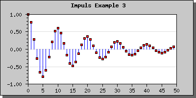
Figure 61: In this imuplsplot we have adjusted the position of the X-axis to the bottom and also added more decimals to the labels on the Y-axis [src]
7.5 Field plots
A variant of scatter plot is the so called Field Plots this is basically a scatter plot where each scatter point is an arrow with a direction between 0 to 359 degrees. This effectively allows the visualization of 3 parameters at each point (x,y,angle). As an additional bonus there is also possible to define a callback for each scatter plot to also define the color for each point.
To create a field plot you create an instance of FieldPlot in the same way as you created a normal scatter plot. The arguments to this method are Y-coordinate, X-coordinate and angle. To specify a callback you use FieldPlot::SetCallback()
The following example (and code) illustrates the usage of the field plot type.
In addition to the parameters mentioned above you can also adjust both the general size of the arrow and also the specific size of the arrowhead. The arrow size is specified in pixels and the arrow head is specified as an integers between 0 and 10. These sizes are specified with a call to FieldPlot::arrow::SetSize()
7.6 Box and Stock charts
JpGraph offers two variation on what is usually known as stock charts, candle-charts or box plot.
7.6.1 Stock Charts
Stock charts is used to display data values where one is interested in 4 different values for each data point. This could for example be used to display a stock's open,close, min and max value during a specific day. Hence the name Stock chart (or Stock plot).
The figure below illustrates a sample Stock chart plot
For this type of plot the Y-data array must be consist of a number of quadruples of data where each quadruple consists of (open,close,min,max). The open and close values determine the min max for the middle bar and the min,max determine the end points of the "error-lines" at the top and bottom of of each bar.
Note that the data follows the following rules
- min < max
- min < min(open.close)
- max > max(open,close)
To separate the two cases where "open > close" or "open < close " different colors are used. These colors are specified with the SetColor() method. By default a positive bar (close > open) have a fill color of white and for the negative case where (close < open) the bars have a red color.
You can specify the width of the bar by setting the width (in pixels) with a call to the method SetWidth()
The final variation of stock plots you can have is to determine whether or not the end point for the min,max lines should have the horizontal line marking the end of the line or not. This can be adjusted with a call to method HideEndLine().
7.6.2 BoxPLots : Stock charts with a median line
A minor variation of stock charts is the "BoxPlot()" this is almost the same as StockPlot() but with the very small difference that in addition to the open,close,min, max values you also specify a median value . The median lies between the open and close value and is illustrated as a horizontal line within the bar.
You may modify the median line color for positive and negative data points / bars by using the SetMedianColor() method.
7.6.3 Image maps for Box and Stock charts
In the same way as for other plots you may associate an image map with these plots. The "hot" area for each plot is the mid "bar" section. In the same way as other plot types you use the SetCSIMTargets() to set the URL's you want to use.
These plot types, though normally used without explicit X-values, can of course handle a supplied X-coordinate array without any problem.
7.7 Combining different graph types
It is perfectly legal to add several different plot types to the same graph. It is therefore possible to mix line plots with (for example) filled bar graphs. What you should keep in mind doing this is the order in which these plots are stroked to the image since a later stroke will overwrite a previous one. All plots are stroked in the order you add them, i.e. the first plot added will be stroked first. You can therefore control which plot is placed in the background and which one is placed in the foreground by the order you add them to the plot.
To start simple we just mix a filled line plot with a non-filled line plot as the following example shows.
Let's now go to something a little bit more complicated. How to mix bar and line graphs. Let's just take one of our previous bar graphs and add a line plot to it and see what happens.
Not too bad. But we can't see the line so we change the order in which we add the lines to the graph and sees what happens.
If you want the line points to be aligned in the center of the bars you can accomplish this is two ways.
If you use a text scale then you need to call the LinePlot::SetBarCenter()
You can also use an integer scale. This places both the bar and the line points centered at the tick marks. As the following example will show
As a final example we show how you can combine a scatter plot and a line plot which could be used to illustrate a regression line fitting.
7.8 Specifying the scale manually
Normally the automatic scaling should be doing an adequate job in most circumstances but there might be cases where you like to manually set the scale. For example if you have several graphs where you like to be able to easily compare them and therefore want them all to have the same scale.
To specify a manual scale you have to add arguments to the standard Graph::SetScale() method. So to specify that you want an Y-scale between 0 and 100 you need to write
 $graph->
SetScale(
"textlin",0,100
);
When you specify a scale manually there is one additional thing you need to decide. How the tick marks should be positioned. You have three choices
- Let JpGraph decide suitable tick marks honoring the exact scale you specified. This is the default behavior if you don't do anything else.
- Allow JpGraph to slightly adjust your specified min and max values. With the default method, depending on the min and max values, the end and start of the scale might not fall on an exact tick mark. For esthetic reasons you might still want the last/first tick mark to fall on the edges of the scale. By calling LinearScale::SetAutoTicks() you tell JpGraph to make the smallest necessary adjustment of the end/start points so that they fall on an exact tick mark.
- Manually specify the tick marks with a call to
LinearTicks::Set() For example
 $graph->
SetScale(
"textlin",0,100
);

$graph->yscale->
ticks->Set(10
,5);
Will set the major tick marks every at 0,10,20,.. And every minor tick mark in between (0,5,10,15,20,25,...).
The three images below illustrates the difference between the possibilities of ticks for a manual scale.
7.9 Adjusting the automatic tick marks
You can adjust the automatic tick marks by telling JpGraph how dense you want them to be. You use the Graph::SetTickDensity() method. You can set the density setting in four steps
- TICKD_VERYSPARSE, Very few ticks
- TICKD_SPARSE, Few ticks
- TICKD_NORMAL, Standard number of ticks
- TICKD_DENSE, Large number of ticks
Taking the previous example with the manual scale but automatic ticks and using a denser ticks setting gives the following result
7.10 Handling date/time scales
With date/time scale we refer to the plotting of data where the independent variable (X-axis) de-nominates a time value. This could for example be the temperature measured in intervals during a day.
From version 1.18 and onwards there are two principal ways of handling date/time scales. The manual way and fully automatic using the special "dat" scale. For most cases the automatic "dat" scale is the preferred choice but in rare circumstances it might be more appropriate to use the manual way since it gives slightly more control (but not that much) of the overall handling of scales.
To be able to use a date/time scale at all we will assume that the data points are represented by both an X coordinate (time-value) and a Y-value (anything else wouldn't make sense).
We first start by describing the use of the "dat" scale.
7.10.1 Using the automatic date/time scale
The easiest way to get a date time scale for the X-axis is to use the pre-defined "dat" scale. To be able to use that it is first necessary to include the module "jpgraph_date.php" and the specify the scale, for example as "datlin" in the call to SetScale() as the following code snippet shows.
 require_once("../jpgraph.php");

require_once("../jpgraph_line.php");

require_once("../jpgraph_date.php");

...

$graph =
 new Graph(540,
300);

$graph->SetScale(
'datlin');

...
The above code snippet would create a date/linear scale for the graph. We will first show a basic use of the date scale and then go on to illustrate how it is possible to tailor the exact formatting of the date axis.
When using the fully automatic formatting the library will use the shortest possible string that uniquely identifieas a date/time. For example if the entire intervall falls within the same day only the time values will be displayed, if the intervall falls over several days then also the date will be added to the label.
As usual it is also possible to manually force a certain label formatting to be used this is illustrated below.
7.10.1.1 Specifying the input data
The first basic example below creates a data set that emulates a sample rate every S second and falls over a total period of two days. It is important to note that the input data on the X-axis must be a in the form of timestamp data, i.e. the number of seconds from the system epoch. In PHP the current timestamp value is returned by the function time().
This means that it is always mandatory to specify two input vectors for a plot. For example to specify a line plot
 $line
 = new LinePlot
($data,$xdata);
The example below show this in practice
Please review the script (by following the [src] link) that creates this graph before continuing since we will base all further examples on the above example.
7.10.1.2 Adjusting the start and end alignment
As can be seen from the above example the scale starts slightly before the first data point. Why? This is of course by purpose in order to make the first time label to start on an "even" value, in this case on an hour. Depending on the entire interval of the graph the start value will always be chosen to be the largest "even" time value, this could for example be on an even minute, even 30min, even hour, even day, even week and so on.
The alignment of the start (and end) vdate alignment can also be adjusted manually by using the two methods
- SetTimeAlign($aStartAlign,$aEndAlign)
- SetDateAlign($aStartAlign,$aEndAlign)
These method allow the alignment to be made by specifying one of the following constants.
For the SetTimeAlign() the following symbolic constants can be used
- Alignment on seconds
- MINADJ_1, Align on a single second (This is the lowest resolution)
- MINADJ_5, Align on the nearest 5 seconds
- MINADJ_10, Align on the nearest 10 seconds
- MINADJ_15, Align on the nearest 15 seconds
- MINADJ_30, Align on the nearest 30 seconds
- Alignment on minutes
- MINADJ_1, Align to the nearest minute
- MINADJ_5, Align on the nearest 5 minutes
- MINADJ_10, Align on the nearest 10 minutes
- MINADJ_15, Align on the nearest 15 minutes
- MINADJ_30, Align on the nearest 30 minutes
- Alignment on hours
- HOURADJ_1, Align to the nearest hour
- HOURADJ_2, Align to the nearest two hour
- HOURADJ_3, Align to the nearest three hour
- HOURADJ_4, Align to the nearest four hour
- HOURADJ_6, Align to the nearest six hour
- HOURADJ_12, Align to the nearest tolw hour
For the SetDateAlign() the following symbolic constants can be used
- Alignment on a day basis
- DAYADJ_1, Align on the start of a day
- DAYADJ_7, Align on the start of a week
- DAYADJ_WEEK, Synonym to DAYADJ_7
- Alignment on a monthly basis
- MONTHADJ_1, Align on a month start
- MONTHADJ_6, Align on the start of halfyear
- Alignment on a yearly basis
- YEARADJ_1, Align on a year
- YEARADJ_2, Align on a bi-yearly basis
- YEARADJ_5, Align on a 5 year basis
Some examples will calrify the use of these methods.
Example 1. We want the time adjustment to start on an even quarter of an hour, i.e. an even 15 minute period.
 $graph
->xaxis->scale->
SetTimeAlign(
MINADJ_15);
Example 2. We want the time to start on an even 2 hour
 $graph
->xaxis->scale->
SetTimeAlign(
HOURADJ_2);
Example 3. We want the start to be on an even day
 $graph
->xaxis->scale->
SetDateAlign(
DAYADJ_1);
7.10.1.3 Adjusting the label format
The default label format always tries to use the shortest possible unique string. To manually set a manual scale the method SetDateFormat() is used for example as in
 $graph
->xaxis->scale->
SetDateFormat(
'H:i');
The above example will force the labels to be displayed as hour (24h) and minutes.
7.10.1.4 Adjusting the date scale density
As with the linear scale it is possible to indicate what density of scale ticks is needed. This is specified as usual with a call to Graph::SetTickDensity()
 $graph->
SetTickDensity(
TICKD_DENSE);
7.10.2 Specifying a date/tiome scale with a manual call-back
In the following we will assume that all data points are specified by a tuple where the date/time is specified as a timestamp in second in the same format as is returned by the PHP function time().
The trick here is to use a label formatting callback routine which gets called to format each label on the scale.
What we do is that we specify that the X-scale should be an ordinary "int" scale (remember that the data values are timestamps which are integers). We then install our custom label callback (with a call to SetLabelFormatCallback()) which given a timestamp formats it to a suitable human readable form. In our example we will use the PHP function Date() for this purpose.
The callback we use will be
 // The callback that
 converts timestamp to minutes and seconds

function
 TimeCallback(
$aVal) {

    return Date
('H:i:s',$aVal);

}
Using some random data we can now generate the following graph
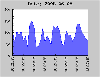
Figure 78: Example on how to format an axis to hold a date/time scale using and integer scale and a callback routine [src]
In the above example we have specified the X-scale manually to make sure that the min/max values on the X-axis exactly matches the min/max x-data values.
SetLabelFormatCallback() will be called for each of the displayed labels and the argument passed on to the supplied function is the default label that the library is assigning that specific label.
This means that if the data to be displayed is based on, for example, timestamps which are given in seconds the displayed value might not be aligned to how time/date values normally should be displayed.
Using integer scales this will not work very well since the library determines label positions to be at even positions (e.g. every 2,5,10, 20,50,100 etc) to suit the auto-scaling since the library will assume that the data is integers and not timestamp values.
The best way to solve this is to use an integer X-scale together with a a callback function with a manually specified scale. In order to setup the scale a bit of manually work is needed. Depending on the data to be displayed one should ensure that the scale starts and ends at suitable times and that the tick interval chosen fits with an even multiple of minutes, hours, days or what is best suited for the time range that is to be displayed.
The following code example illustrates this. It creates some "fake" data that is assumed to be sampled time based data and sets up some suitable scales and tick interval. This script may be used as a basis for more advanced handling of the time data.
 <?php

// Example on how to treat and format
 timestamp as human readable labels

require_once(
"../jpgraph.php");

require_once("../jpgraph_line.php");


// Number of "fake" data points

DEFINE('NDATAPOINTS',
500);


// Assume data points are sample
 every 10th second

DEFINE('SAMPLERATE',
10);


 // Callback formatting function for
 the X-scale to convert timestamps

// to hour and minutes.

function
 TimeCallback(
$aVal) {

    return Date
('H:i', $aVal);

}


// Get start time

$start = time();

// Set the start time to be on the
 closest minute just before the "start" timestamp

$adjstart
 = floor($start /
 60);


// Create a data set in range
 (20,100) and X-positions

// We also apply a simple low pass filter on the data to make it
 less

// random and a little smoother

$data =
 array();

$xdata =
 array();

$data[0] =
 rand(20,100
);

$xdata[0] =
 $adjstart;

for( $i=1;
 $i <
 NDATAPOINTS; ++
$i ) {

    $data
[$i] = rand(
20,100)*0.2
 + $data[$i-
1]*0.8;

    $xdata
[$i] = $adjstart +
 $i *
 SAMPLERATE;

}


// Assume that the data points
 represents data that is sampled every 10s

// when determing the end value on the scale. We also add some
 extra

// length to end on an even label tick.

$adjend
 = $adjstart
+ (NDATAPOINTS
+10)*10;


$graph =
 new Graph(500,
250);

$graph->SetMargin(
40,20,30
,50);


// Now specify the X-scale explicit
 but let the Y-scale be auto-scaled

$graph->SetScale(
"intlin",0,0
,$adjstart,$adjend);

$graph->title->
Set("Example
 on TimeStamp Callback");


// Setup the callback and adjust the
 angle of the labels

$graph->xaxis->
SetLabelFormatCallback(
'TimeCallback');

$graph->xaxis->
SetLabelAngle(
90);


// Set the labels every 5min (i.e.
 300seconds) and minor ticks every minute

$graph->xaxis->
scale->ticks->Set
(300,60);


$line =
 new LinePlot($data,
$xdata);

$line->SetColor(
'lightblue');

$graph->Add(
$line);


$graph->Stroke();

?>
7.11 Adjusting labels on a text scale
In the following section we will work through an number of examples on how to manipulate labels on a text scale. Primarily we will investigate how to best handle the case where you have a large number of values.
As a remainder; Text scale is meant to be used on the X-axis when the X-axis doesn't have a numeric value, i.e you are only interested in linear ordering of the data. If you don't specify the labels manually they will be set automatically starting from 1 as the example below shows.
To specify the labels on the X-axis as suitable text strings you call the method Axis::SetTickLabels() with an array containing the text-labels. If there are more data points than labels the non-specified labels will be given their ordinal number. If we augment the previous example with the name of the month we get the following new example
Tip: To get hold of localized version of the month names (or weekdays) you can use the DateLocal class available in the global variable $gDateLocale If no locale has been specified the default locale for the installation will be used.
What happen now if we have a larger number of bars? Let's try with 25 bars and see what result we get.
Not all to impressive. The labels are to close and they overlap. Hence it is not a good idea to display every label. To adjust what labels are to be displayed you use the SetTextLabelInterval() method. The argument to this method is the interval between text labels. So to display only every 3 month you would add the line
 $graph->xaxis->SetTextLabelIntervall(3
)
Which would give the result shown below
Much better, quite readable.
If we have an even larger data set it might not longer be meaningful to display all the tick marks since they would simple become to close. In JpGraph there is a possibility to specify that you only would like every n:th tick mark to be visible ( SetTextTickIntervall() ). For bar graphs using text scale however, that might not be such a good idea since the tick marks are between the bars and the labels centered under the bars. If we only were to display, say, every 3 tick mark it wouldn't look to good. Not that we can't do it, as the example below shows, but it just doesn't look very good.
A better way to handle large data set is simply to hide the tick marks all together. Tick marks may be hidden by calling the method Axis::HideTicks(); If we hide all the ticks on the X-axis we will get the result shown below
7.12 Adding arbitrary text strings to the graph
To add clarification or other information text strings to the graph you can add arbitrary lines of text anywhere you like onto the graph. The text might have multiple lines and you can choose the paragraph alignment.
To add text you have to create one or more instances of the Text() object and then add the text object to the graph with the AddText() method.
The position of these text boxes are given as fraction of the width and height of the graph. When you are positioning these text boxes you might also choose what part of the text box should be considered the anchor point for the position you specify.
By default the anchor point is the upper left corner of the bounding box for the text.
To show some ways of positioning the text we use a very simple bar graph not to distract from the text. We first just add a single text line with most of the settings their default value by adding the following lines to the graph
 $txt=new
 Text("This is
 a text");

$txt->Pos(
0,0);

$txt->SetColor(
"red");

$graph->AddText(
$txt);
The result is shown below.
Not too exiting. Let's make it more interesting by having a background color, using larger fonts and framing the text box and adding a drop shadow to the text box by using the methods SetBox() and SetBox()
That's better. Now we get some attention. If you want to add a text with several lines you just need to separate the lines with a newline ('\n' character). The default paragraph alignment is left edge but you can also use right and center alignment.
As an illustration let's add a couple of more lines to the previous text, center the text box in the middle of the graph and also use centered paragraph alignment for the text. To adjust the paragraph alignment of the text you have to use the Text::ParagraphAlign()
Of course there is no limit to the number of text string you can add to the graph.
From version 1.12 it is also possible to add text strings to a graph using the scale coordinates instead. This is accomplished by using the Text::SetScalePos() Which is completely analog to SetPos() with the only difference that the positions given are interpretated as scale values instead of fractions of the width and height.
7.13 Adding titles and footers to the Graph
Each graph can have up to three different titles accessed by the three properties
- title
- subtitle
- subsubtitle
All of these three properties is a standard text object which means that you can have individual font, colors, margins and sizes of these tree titles.
The only thing you need to think of is that you probably want to add some extra margin to make room for the titles (using Graph::SetMargin() )
The individual positioning of these titles are done automatically and will adjust to the font size being used.
If you for, esthetic reasons, would like increase the distance from the top where the title is positioned (or the intra distance between title and sub title) you can use the Text::SetMargin() method. For example the line
 $graph->title->SetMargin
(20);
will set the distance between the top of the title string and the top of the graph to 20 pixels. If you instead call the SetMargin() method for the subtitle it will adjust the distance between the top of the subtitle and the bottom of the title.
The titles will be positioned at the top and be centered in the graph. Each of these titles may have multiple lines each separated by a "\n" (newline) character. By default the paragraph alignment for each title is centered but may of course be changed (using the ParagraphAlign()) method.
Each graph can also have a footer. This footer is actually three footers. Left, center and right. The 'left' footer is aligned to the left, the 'center' at the bottom center and the right to the right.
Each of these three positions is a standard Text object which means you can change color, font and size as you please individually on each of these footer positions.
You access the footer through the Graph::footer property as the following example shows
 $graph->
footer->left->Set
("(C) 2002 KXY"
);

$graph->footer->
center->Set("CONFIDENTIAL"
);

$graph->footer->
center->
SetColor("red");

$graph->footer->
center->
SetFont(
FF_FONT2,
FS_BOLD);

$graph->footer->
right->Set("19 Aug 2002"
);7.14 Adding a tab title
A variant of the titles is the tab title. This is just another option you have of putting a name on the graph. The appearance of this type is a tab on top of the plot area with text inside.
You can access the tab using the 'tabtitle' property of the graph.
The following figure shows an example of how this can look.
As usual you have full freedom to specify font and colors for this type of title. Please see the class reference regarding GraphTabTitle() for more information.
7.15 Using background images
Instead of having a single color background you can easily have an arbitrary image as the background. The image may be in either PNG, JPG or GIF format depending on what your installation supports.
A note on GD: If you are using GD 2.xx you must make sure that the define USE_TRUECOLOR is set to true. This is also the default. Failure to do so in combination with GD 2.xx will make the background image just look like a solid black square.
To use a specific image as the background you just have to use the method Graph::SetBackgroundImage() The arguments specify file-name, how the image should be positioned in the graph and finally the format of the image (if it is in JPG, PNG or GIF) format. If the format is specified as "auto" (the default) then the appropriate image format will be determined from the extension of the image file.
The file name is of course obvious but the second argument might not be. This arguments determine how the image should be copied onto the graph image. You can specify three different variants here
- BGIMG_ COPY This will just copy the image unchanged onto the graph from the top left corner.
- BGIMG_CENTER This will just copy the image unchanged onto the graph but it will center the image in the graph.
- BGIMG_FILLFRAME This will scale the image to exactly fit the whole graph image.
- BGIMG_FILLPLOT This will scale the image to exactly fit just the plot area of the graph.
The following section only applies to palette based images. True color images can NOT be manipulated this way. Applying the following sections to true-color images will have no affect.
You might often find yourself wanting to use a background image as a "waterstamp". This usually means taking the original image, import it to some image editing program and then "bleaching" the color saturation, reducing the contrast and so on. Finally you save the modified image which you then use as a background image.
This whole process can be automatically accomplished in JpGraph by using the method Graph::AdjBackgroundImage() which allow you to adjust color saturation, brightness and contrast of the background image.
 $graph->
AdjBackgroundImage(...)
to achieve the "watercolor" effect to avoid the image being too intrusive in the graph.
7.16 Using a background gradient
In addition to the background image you can also add a background color gradient. This gradient can be covering the entire graph, just the plot area or just the margins. This flexibility allows you to combine a background image with a background color gradient. You can for example use a background image in the plot area and a color gradient out in the margins.
You specify a color gradient background by calling the Graph::SetBackgroundGradient() method. All details are available in the class reference (follow the link above). We finally give a quick example on what kind of effect you can achieve using this feature.
Finally we like to mention that in the "/utils/misc/" directory you will find a small utility script called "mkgrad.php". Running this script presents you with a UI that makes it a breeze to create a gradient image on it's own.
The UI for the utility is so obvious that we won't discuss it
further, we just show it below. The UI for the mkgrad.php utility
In the example below this utility is used to get a more interesting plot area.
7.17 Using callbacks for Plot marks
An interesting enhancement when using Plotmarks is the possibility to add a callback function to control the size and color of the plotmarks.
This callback function will get called with the current Y-value (for the plotmark) as it's argument. As return value the callback function must return an array containing three (possible null) values. The values returned must be
- Plot mark Weight
- Plot mark Color
- Plot mark Fill color
The exact meaning of the parameters will of course depend on the type of plot marks being used.
The callback must be a global function and is installed with a call to PlotMark::SetCallback()
So for example to install a callback that changes the fill color for all marks with a (Y) value higher than 90 you could add the lines
90) $fcolor="red" else $fcolor=""; return array("","",$fcolor); } ... $plot->mark->SetCallback("MarkCallback"); ...'; ShowCodeSnippet($t); ?>
As you can see in the above example we have left some of the return values blank. Doing this will just ignore any change of these value and use the global settings for the plotmarks.
If you also let the (Y) value affect the size of the plot marks you can get what is sometimes known as a "balloon plot". The example below is basically a scatter plot that uses filled circles to mark the points. A format callback is then used to change the color and size depending on the Y-value for each plot.
7.18 Rotating graphs 90 degrees
In section 10.2 you can read about arbitrary rotation of the graphs. For most practical purposes rotation of 90 degrees is most useful. This could for example be used to plot horizontal bar graphs.
The slight complication with general rotation is that the margins also rotates, this means that if you rotate a graph 90 degrees the left margin in the image was originally the bottom margin. In additional by default the center of the rotation is the center of the plot area and not the entire image (if all the margins are symmetrical then they will of course coincide). This means that depending on your margin the center of the rotation will move. You can read more about this and how to manually set the center for rotation in the section about rotation, 10.2
This is just a slight inconvenience which you have to take into account when you need to set an explicit margin with a call to Graph::SetMargin()
However, in order to make a rotation of 90 degrees much easier you can easily rotate a graph 90 degrees and set the correct margin with a call to Graph::Set90AndMargin() The parameter to this method lets you specify the margins as you will see them in the image without having to think of what becomes what after the rotation.
So, the only thing you need to do is call this method and then the graph will have been rotated 90 degrees.
7.19 Formatting the axis
To get the exact type of axis you want in your graph there are a number of adjustments available for you. You may change, color, size, position and general appearance.
7.19.1 Standard two axis graphs
Assuming we start with the traditional two axis graph, one X and one Y axis. You may then change the position of each axis by calling Axis::SetPos($aPosition) You have to remember that you need to specify the position on the other axis. SO you need to specify the world-coordinate for the position. By default the axis are each positioned at the 0-point on the other axis, i.e. the axis will cross at the 0,0 point in the graph.
In addition to the standard positioning you may also use the two special position markers "min" and "max". This will position the axis at the minimum (or maximum) position of the other axis.
For example, to make sure that the X-axis is always at the bottom of the graph (at lowest possible Y-value) you would have to add the line
 $graph->xaxis->SetPos
("min");
To change the color and width of the axis you have to make use of the Axis::SetColor() and Axis::SetWeight() methods.
Invisible axis Even though JpGraph (1.7) doesn't directly support "hidden" axis where the labels are still drawn it is very easy to achieve this effect by setting the colors of the axis to be the same as the background. See the example barintex2.php in the Example directory. To completely hide an axis you can make use of the Hide()
You might also want to add titles to the axis. This is done through the Axis::SetTitle() method. This is actually just a shortcut for accessing the title property direct. Axis::title::Set() which also allow you to set the alignment in one call.
By default the position of the title is to the far right for the X-axis and in the middle (and 90 degrees rotated) for the Y-axis.
You can adjust the position of the title with the help of the second argument to the Axis::SetTitle() method.
The possible positions are "high","middle" and "low" which refers to the scale values on the axis.
One common modification you might want to do to the title is to increase the margin between the axis and the actual title. This is often necessary to do for the Y-axis if the values displayed are large. You may adjust the distance (in pixels) between the axis and the title by using the method Axis::SetTitleMargin()
So for example to increase the margin on the Y-axis you might add the line
 $graph->yaxis->SetTitleMargin(40
);
to your code.
Finally we mention something about the positioning of tick marks and labels on the axis. You have the possibility to choose what side of the axis the tick marks and the labels should be at. For the X-axis this can be specified as either on the the top (inside the plot area) or at bottom (outside of the plotarea). In the same way you can specify for the Y-axis if the labels ( or ticks) should be on the left or right side.
To adjust the label positioning you have to use the method Axis::SetTitleSide() and to adjust the position of the tick mark you have to use the method SetTickSide()
- SIDE_UP
- SIDE_DOWN
- SIDE_LEFT
- SIDE_RIGHT
For example, the following lines added to a script would change side of the labels and tickmarks for the X-axis.
 $graph->xaxis->SetLabelPos
(SIDE_UP);

$graph->xaxis->
SetTickSide(
SIDE_DOWN);
This technique is for example used if you position the X-axis at the top of the graph as the following example shows.
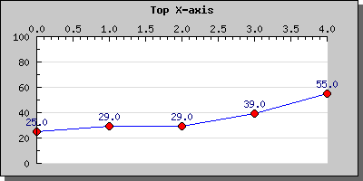
Figure 93: Example of both how to adjust the position of the X-axis as well as adjusting the side for the tick and axis title [src]
7.19.2 Scientific style axis
In scientific style plots it is often common to duplicate each axis so that all sides of the graph have a labeled axis. This is of course also fully supported by JpGraph.
Before we continue we show a small example to illustrate this feature
The example above shows the basic configuration. There are now several modifications you may do to these axis like
- Choose if the labels should be inside or outside the plot area
- Choose if the tickmarks should be inside or outside the plot area
The style of axis is determined by the method Graph::SetAxisStyle() The available type of axis are
- AXSTYLE_SIMPLE, The standard two axis graph
- AXSTYLE_BOXIN, Four axis scientific style with labels and tickmarks on the inside
- AXSTYLE_BOXOUT, Four axis scientific style with labels and tickmarks on the outside
7.19.3 Adjusting the position of the scale labels
How to adjust the actual labels are discussed elsewhere in this manual (see ???,???). However we like to mention here that you can adjust the label margin (distance between the axis and the labels) with the method Axis::SetLabelMargin()
to adjust the actual label format (like font, color, angle) you need to access the Axis::SetFont() and the Axis::SetColor() methods. If you investigate the Axis class you will discover more methods to adjust the many aspects of the axis layout.
As a final note we also mention the methods Axis::SetLabelAlign() and Axis::SetLabelAngle() This first method is really only mentioned here for completeness since it is mostly used for internal purposes. However on some occasion you might want to adjust the alignment of the labels. By default they are centered in respect to the tick mark. By using the method you might override this positioning should you choose to do so.
The second of these methods adjusts the angle of the label in regards to the axis. This is very useful for X-axis that have long labels.
7.19.4 Formatting the scale labels
In order to have full control over the way that the labels are displayed it is possible to define a callback function that will be applied to all labels. The callback function will be called with the label as the only argument and should return the value that will be displayed in the graph. This could for example be used to turn seconds (used to position data points) into hour and minutes on the scale. For further reference see the two methods: Graph::SetLabelFormatCallback(); and Graph::SetLabelFormat();
7.19.5 Inverting the Y-axis
One good way of illustrate the usefulness of label callbacks in a slightly different context is to show how we can achieve the effect of an inverted Y-scale.
An inverted Y-scale has the lowest number at the top and the scale values increases downwards.
Even though JpGraph doesn't directly support this feature it is quite easy to achieve with just a few extra lines of code in your image script.
Before we continue we give an example of what we are referring to.
Two achieve this effect there are two simple steps to take:
- Negate all you Y-value in the data
- Create a callback that negates the scale labels so they appear to be positive.
And that's it! We refer you to the code in the example above for the details.
7.20 Adjusting the auto-scaling limits - grace value
By default the auto-scaling algorithm tries to make best possible use of screen estate by making the scale as large as possible, i.e. the extreme values (min/max) will be on the top and bottom of the scale if they happen to fall on a scale-tick. So for example doing a simple line plot could look like the plot shown in the below.
However you might sometime want to add some extra to the minimum and maximum values so that there is some "air" in the graph between the end of the scale values and the extreme points in the graphs. This can be done by adding a "grace" percentage to the scale. So for example adding 10% to the y-scale in the image above is done by calling the SetGrace() method on the yscale as in
 $graph->yaxis->scale
->SetGrace(10,
10);
These lines add a minimum of 10% to the top and bottom values of the scale. Note that we say "minimum" since depending on the specific tick values choose this might be a little bit more to make the end of the scale fall on an even tick mark.
Adding this line to the previous graph will result in the following example
Since we haven't adjusted the position of the X-axis it will remain at Y=0 which might not necessary be what we would like so we therefor also add the line
 $graph->xaxis->SetPos
("min");
So that the X-axis always will remain at the lowest possible Y-value. Doing this will then result in the example below
7.21 Adding bands of pattern and color to graphs
As an additional way of emphasizing certain areas of the graph it is possible to add bands (either vertical or horizontal) to any one of the standard X-Y coordinate system based graphs. A band is a rectangular area that stretches one entire axis. This means that if you define a band between X-coordinates 3 and 5 the band area will occupy an area between the X-coordinates and the entire Y-range.
In order to access this functionality you must first make sure that you include the additional library file jpgraph_plotband.php
At the time of this writing (current as of JpGraph 1.8) the table below illustrates the 8 basic types of patterns available. We will shortly show you how you can customize these patterns, To keep these examples clear we have only used one pattern in each figure.
To add a one of these patterns to your graph you need to call the method PlotBand::PlotBand() The arguments is fairly easy to understand. The pattern you would like to use is specified by using the correct constant. You can see the name of the correct constants in the figures above. You also need to specify if the band should stretch along the vertical or horizontal axis as well as the min and max coordinates for the band. As coordinates you may also use the special values "min" and "max" which automatically sets the value to the minimum/maximum value of the scale. The specified numeric value will be automatically truncated to fit within the plot area.
We don't discuss the other arguments further here, instead we refer you to the class reference.
7.21.1 Customizing the patterns
All patterns can be customized by
- ... altering the colors of the band
- ... altering the density of the patterns using the method
PlotBand::SetDensity() The density is specified as an integer in
range 1 to 100 where a higher number means a higher density (smaller
distance between the lines). For example setting the density of the 3D
plane above to 60 gives the result
- ... enabling or disabling a frame around the pattern by using the
method
PlotBand::ShowFrame() The band will be given the same color as the
band.
- ... finally you can change whether the band should be drawn on top of the plots or beneath, (by default the bands are under the plots), using the PlotBand::SetOrder() as the following example show
 $band
->prect->SetHorizon(
$aHorizon)
assuming that the band is a 3D plane.
To finish this section we give one final, more creative, example on how to use the bands.
7.22 Adding static lines to the plot
In addition to the bands you can also add static lines to the graph. An example of that is actually shown in figure 11 above. You create a line as an instance of class PlotLine . So for example the lines
 $sline
 = new PlotLine
(HORIZONTAL,0,
"black",2);

$graph->Add(
$sline);
will add a 2-pixel wide horizontal static line at Y-position zero.
8 Working with non X,Y-plots
Non X,Y plots includes
- Pie plots (2D and 3D)
- Radar plots
- Polar plots
- Gantt charts
The fundamental difference is that these classes makes use of an extended version of the basic Graph class. Therefor you can not mix X,Y plots with non-X,Y plots. For example it is not possible to mix a line graph with a Polar graph.
- To create 2d or 3d pie plots you must use the PieGraph class
- To create radar plots you must use the RadarGraph() class
- To create radar plots you must use the PolarGraph() class
- To create gantt plots you must use the GanttGraph() class
8.1 Radar plots
Spider plots are most often used to display how a number of results compare to some set targets. They make good use of the human ability to spot symmetry (or rather un-symmetry) . the figure below show an example of a spider (sometimes called a web-plot). Spiderplots are not suitable if you want very accurate readings from the graph since, by it's nature, it can be difficult to read out very detailed values.
- There is one axis for each data point
- Each axis may have an arbitrary title which is automatically positioned
- A spider plot may be filled or open
- You can control color, weight of lines as you are already used to
- A spider plot can, as usual, have a title and a legend
- The first axis is always oriented vertical and is the only axis with labels
- Grids may be used (dashed in the figure above)
- You may have ticks (although suppressed in the figure above
- You can control the size and position within the frame of the graph
- You may have several plots within the same graph
In the following section we show how to draw both simple and complex radar graph. As we will show all the settings will follow the same pattern as for the more standard linear graphs.
8.1.1 Simple radar plots
Let's start by creating a very simple radar plot based on 5 data points using mostly default values.
As the first thing you must remember to include the extension module that contains the radar plot. "jpgraph_radar.php".
A very simple radar plot is created by the code
 <?php

include (
"../jpgraph.php");

include ("../jpgraph_radar.php");


// Some data to plot

$data =
 array(55,80,
46,71,95
);


// Create the graph and the plot

$graph =
 new RadarGraph
(250,200,
"auto");

$plot =
 new RadarPlot
($data);


// Add the plot and display the graph

$graph->Add(
$plot);

$graph->Stroke();

?>
and would give the result
To change the size and position of the radar graph is similar to the pie plot and you do it by using the methods SetSize() and SetCenter()
If you want a filled radar plot you need to specify the fill color with the method SetFillColor() The following example shows these methods in action
8.1.2 Specifying titles for the axis and legends for the plots
We normally would like something more meaningful as description of each axis than it's number. Specifying the titles are accomplished through the use of the method SetTitles() of the graph. Let's say that each axis corresponds to a month. We could then use the code
 $titles
 = $gDateLocale
->GetShortMonth
();

$graph->SetTitles(
$titles);
As you can see the way radar plot is constructed will assign the titles (and plot points) in a counter-clockwise direction. If you want them in clock-wise order you will have to inverse your input data array as well as the title array.
To specify a legend you (as with the other plot) make use of the SetLegend(); method on each radar plot.
8.1.3 Adding grid line to the radar plot
Each major tick mark can also be connected together to create a grid. The grid is accessed through the 'grid' property of the graph. To enable the grid and set the line style to "dotted" you would have to add the lines
 $graph->grid->Show
();

$graph->grid->
SetLineStyle(
"dotted");
and would result in the following graph
By design the plot is above the grid line but beneath the axis in image depth, hence some part of the grid lines are hidden.
To have the grid lines more "visible" just change their color, say to, dark red by invoking the SetColor() method on the grid lines which would give the following result
Another simple change we could do would be to just change the background color of the radar graph. This is (not surprisingly) done by a call to the method SetColor() invoked on the graph object.
8.1.4 Adding several plots to the same radar graph
You can easily create several radar plot which are added to the same radar graph. The thing to remember is that if you use filled radar plots and they overlap each other that the order which they are added will be the order they are drawn.
A simple example of this is shown below
8.1.5 Adding plotmarks i radar graphs
In exactly the same way as for line graphs it is possible to add plot marks in radar plots. The mark property is accessed through the RadarPlot::mark The example below adds a red ball as a marker.
8.2 Pie plots
So far we have just show plots based on an X-Y coordinate system. This is not the only types of graphs you can create with JpGraph. Another common type is Pie plots. JpGraph supports both 2D and 3D pie plots. For 2D pie plots there are also 2 versions, but more on that later.
The main difference as compared to the X-Y plots is that to all pie plots are added to the PieGraph() instead of the Graph() object we used for the X-Y graphs we have drawn so far. For this you must first include the "jpgraph_pie.php" in your script (or "jpgraph_pie3d.php" if you want to use 3-dimensional pies).
Below you cane see the code needed to create the simplest possible pie graph just using the default settings.
 include (
"../jpgraph.php");

include ("../jpgraph_pie.php");


$data =
 array(40,60,
21,33);


$graph =
 new PieGraph(300,
200);

$graph->SetShadow();


$graph->title->
Set("A simple
 Pie plot");


$p1 =
 new PiePlot($data);

$graph->Add(
$p1);

$graph->Stroke();
The above code would give the following pie graph
There is a few things worth noting here
- By default all pie slices have the percentage shown just outside the slice.
- The colors are automatically assigned to the slices.
- The pie have the edges marked by default
- The first slice start at 0 degrees (3 o'clock)
You can change almost all aspects of appearance of the pie graphs. For example you could change :
- Change the angle for the first slice, ( PiePlot::SetStartAngle())
- Remove the border lines around the pie ( PiePlot::ShowBorder())
- Change the color of the border ( PiePlot::SetColor(),
- Change the colors of the slices ( PiePlot::SetSliceCOlors())
- Change the size and position of the pie ( PiePlot::SetSize(), PiePlot::SetCenter())
- Adjust the labels for the slice (color, font, format, position ) by accessing the value property of pie plots, for example ( PiePlot::value::SetFont(), You can read more about label formatting and how to change what is displayed as a value further down in this chapter.
The next simplest addition we can do is to add a legend to the pie graph. We do this by using the SetLegends(); method. By adding the legends to the previous example we get the following image
(In the figure above we also moved the center of the pie slightly to the left to make more room for the legend box.)
The text for the legends can also contain printf() style format strings to format a number. This number passed on into this string is either the absolute value of the slice or the percentage value. How to switch between the is describe further down in this chapter.
The next change you might want to change is the size and position of the Pie plot. You can change the size with a call to SetSize(); and the position of the center of the pie plot with a call to SetCenter(); The size can be specified as either an absolute size in pixels or as a fraction of width/height (whatever is the smallest). The position of the pie plot is specified as a fraction of the width and height.
To put the size and positioning API to use we will show how to put several pie plots on the same pie graph. In the following example we have also adjusted the legends of the slice values to use a smaller font.
What we do in this example is quite simple, create 4 pie plots, make them smaller and put them in the four corner of the graph. This will give the result as shown in the following example.
8.2.1 Adding guide lines to Pie Plots
For very busy Pie plots it can become too little space for the labels to be printed just beside the pie slice. For this purpose it is possible to use guide lines for the labels. The library will then draw a line from the center edge of the slices to the label which will be positioned further out from the Pie Plot.
There is one method that is primarily used to handle this, PiePlot::SetGuideLines() the simplest usage of this would be
 $pieplot
->SetGuideLines
();
An example of this could then be
The above example will give guide lines very similar as what is produced by other programs, e.g. Excel. In addition to the above variant it is also possible to instruct the library to line up the labels vertically in a way that we think is easier to read. This is achieved by specifying the second parameter to the SetGuideLines() to 'false' as in
 $pieplot->
SetGuideLines(
true,false);
The first parameter is to enable/disable the guide-lines. With the same example as above this would then produce the image
It is also possible to configure the vertical distance between the labels. By default the distance between the labels is roughly 40% of the labels font height. By using the method PiePlot::SetGuideLinesAdjust() it is possible to specify a fractional value which is interpretated as the distance between the bottom of one label to the bottom of the next. This means that specifying a value of '1.0' the labels will have no space between them and the bottom of one label will touch the top of another label. By default this value is 1.4.
By increasing or decreasing this value it is possible to make the labels become positioned more or less compact. Below we have taken the above example and reduced the distance to '1.1' and as can be seen this yields much more compact labeling.
Note: As of 1.18 guide lines is only available in 2D Pie plots and not available for 3D Pie plots. This is planned for the 1.19 version.
8.2.2 Creating 3D pie plots
So far we have only made use of 2D pie plots, creating 3D pie plots is no more difficult. Instead of creating the plots with a call to PiePlot() you create the plots with a call to PiePlot3D() If we just take the first simple pie plot and replace the call to PiePlot() with a call to PiePlot3D() we get the following result.
3D Pie plots have the same possibilities as the normal pie plots with the added twist of a 3:rd dimension. You can adjust the perspective angle with the method SetAngle() So for example to make the pie more "flat" you just set it to a smaller angle. Setting the perspective angle to 20 degrees in the previous example will give the following result.
8.2.3 Exploding pie slices
One way to attract attention to some specific piece of information in a pie chart is to "explode" one or more slices. Both 2D and 3D pies support exploding one or several slices.
Exploding slices is accomplished by the methods Explode() and ExplodeSlice() The first method is used if you want to explode more than one slices and the second is a shorthand to make it easy to just explode one slice.
For example to explode one slice the default "explode" radius you would just have to say
 $pieplot->ExplodeSlice(
1)
The above line would explode the second slice (slices are numbered from 0 and upwards) the default amount. Doing this to the two previous example would result in
To explode all slices at once you can use the PiePlot::ExplodeAll() method. If you want to explode several slices you can use the PiePlot::Explode() method and supply a suitable array argument.
8.2.4 Specifying and adjusting labels on pie plots
By default the values shown just outside the pie for each slice are the percentage value for each slice. If you instead wanted the absolute value you would just have to use the SetLabelType() method. So to use the absolute value you would call
 $pieplot->
SetLabelType(
"PIE_VALUE_ABS");
Furthermore you could enhance the formatting of the value by either using a printf() style format string (using SetFormat() ) or by providing a formatting function callback (using SetFormatCallback() ) for doing more advanced formatting.
You can also adjust the position of the labels by means of the PiePlot::SetLabelPos() method. The argument to this method is either the fraction of the radius or the string 'auto'. In the latter case JpGraph automatically determines the best position and the the first case The following example illustrates this
If this formatting is not enough you can also "manually" specify the labels for each slice individually. You do this by using the PiePLot::SetLabels() method. This will let you specify individual text strings for each label. In each specification you can also add a printf() formatting specification for a number. The number passed on will be either the absolute value for the slice or the percentage value depending on what was specified in the call to SetLabelType()
The SetLabels() method can also take a second parameter, the label position parameter. This is just a shortcut to the SetLabelPos() as described above. By default the position will be set to 'auto' if not explicitely specified.
8.2.5 Specifying slice colors and using themes
Another typical change would be to change the colors of the slices. There are two fundamental ways of doing this. You either manually specify the colors for the slices as an array using the method SetSliceColors() If you specify fewer colors than the number of slices they will just wrap around.
Another way is to use one of the pre-defined color "themes". This is just a predefined set of colors that will be used for the slices. You choose what "theme" you like to use with the method ( SetTheme() ) At the time of this writing the available themes are
- "earth"
- "pastel"
- "sand"
- "water"
The following example shows the same pie using the different "themes" in order.
A complete color chart of all available colors in the different themes can be found here
Another simple change is to remove the border ( or change it's colors ) that separates each slice. This can be done by a call to ShowBorder()
8.2.6 Adding drop shadows to the slices
An additional visual enhancements can be made by adding a drop shadow to the individual slices. This is accomplished by means of the PiePlot::SetShadow() method. Adding a drop shadow is often more affective if the pie has one or more slices exploded as the following example shows
8.2.7 Another variant of 2D Pie plots
As mentioned in the beginning there are two versions of the 2D pie plots. The normal pie plot created as an instance of class PiePlot and a variant created as an instance of class PiePlotC
This variant is an extension of the standard PiePlot in the sense that it also have a filled circle in the center. The following example illustrates this
Since the PiePlotC is an extension to the basic pie plot all the normal formatting you can do for pie plots you can also do for the PiePlotC .
The additional formatting only concerns the filled middle circle. You have the option of adjusting size, fill color and all font properties. You perform these operations with the methods
| PiePlotC::SetMidColor() | Set fill color of mid circle |
| PiePlotC::SetMidSize() | Set size (fraction of radius) |
| PiePlotC::SetMidTitle() | Set title string (may be multi-lined) |
| PiePlotC::SetMid() | Set all parameters in a single method call |
In addition to the normal CSIM for PiePlot:s the center area is also a CSIM hotspot. You specify the target CSIM with a call to PiePlotC::SetMidCSIM()
The next example shows an example with some more innovative formatting. In this example we have :
- hidden the frame around the pie graph
- exploded all the slices
- added drop shadow to the individual slices (and the center filled circle)
- specified individual multi line labels.
- changed the font for the title to a TTF font.
8.3 Polar plots
8.3.1 Overview
Each data point in a polar plot is represented by a tuple consisting of a radius and an angle. The polar plot itself can be either outlined or filled. In addition each point may have a standard marker (the same as for line and scatter plots).
The scale for the radius can be either linear or logarithmic.
A polar graph is created by creating an instance of PolarGraph::PolarGraph(). The polar graph type inherits all the capabilities of ordinary X-Y graphs, i.e they can have background images, background gradients, tabbed titles and so on.
Polar graphs comes in two basic types, they can either show a full 360 degree graph or a half 180 degree graph. The two examples below show these two basic types of graphs.
8.3.2 Adjusting the radius scale
The radius axis can be shown in either a linear or logarithmic scale. This is controlled, as usual, by a call to PolarGraph::SetScale() The two examples below show the same plot in either linear or logarithmic scale
Please note that the maximum values of the scales are different.
By default the scale will be auto scaled depending on the data. You can also specify a manual scale by supplying an extra argument to the SetScale() value. The only difference from the manual scaling with the other X-Y-graphs is that for polar graph you only specify a manual maximum. The minimum will always be 0 for the linear scale and a scaled value of 10 (i.e 1, 0.1, 0.001 and so on) for the logarithmic scale.
The plot is clipped to the plot area so if you specify a smaller scale then the maximum value that part of the plot that are outside the plot area will be clipped.
8.3.3 Adjusting the grid lines
As usual you have full freedom to select what grid lines you like to show (and what colors they should have). There are three different types of grid lines you may adjust. The radius minor and major grid lines and the angle grid lines.
You select what grid lines to show with a call to PolarAxis::ShowGrid() The two example below shows a logarithmic plot with either just major grid lines or both minor and major grid lines.
The colors of the grid lines are specified with a call to PolarAxis::SetGridColor()
For the angle grid lines it is possible to specify the angle division between each grid line with the method PolarAxis::SetAngleStep() You specify the step distance in degrees. By default the step size is 15 degrees.
8.3.4 Adjusting the label fonts
You can individually specify different fonts and colors for the angle and the radius labels. The radius font is specified with PolarAxis::SetFont() and the angle font is specified with a call to PolarAxis::SetAngleFont()
You can adjust the color with the method PolarAxis::SetColor() ?>
The following example specifies different color for the labels. it also shows that you can add both a radial axis title as well as a tabbed title. In this example we have also chosen not to show the frame around the edge of the plot.
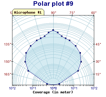
Figure 141: Different colors for labels, specifying both a tabbed title as well as a axis title [src]
8.3.5 Adjusting the labels
As can be seen from the previous examples the angle labels have a small superscripted "o" after each label. You can select if you like to show this degree mark or not with a call to the PolarAxis::SetANgleDegreeMark() method by which you can enable or disable that mark after the angels.
For the radius labels all standard formatting that can be done to the X-Y axis such as format string or format callbacks are supported.
A common modification for polar plots is probably to disable the display the last label when using a 360 degree plot since the last label will "collide" with the plot box around the plot area. It is possible to disable the last label with a call to Axis::HideLastTickLabel() As you can see this has been used in some of the examples in this chapter.
8.3.6 Image maps
If you have specified markers for the polar plot (by setting the mark property of the plot) each marker can be a hot spot in a client side image map. The target URL are as usual specified with the SetCSIMTargets() as the following short code excerpt shows
 // Start by specifying the proper URL targets

$targets
 = array("#1","#2", ....... );

$polarplot
 = new PoalrPlot
($data);

$polarplot
->mark->SetType(
MARK_SQUARE);

$polarplot
->SetCSIMTargets
(targets);

$graph->Add(
$polarplot);

$graph->StrokeCSIM();
8.3.7 A final example
As a final example we show a full 360 degree polar plot with square markers as well as background color gradient and a legend for the plot.
9 Gantt charts
9.1 Why use Gantt charts?
The cynical view: To explain why your project is over-due and over-budget.
The pragmatic view: To keep management of our back and know what we have forgotten
The common view: As a tool to help identify project issues and highlight problem areas.
Basically, Gantt charts are used to show the state of a number of activities (possible grouped) against time.
9.2 Capabilities in JpGraph Gantt module
- Both automatic and manual scaling of date
- Full support for independent CSIM for both labels and activity bars
- Extremely flexible scales, possibility to use both months, weeks, days, hours and minutes as scales. Furthermore (unlike MS Project) you can have as may scales displayed at the same time as you like.
- Support for visualization of grouped activities
- Gantt charts can be automatically sized according to the number of bars and scale used. This means you don't have to supply a specific size when creating a graph.
- Unlimited number of activities
- Supports platform independent Week number calculation according to ISO:8601
- Rich possibility to display a variety of scales or combination of scales supports both day, week, month, year. Each scale header is totally configurable in terms of font, size, color, background etc
- User configurable date format in the scale headlines
- Visualization of constrains between activities, start-to-start, start-to-end, end-to-start and end-to-end
- Scales have "intelligent" grids
- Supports title and subtitle with user specified font, size and color
- Activity bars can have multiple patterns and colors
- Activity bar may have shadows
- Activity bars can have internal progress bars displayed to show how much of a given task has been accomplished
- Activity titles can have individual fonts, colors and backgrounds
- Activity bars can have captions
- Activity bars can have specified left- and right end markers
- Bar heights can be specified in absolute pixels or in percent of the activity line width
- Supports milestones with many different marks
- Supports vertical marker lines with text
- Can easily be localized
- Full support for CSIM (or drill down graphs)
- Alternate row colors
- ... and more
9.3 A simple Gantt chart
Time to show you an example of a Gantt chart and how easy it is to make one. Lets make it the simplest possible Gantt chart. One activity, named "Project", which lasts from "2001-11-01" to "2002-02-20".
All it takes to do this (using default values for everything) is the following code.
 <?php

include (
"../jpgraph.php");

include ("../jpgraph_gantt.php");


// A new graph with automatic size

$graph =
 new GanttGraph
(0,0,
"auto");


//  A new activity on row '0'

$activity
 = new GanttBar
(0,"Project",
"2001-12-21",
"2002-01-20");

$graph->Add(
$activity);


// Display the Gantt chart

$graph->Stroke();

?>
The resulting image is shown in Figure below.
Let's note a few things with the above image and code:
- You always need to include both jpgraph.php and jpgraph_gantt.php
- A bar is specified a minimum of four parameters, vertical position (more about that in a second), a title, start and end date.
- If you don't specify a size for the image it will be automatically decided based on the min and max dates for the bars rounded to a full week.
- By default the week and day scale are displayed.
- Weekend background are displayed default in a slightly gray color
- Sundays are written in red.
- Weeks are numbered according to ISO 8601
- Activity bars are rendered as blue stripes on a white background by default.
So, lets start making this graph a little bit more interesting. First we are going to add a title, then we will add a month scale and finally we will change the color of the bar.
All that is taken care of in the code below.
 <?php

include (
"../jpgraph.php");

include ("../jpgraph_gantt.php");


$graph =
 new GanttGraph
(0,0,
"auto");

$graph->SetShadow();


// Add title and subtitle

$graph->title->
Set("A nice
 main title");

$graph->title->
SetFont(
FF_ARIAL,
FS_BOLD,12);

$graph->subtitle->
Set("(Draft
 version)");


// Show day, week and month scale

$graph->ShowHeaders(
GANTT_HDAY |
 GANTT_HWEEK |
 GANTT_HMONTH);


// Instead of week number show the
 date for the first day in the week

// on the week scale

$graph->scale->
week->SetStyle(WEEKSTYLE_FIRSTDAY);


// Make the week scale font smaller
 than the default

$graph->scale->
week->SetFont(FF_FONT0
);


// Use the short name of the month
 together with a 2 digit year

// on the month scale

$graph->scale->
month->
SetStyle(
MONTHSTYLE_SHORTNAMEYEAR2);


// Format the bar for the first
 activity

// ($row,$title,$startdate,$enddate)

$activity
 = new GanttBar
(0,"Project",
"2001-12-21",
"2002-01-20");


// Yellow diagonal line pattern on a
 red background

$activity
->SetPattern(BAND_RDIAG,
"yellow");

$activity
->SetFillColor
("red");


// Finally add the bar to the graph

$graph->Add(
$activity);


// ... and display it

$graph->Stroke();

?>
From the above example you might note a few things
- The margins adjust automatically to the added title and subtitle
- The height of the scale headers adjust automatically when you change the font.
- You have great flexibility in choosing what format the scale labels will have. If you for example wanted the full 4 digit year in the month header all you have to change is use the constant MONTHSTYLE_SHORTNAMEYEAR2 in the code above to MONTHSTYLE_SHORTNAMEYEAR4
- You have full freedom of manipulating headers in terms of font, color, background and size.
To show that this is really simple let's show the full year in the month, and set the header style to be white text on a dark blue background by adding the lines
 // Use the short
 name of the month together with a 4 digit year

// on the month scale

$graph->scale->
month->
SetStyle(
MONTHSTYLE_SHORTNAMEYEAR4);

$graph->scale->
month->
SetTextColor(
"white");

$graph->scale->
month->
SetBackgroundColor(
"blue");
to the code above. The resulting image is shown in Figure 145
9.4 The structure of a Gantt chart
A Gantt chart is made up of four distinct areas.
- On the left side there is the activity title column.
- On the top there is the scale headers (up to four headers may be displayed)
- The actual plot area where all the Gantt bars and markers go
- The margin area, where for example the titles are shown
Since a Gantt chart inherits all the usual properties of a JpGraph Graph() you have the access to the same method to formatting the image as before. For example to have a shadow around the image you call Graph::SetShadow() and to set the margin color you can use Graph::SetMarginColor(). Please refer to the reference documentation for a full list of supported features.
To create a Gantt chart you add objects to it. As of this writing you may add the following object by the use of the GanttChart::Add() method
- Gantt bars (indicates the length of an activity)
- Milestones, a single mark at a specific date
- Vertical line, might be use to mark phases in projects
All these objects may be extensively modified in terms of formatting. You can specify color (both fill- and frame color), size, titles, style and patterns and so on. All these objects comes with (in my mind) sensible default so you don't have to specify a lot of parameters. But if you need a fine grain control or if you disagree with my taste you can.
9.5 Creating a GanttChart
You create a new Gantt Chart with a call to GanttChart(). The signature for GanttGraph is the same as for ordinary JpGraph graphs, i.e
 function
 GanttGraph(
$aWidth,
$aHeight,
$aCachedName,
$aTimeOut,
$aInline)
The only real difference is that for GanttCharts you can specify one or both of the dimension parameters (width and height) as -1 in which case that dimension will be automatically sized determined by scale and fonts chosen. The following examples shows some possible ways of creating a new graph
- $graph=new GanttGraph()
The size of the graph will be determined automatically, no caching will be used and the graph will be generated in-line. - $graph=new GanttGraph(-1,-1,"auto")
The size of the graph will be determined automatically, caching will be used (the name will be based on the script name), no timeout will be used and the graph will be generated in-line - $graph=new GanttGraph(450,-1,"auto",5)
Same as the previous entry but the width is fixed to 450 points and the cached image will have a timeout of 5 min. - $graph=new GanttGraph(-1,-1,"auto",5,false)
The image will not be generated in-line, only the cache will be updated if it has timed out, otherwise nothing will happen.
Since GanttGraph() inherits all the methods (that make sense for GanttGraph) from Graph you can specify shadow, color etc of the general frame.
9.6 Positioning objects in the Gantt plot
Bars and Milestones need both a vertical position and a horizontal position. The horizontal start position is specified as a date, e.g. "2001-06-23", and the vertical positions are specified as a number [0,1,2,3,...]. This vertical number indicates the position from the top where the object should be placed. To understand this you might imagine a number of "invisible" horizontal bands with a certain height. If you specify 0 as the vertical position the bar will be placed in the first band, specify 3 and the bar will be placed in the fourth band and so on.
It is perfectly legal, and perhaps even desirable to leave "gaps" when laying out bands to group related activities. So, for example you could have three activities/bars at positions 1,2,3 and then another 2 bars at position 6,7 leaving band 0,4,5 empty.
All these "invisible bands" have the same height (equ-spaced). The height of each band is automatically determined and depends on both the method of layout ( as specified by (GanttChart::SetLayout()) and the individual heights of the individual bars and titles. The rules are quite simple:
- If you use layout=GANTT_FROMTOP (the default and most common) the height will equal the height (+ a margin) of the highest gantt bar. The height calculation of each bar takes into account both the actual bar, the title, and any left- right-marks (more about that later) that may be present. The name "fromtop" refers to that when you have explicitly specified a height the bars will usually be added from band 0 and onwards and hence being added from the top. (This might leave empty space at the bottom of the plot area in the graph if the height of the graph has been explicitly specified).
- If you use layout=GANTT_EVEN the bars are evenly (hence the name) spread out over the available height in the gantt chart and no consideration is taken of the individual bars heights. Note that if you use automatic sizing you cant use even layout. It just doesn't make sense. Even layout is for those cases when you deliberately specify a very large image and want the bars evenly distributed using the full height.
9.7 Gantt bars
The most common of all object in a Gantt chart is of course the activity bar (GanttBar()). In terms of formatting this object has a very large flexibility. The full signature for the GanttBar constructor is
 function
 GanttBar(
$aVPos,$aTitle,$aStart
,$aEnd,$aCaption,
$aHeight)
$aVPos | The vertical position for the bar, [0..n] | |
$aTitle | Title for the activity | |
$aStart | Start date for the activity given as string, e.g "2001-09-22" | |
$aEnd | End date for activity given as either a date (a string) or as the duration (in days) of the activity, e.g both "2001-10-15" and 20.5 are valid inputs | |
$aCaption | Text string (caption) to appear at the end (right side) of the bar | |
$aHeight | Height of bar given as either a value in range [0,1] in which case this is interpretated as what fraction of the vertical position should the bar occupy. The height can also be given in absolute pixels [1..200] |
9.7.1 Specifying vertical position
As described above vertical positions are specified as a numeric value [0..n] where 'n' is an arbitrary constant. (For practical purposes n is most likely < 100)
Using our previous example we will illustrate this parameter by changing the position of our 'Project' activity to position 7. Therefor we change the call to GanttBar() to
 $activity = new GanttBar(
7,"Project","2001-12-21"
,"2002-02-20"
);
and we then get the chart as shown below in Figure 146.
Note that the height of each position (vertical position) will depend on the actual height of the bar.
9.7.2 Specifying start and end position for a bar
Start of bars are given as a date string. The format depends on the current locale. Examples of valid date strings are
- "2001-10-22"
- "22 October 2001"
- "22 Oct 2001"
Even if several format are supported it is recommended to use all numeric dates, i.e in the form "2001-10-22".
Specifying the end position may be done in two different ways, either by the end date in the same way as for the start date. The other way is to specify the length of the activity in number of days (and fractions thereof). Examples of valid end dates are:
- "2001-11-15"
- "15 Nov 2001"
- 22, (specifies duration of 22 days)
- 22.7, (specifies duration of 22.7 days)
Please note that duration is specified as numerical values and not strings.
9.7.3 Milestones
Milestones are similar to bars but have no end date since milestones just apply to one single date. Milestones are created much the same way as activities but using method MileStone() instead.
The full signature for milestones are
 function MileStone
($aVPos,$aTitle,
$aDate,
$aCaption)
$aVPos | The vertical position for the bar, [0..n] | |
$aTitle | Title for the activity | |
$aDate | Date for the milestone | |
$aCaption | Text to the right of the milestone |
Valid milestones are for example
 $milestone = new
 MileStone(3,"Code complete","2001-12-01"
);
$milestone = new MileStone(3,"Code complete","2001-12-01" ,"(2001-12-01)" );
By default milestones are rendered as a filled "Diamond" shape. This may be optionally modified. The actual shape is specified by the 'mark' property of milestone which is an instance of the PlotMark() class (same class responsible for the marks in line graphs).
To change the shape of a milestone to, say a triangle, you use the SetType() method as in
 $milestone->mark->
SetType(
MARK_DTRIANGLE)
Let's put this into practice and add a milestone to our previous example by adding the following two lines of code which result in Figure 147 shown below.
You may note that by default the title color is red for milestones. If you like to change this to be instead, say bold black, you would invoke the SetColor() and SetFont() methods on the title property of milestones as in
 $milestone->
title->SetFont(FF_FONT1
,FF_BOLD);

$milestone
->title->SetColor(
"black");
and thew result would now (not surprisingly be)
To modify the caption you do exactly the same but act on property 'caption' instead of 'title', i.e.
 $milestone->caption->
SetFont(
FF_FONT1,
FF_BOLD);

$milestone
->caption->SetColor(
"black");
It is worth noting that you modify the bar title and caption the exact same way by acting on the 'title' and 'caption' property for the bars.
9.7.4 Vertical line
The final object you may add to a Gantt chart is simple, but quite useful, a straight vertical line extending over the whole plot height. This could for example be used to illustrate different phases in a project. You create a line object by a call to GanttVLine()
The full signature for GanttVLine() is
 function GanttVLine
($aDate,$aTitle,
$aColor,
$aWeight,
$aStyle)
$aDate | Date for the milestone | |
$aTitle | Title for the line. The title is displayed at the bottom of the line | |
$aColor | Color for the line | |
$aWeight | Line width | |
$aStyle | Line style,"dashed", "dotted" and so on |
Valid creations of lines are for example
 $vline = new
 GanttVLine(
"2001-12-24");
$vline = new GanttVLine( "2001-12-24", "Phase 1");$vline = new GanttVLine( "2001-12-24", "Phase 1", "darkred");$vline = new GanttVLine( "2001-12-24", "Phase 1", "darkred",5);$vline = new GanttVLine( "2001-12-24", "Phase 1", "darkred",5,"dotted" );
To add the line to the graph you just have to call GanttGraph::Add() as with milestones and bars. Let's illustrate the use of vertical lines by adding a line to the previous example.
 $vline
 = new GanttVLine
("2001-12-24","Phase 1");

$graph->Add(
$vline);
and the example (See 149) now becomes
From the above figure you can see that by default the line is drawn at the beginning of the day of the specified date and in a 'dashed' style. This can (of course!) be modified so that the line is drawn/aligned anywhere in the specified day. You modify this by invoking the method SetDayOffset() with an argument specifying the fraction of the day where you want the line positioned.
If you, for example, want to display the line in the middle of the day just add the line
 $vline->
SetDayOffset(
0.5);
to the previous code and the result will be
As usual you may modify the font, size and color by invoking the appropriate method (SetFont(), SetColor()) on the 'title' property of lines.
9.7.5 Adding markers to a gantt bar
You can easily add a variety of markers both to the start and end of the gantt bar. They could for example be used as an alternate way to illustrate important milestones or anticipated deliveries.
The left and right markers are accessed through the two properties 'leftMark' and 'rightMark'. They are both instances of the general 'PlotMark' class which is also used for the milestones (and in line graphs). The 'PlotMark' class supports several different styles, for example, diamond (the default for milestones), filled and unfilled circles, squares, stares, and so on. Please refer to the reference section for a complete listing.
Let's illustrate this by adding a right marker to the previous example. We will use a style of a filled (red) circle with a white title, say, "M5". In order to accomplish this we must augment the previous example with the following lines:
 $activity
->rightMark->Show();

$activity
->rightMark->title->
Set("M5");

$activity
->rightMark->SetType(
MARK_FILLEDCIRCLE);

$activity
->rightMark->SetWidth(
10);

$activity
->rightMark->SetColor(
"red");

$activity
->rightMark->SetFillColor(
"red");

$activity
->rightMark->title->
SetFont(
FF_ARIAL,
FS_BOLD,12);

$activity
->rightMark->title->
SetColor(
"white");
This might seem like a lot of lines but this is as complicated as it possible can get. As an illustration in the example belwo more or less everything that is changeable has been changed, the default font, font-color, fill-color, frame-color and width of marker. The two lines only really necessary are the first two, showing the mark and setting a title. One could still get a good result by using default values for the rest of the properties.
The resulting image can be seen in Figure 151 below.
We have deliberately introduced a "strangeness" here. If the previous two examples are compared it can bee seen that the last example is larger than the previous one. Why?
The explanation is trivial once we recall that the height of bars are sized relative to the horizontal spacing. The horizontal spacing are based on the highest single bar including title size and, here come the explanation, marker size. The horizontal spacing has grown since the minimum height is now based on 10 points(=the height of the mark). The bar still occupy the same percentage of the height so it seems to have grown.
If this behavior is unwanted it is always possible to specify an absolute size for the bar heigh, say 8 pixels, with a call
 $activity
->SetHeight(8);
and achieve the result in Figure 152 below.
It is worth noting that the height reserved for each bar is still the same since we haven't changed the height of the marker and the reserved space is the maximum height used by any bar.
9.7.6 Adjusting the minimum distance between bars
Let's see what happens if we set the height of each bar to be 100% of the reserved height by adding another activity/bar below the first one and set the height of each bar to 100% by adding the lines (We omit the added lines to add another bar since they are just a copy of the first bar)
 $activity->
SetHeight(1.0);

$activity2
->SetHeight(1.0);
to the previous example. (Note that a value in the range [0..1] is interpretated as the fraction of the reserved height while a value > 1 is interpretated as the absolute size in pixels.)
Aha.. What we are trying to do doesn't really make sense. Since we have specified that the bar will always occupy 100% of the available reserved with there will be no distance between the bars. So what if we specify the bar as 10 pixel absolute by changing the lines to
 $activity
->SetHeight(10);

$activity2
->SetHeight(10);
we instead get
So what can we actually do? Well if you remember the reserved height for each bar is the maximum height of all bars including titles. This guarantees that no two bars will ever overlap. To guarantee that titles don't end up too close together there is a Vertical Label Margin which basically specifies some extra "air" in between the titles. The amount of air is specified in percent of the title height. To set the margin you use
 GanttGraph::
SetLabelVMarginFactor(
$aMargin)
As an example let's set that margin in the previous example to 0 and see what happens.
As you would perhaps expect the two bars just barely touches now since there are no extra margin added. If the two bars hadn't had the extra right marker it would have looked very compressed.
By default the vertical margin is set to 40%.
9.8 Formatting the scale headers
The scale headers allow you to view up to four different scales at the same time. The four basic scales are:
- Day scale
- Week scale
- Month scale
- Year scale
You can choose what scale to include and exclude by using the SetScale() method. For example, for a detailed gantt you might choose to display days and weeks by specifying
 $graph
->ShowHeaders( GANTT_HWEEK |
 GANTT_DAY );
If you instead wanted "the big picture" it might be enough to show year and months by specifying
 $graph->
ShowHeaders(
 GANTT_YEAR |
 GANTT_MONTH );
You can choose freely the combination of scales that you want, but a chart must at least have one scale of course.
Once you have decided what level of details you need you can then fine tune the exact layout/formatting of each of the enabled scales as described below.
These scale header are all accessed through the graph instance variables 'scale' as in
 $graph->
scale->week
or
$graph->scale->day. All these headers share the following properties.
Show()Determine if the scale should be shown or not
SetFont()Font for text in header
SetFontColor()Specify the color of the header text
SetStyle()Specify what date format should be used, for example in the week scale it is possible to show either week number, the start date of the week and so on.
SetBackgroundColor()As it says, the background color for the header
SetFrameWeight()The line weight of the box around the scale
SetFrameColor()The line color for the frame
SetTitleVertMargin()The margin, in percent, below and above the title text
In addition to these methods each scale also has the property 'grid' which determines the appearance of grid lines for that specific scale. You may modify the appearance of grid lines by the "normal" line methods, i.e. SetColor(),SetWeight() SetStyle() and Show(). So for example to set the week grid line red you would use
 $graph
->scale->week->
grid->SetColor("red"
);
Each of the scales also have some specific formatting possibilities as described below.
9.8.1 Minute scale
Minute scale is the lowest resolution you can use. It is often convenient to use Minute scale with "GanttScale::SetINtervall()" since by default the increment will be 1 minute. The style of minute scale can be further adjusted by the use style parameters which can be one of
- "MINUTESTYLE_MM", This will display minutes as a two digit number with a leading zero if necessary
- "MINUTESTYLE_CUSTOM", This will let you specify you own custom minute style by making a call to HeaderProperty:: SetFormatString()
Minute scale is enabled by adding the GANTT_HMIN in the GanttGraph::ShowHeaders() call. For example as in
 $graph
->ShowHeaders(GANTT_HDAY |
 GANTT_HHOUR |
 GANTT_HMIN);
The code snippet below shows how to set up a minute scale with 30 min interval and some custom colors.
 $graph->
scale->minute->SetIntervall
(30);

$graph->scale->
minute->
SetBackgroundColor(
'lightyellow:1.5');

$graph->scale->
minute->
SetFont(
FF_FONT0);

$graph->scale->
minute->
SetStyle(
MINUTESTYLE_MM);

$graph->scale->
minute->grid->SetColor
('lightgray');
9.8.2 Hour scale
The hour scale has more builtin formatting possibilities. The following formatting options are available
- "HOURSTYLE_HM24", Will display the only the hour in military time 0-24 , for example 13:00
- "HOURSTYLE_H24", Will display the hour with both hour and minute in military time 0-24, for example 13
- "HOURSTYLE_HMAMPM", Will display the hour and minutes with a suitable am/pm postfix, for example 1:30pm
- "HOURSTYLE_HAMPM", Will display only the hour with a suitable am/pm postfix, for example 1pm
- "HOURSTYLE_CUSTOM", Custom defined format as specified with a call to HeaderProperty::SetFormatString()
For hours it is possible to specify the interval in either of two ways. With an integer, e.g. 6, or as time interval, e.g. "1:30" which makes the interval one and a half hour. The only restriction is that the interval must be even dividable for 24 hours since one day is the smallest possible interval to show. This means that it is allowed to use, for example 2,4,6,"1:30" or "0:45" as intervals but not 7, "2:45".
The code snippet below shows hot to set up a hour scale to with 45 minutes interval and some custom colors
 $graph
->scale->hour->
SetBackgroundColor(
'lightyellow:1.5');

$graph->scale->
hour->SetFont(FF_FONT1
);

$graph->scale->
hour->SetStyle(HOURSTYLE_HMAMPM);

$graph->scale->
hour->
SetIntervall(
"0:45");
The example below shows a gantt chart with the day and hour scale enabled
9.8.3 Day scale
Days are shown as "one letter boxes". The extra formatting possibilities you have for days is the possibility to specify a different color for the weekend background and for the Sunday.
SetWeekendColor()Set the background color for weekends. (Defaults to light gray)
SetSundayFontColor()The Sunday font color. (Defaults to red)
In addition to this there is also a possibility to choose whether or not the weekend background should be extended vertically down over the plot area. By default it is. Since that is a property more of the whole plot you modify this behavior with a call to the method
UseWeekendBackground()of the scale, e.g.
 $graph->scale->UseWeekendBackground(false
);
9.8.4 Week scale
Week scales, if enabled, by default shows the week number in range 1 to 53 (as defined by ISO-8601, see the reference section).
It might be worth pointing out here that the week number calculation is carried out within JpGraph and does not rely on the underlying OS date libraries. This makes the behavior consistent over several OS:s (at least M$ Windows does not comply to ISO-8601 or supply any way of doing this through the normal libraries, e.g. strftime())
You may modify the week behavior in three ways. You can specify (with SetStyle()) a different date format using the constants
WEEKSTYLE_WNBRShow week number To further modify the formatting of the actual week number you can optionally supply a format string with a call to
SetLabelFormatString()The format of the string should be a standard sprintf() syntax expecting an integer (the week number). By default a 'W' is prefixed to the number.
WEEKSTYLE_FIRSTDAYShow date of first day in week.
9.8.5 Month scale
For month scale you can use the SetStyle() method to choose between a variety of formats.
MONTHSTYLE_SHORTNAMEDisplay the month name in its locale specific short form, i.e Jan, Feb etc
MONTHSTYLE_SHORTNAMEYEAR2Display the month name in its locale specific short form together with a 2 digit year , i.e Jan '01, Feb '01 etc
MONTHSTYLE_SHORTNAMEYEAR4Display the month name in its locale specific short form together with a 4 digit year , i.e Jan 2001, Feb 2001 etc
MONTHSTYLE_LONGNAMEDisplay the month name in its locale specific long name, i.e. January, February
MONTHSTYLE_LONGNAMEYEAR2Display the month name in its locale specific long name together with a 2 digit year , i.e January '01, February '01 etc
MONTHSTYLE_LONGNAMEYEAR4Display the month name in its locale specific long name together with a 4 digit year , i.e January 2001, February 2001 etc
9.8.6 Year scale
Year scale has no extra formatting possibilities.
9.9 More formatting for bars
This section shows some further modification you might do to activity bars.
9.9.1 Adding caption to bars
Caption for bars are placed at the far right side of the bars. They can for example be used to indicate the resources assigned to a task, the duration of the task or the progress of the activity.
Caption text for a bar is specified either when creating a bar or later by accessing the 'caption' property of bars. So the two lines
 $activity
 = new GanttBar
(0,"Activity 1",
"2001-11-21",
"2001-12-20",
"[BS,ER]")
and
 $activity->
caption->Set("[BS,ER]"
);
are both ways of specifying the caption "[BS,ER]" for the activity. Since activity is a standard JpGraph text object you can easily modify font, color and size with calls to SetFont() and SetColor(), (e.g.
 $activity
->caption->SetFont(
FF_ARIAL,
FF_BOLD,9);
The figure below illustrates the use of caption
9.9.2 Adding progress indicators to bars
To indicate the progress of a specific activity it is also possible to add a progress indicator to each bar. This progress indicator consists of a smaller bar within the bar. By default this progress bar is black and 70% of the height of the bar. These parameter can (of course) all be changed.
The properties for the progress indicator are accessed through the 'progress' property and it's methods.
To set the progress for a specific activity you only specify the percent as a fraction. As in
 $activity->progress->
Set(0.4)
In Figure 158 the previous example is modified to indicate the progress of each activity by the default progress indicator. A solid bar. To make it clearer we have also modified the caption to reflect the displayed progress. (At the same time we also modified the scale headers just to illustrate some more formatting options).
To specify a different format for the progress you use the SetPattern() method as in
 $activity->progress->
SetPattern(
BAND_RDIAG,
"blue");
In the reference section you can see the exact parameters and all available methods.
9.10 Grouping activities
It is common to group activities. We have used this feature in the examples of constrains. There is no special type for activity bars that are used to illustrate grouping. The common way of illustrating this (as have been used above) is to add "half" a triangle marker at both ends of the bar. The special provision that JpGraph does is that if you add a left or right marker of type MARK_LEFTTRIANGLE or MARK_RIGHTTRIANGLE those triangles will be drawn under the bars to give the effect as show in the examples above. In the example above we also have made the grouping bars have slightly less heigh since the end triangles will visually "grow" the bar.
So to get the effect we want for a group bar we have to use the two lines:
 $groupbar->
leftMark->
SetType(
"MARK_LEFTTRIANGLE");

$groupbar
->rightMark->SetType(
"MARK_RIGHTTRIANGLE")
As of the current version There is not yet any formatting support to accomplish the effect of indentation for the titles so this is accomplished by using a fixed width font and adding spaces in front of the title.
9.11 Using multiple columns as titles
It is often of interest not only to show one title for a gantt bar but often one wants to show, title, start date, end date, duration or effort and so on. Up until now we have, to keep things simple only shown a single title for each activity. We will now show you how you can specify an arbitrary number of columns as titles for a Gantt chart as well as adding icons in the graph columns.
First out is an example to help visualize what we will achieve
To use multiple columns there is two steps. First you need to set the titles (name, color, fonts etc). Thereafter you need to add the title columns for each individual bar.
To set the columns you will have to work with the Activity information property of the scale. The following code excerpt show this
 $graph->scale->actinfo
->SetColTitles
(

    array('Note'
,'Task','Duration',
'Start',
'Finish'),array(
30,100));
You will notice two things. We fist specify the titles using an array. We have also specified a second array with the numbers 30 and 100. This is an optional array that specifies the minimum width of, in this case, the first two columns. By default the columns will be wide enough to hold the widesat text string in the column. However for esthetic reasons you might sometimes want to increase the minium width. This is what we have done here for the first two columns.
Furthermore you can also adjust the background colors and the style and colors of the vertical dividing grid lines. In the previous image we used the lines
 $graph->
scale->actinfo->SetBackgroundColor('green:0.5@0.5');

$graph->scale->
actinfo->
SetFont(
FF_ARIAL,
FS_NORMAL,10);

$graph->scale->
actinfo->vgrid->SetStyle
('solid');

$graph->scale->
actinfo->vgrid->SetColor
('gray');
The style for the grid lines can also be "dashed", "dotted" or "longdashed" as in other line formatting contexts within the library. You can also adjust if you would like the small "3D" effect in the titles. By default this is enabled. You can easily turn this of with a call to
 $graph->scale->actinfo
->SetStyle(ACTINFO_2D);
To adjust the colors of the vertical dividing lines in the title the method SetColor() is used as in "$graph->scale->actinfo->SetColor('navy');".
The second thins is to actually populate the columns. This is done (of course) as you add the activity bars to the graph. Previous we just used a string as the title when we wasn't using columns. By simply replacing this string with an array we specify the content of the columns.
For example to specify two column titles we just create a hypothetical Gantt bar as In the full example above we put all this in arrays to make for better coding practice since we create several bars.
In addition to ordinary text you can also add an image or any of the predefined icons available. In order to add that in a column you first create an instance of IconImage() and then specify that instance instead of the text. So in the previous code snippet if we wanted a "open folder" image in the first column we would change the lines to
 $iconopen = new
 IconImage(
GICON_FOLDEROPEN,
0.6);

$title2="";

$bar =
 new GanttBar(0,array(
$iconopen,
$title2),
"2003-11-23",
"2003-12-05");
The available builtin icons are
- GICON_WARNINGRED
- GICON_TEXT
- GICON_ENDCONS
- GICON_MAIL
- GICON_STARTCONS
- GICON_CALC
- GICON_MAGNIFIER
- GICON_LOCK
- GICON_STOP
- GICON_WARNINGYELLOW
- GICON_FOLDEROPEN
- GICON_FOLDER
- GICON_TEXTIMPORTANT
In addition you can also use any of you own images if you specify the argument as a string, for example
 $myicon = IconImage(
'myicon.png');
If you wonder, the second argument in the IconImage() call is an optional scaling factor which you can use to adjust the size of the image.
9.11.1 Adding a title for the columns
Precisely as before you can also have a title spanning all the columns. This title is specified with the property tableTitle of the scale. Specifying a table title will automatically adjust the height of the column titles to fit the table title. The small code snippet below shows how to add a title.
 $graph
->scale->tableTitle->
Set('Phase 1');

$graph->scale->
tableTitle->
SetFont(
FF_ARIAL,
FS_NORMAL,12);

$graph->scale->
SetTableTitleBackground(
'darkgreen@0.6');

$graph->scale->
tableTitle->
Show(true);
A full example of this is shown below
9.11.2 Specifying CSIM entries for column titles
In exactly the same way as for a single title it is possible to specify individual CSIM targets for each of the title columns. This is accomplished by specifying an array for both the target and the alt text instead of a single string as arguments for SetCSIMTarget() The following code snippet shows how to specify that.
 $bar
->title->SetCSIMTarget(array('sometarget1.html','sometarget1.html'),

array('alttext1'
,'alttext2'));
9.12 More general Gantt formatting
In this section we will show a few more way by which you may customize the gantt chart itself. This includes
- Adding a table title (not to be confused with the graph title)
- Adjusting appearance of the various lines in the bar chart
9.12.1 Adding a table title
The (default) white area in the top left of the gantt table may have a title. This is accessed by the 'tableTitle' property of the gantt scale. Using this is straightforward as the following lines show.
 $graph
->scale->tableTitle->
Set("(Rev:
 1.22)");

$graph->scale->
tableTitle->
SetFont(
FF_FONT1,
FS_BOLD);

$graph->scale->
SetTableTitleBackground(
"silver");

$graph->scale->
tableTitle->
Show();
The example lines above also changes the default white background to silver. Adding these lines to the previous example gives the following result:
From the above example you might notice that the width of the left column (which holds all the titles) have automatically adjusted itself to make the table title fit.
9.12.2 Modifying the divider lines
The vertical and horizontal lines between the titles and the bars can be modified by accessing the 'divider' and 'dividerh' properties of the scale. Again, this is straightforward as the following example shows:
 $graph->scale->divider
->SetWeight(3);

$graph->scale->
divider->
SetColor(
"navy");

$graph->scale->
dividerh->
SetWeight(3);

$graph->scale->
dividerh->
SetColor(
"navy");
The effect of this is shown in Figure 163 below
9.12.3 Modifying the box around the plot
In a similar manner to the other plots in JpGraph you modify the Box round the plot with the standard graph method 'SetBox()' as in
 $graph
->SetBox(true,
"navy",3)
which will result in a thicker plot box around the area as shown below
9.12.4 Horizontal grids and alternating line colors
In order to make large charts easier to read it is possible to specify alternating an horizontal grid and optional alternating line colors in the background for Gantt charts. The horizontal grid is accessed through the Graph::hgrid property and the line (used in the grid) is accessed through the Graph::hgrid::line sub-property
In order to specify the alternating line colors the SetRowFillColor() method is used. For example, to use alternating blue background with blue grid line the following lines would have to be added to the graph script
 // Setup a
 horizontal grid

$graph->hgrid->
Show();

$graph->hgrid->
line->SetColor('lightblue'
);

$graph->hgrid->
SetRowFillColor(
'darkblue@0.9');
Below is an example of a Gantt graph using this formatting
9.12.5 Adding icons to Gantt graphs
As is illustrated in the image above it is also possible (just like for normal Graph) to add small images (or icons) to a Gantt graph by creating an IconPlot() instance and then adding it to the graph. In the image above the following lines were used to add the small image of "tux" in the left lower corner
 $icon = new IconPlot(
'penguin.png',
0.01,0.95,1
,15);

$icon->SetAnchor(
'left',
'bottom');

$graph->Add(
$icon);
9.12.6 Adjusting the margins with auto-sizing
As of version 1.17 it is possible to use Graph::SetMargin() to specify the margin for a Gantt graph even when the vertical height is determined automatically. For example to generate a graph with no left, right or bottom margin the following lines would be needed $graph
= new GanttGraph
(500);
$graph->SetMargin(
0,0,30
,0);9.13 Simplifying the drawing of Gantt graphs
As we have shown in the previous examples constructing a Gantt chart consists of a number of repetitive tasks; Create the individual activity bars and add them to the graph.
Now when you have a basic understanding of how this works you are ready to appreciate a small helper method. GanttGraph::CreateSimple(). This method takes a few arrays of data which specifies you Gantt chart and then constructs this chart. By using this method you sacrifices a few adjustment possibilities for simplicity. This method is nothing magical it just takes the data for the activities,(start and end date, titles, progress, any constrains and so on) and constructs the activities and adds them to the graph.
The activities are specified in data array which for each activity have the following fields
- What row the activity should be on
- Activity type, controls the appearance. Can be one of
- ACTYPE_NORMAL, A standard activty bar
- ACTYPE_GROUP, A Grouping bar
- ACTYPE_MILESTONE, A milestone
- Title text
- Start date
- End date (NOT FOR Milestones!)
- Caption
So for example to create a Gantt chart consisting of two activities which are grouped and a milestone one would have to use something similar to the following code
 $data = array(

  array(0
,ACTYPE_GROUP
,    "Phase 1"
,        "2001-10-26"
,"2001-11-23",""),

  array(1
,ACTYPE_NORMAL
,   "  Label 2"
,      "2001-10-26"
,"2001-11-13","[KJ]"),

  array(2
,ACTYPE_NORMAL
,   "  Label 3"
,      "2001-11-20"
,"2001-11-22","[EP]"),

  array(3
,ACTYPE_MILESTONE
,"  Phase 1 Done"
, "2001-11-23"
,"M2") );


// Create the basic graph

$graph =
 new GanttGraph
();

$graph->title->
Set("Gantt
 Graph using CreateSimple()");


// Setup scale

$graph->ShowHeaders(
GANTT_HYEAR |
 GANTT_HMONTH |
 GANTT_HDAY |
 GANTT_HWEEK);

$graph->scale->
week->SetStyle(WEEKSTYLE_FIRSTDAY);


// Add the specified activities

$graph->CreateSimple(
$data);


// .. and stroke the graph

$graph->Stroke();
This will then show up as
You may (slightly) modify the appearance of the simple Gantt charts by means of the methods GanttGraph::SetSimpleFont() and GanttGraph::SetSimpleStyle() But not anything else, remember that the purpose with this way of constructing graphs is to be simple. If you need full advanced control you have to construct all the activities in the "normal" way.
You can also specify constrains and progress for each bar by supplying additional data arrays to GanttGraph::CreateSimple().
9.14 Adding CSIM (Client side Image Maps) to Gantt charts
Gantt charts can have independent (different targets) hot spots in both the activities and in the associated labels for each activity.
You specify the target and the associated "Alt" text for an activity bar by calling the GanttBar::SetCSIMTarget() and GanttBar::SetCSIMAlt()
In a similar way you set the target and Alt texts for the activity title as the following code extract shows.
 $bar
->SetCSIMTarget
("http://localhost/abc/"
);

$bar->SetCSIMAlt(
"Alt Text for the bar");

$bar->title->
SetCSIMTarget(
"http://localhost/abc");

$bar->title->
SetCSIMAlt(
"Alt Text for the title");
The above code assumes that your activity is available in the variable 'bar'. In the example directory there is a complete example of how to use CSIM together with Gantt charts in the "ganttcsimex1.php" file. (Please note that this example makes use of the simplified Gantt chart specification using the CreateSimple() method.
9.15 Adding constrains between your activities
With Gantt charts there is often the need to illustrate constrains between one or several activities. One of the most common constrain is that on activity can't start before an other activity finish.
JpGraph support visualizing the following types of constrains
- Start to End
- Start to Start
- End to Start
- End to End
An example will clarify how to specify a constrain between two activities.
Assume that we start with the Gantt schema as illustrated below
We would now like to add the constrains that the activity "Label 3" cant start before activity "Label 2" has finished and that the milestone "Phase 1 done" is depending on when activity "Label 3" is done.
The principle of adding constrains is that you for each activity you want to have a constrain you have to tell to what other activity this constrain should be to. That other activity is specified by telling on what row that activity lies. Depending on what type of constrain, e.g. Start-to-End, an arrow will now connect the two activities in correct way.
The way to do this is to call the SetConstrain() method on the activity. In this method you specify the type of constrain as well as to what other activity this constrain should be to. If you read the class reference you can also see that you can specify the type and size of arrow used. For now we will just use the default sizes and type.
So for example to add an End-To-Start constrain between "Label 2" and "Label 3" you could write
 $bar2->
SetConstrain(2,CONSTRAIN_ENDSTART)
The first parameter in the call above "2" is the row of the target activity (i.e. the row where "Label 3") activity is. In the example below we have added the constrains we wanted.
A note: The actual path followed by the arrow is controlled by some heuristics to make it clear what the constrain is. It has been a design decision that in order to keep the API simple the user has no further detailed controlled on the actual path followed. However, in future version the heuristics may be extended and provide some user-controllable parameters.
9.16 Advanced formatting
9.16.1 Showing only part of the graph
You can choose to only display a vertical slice of the overall Gantt chart by explicitly specifying a date range with the method GanttGraph::SetDateRange(). This will cap any bars to only be displayed in between the start and end date given as parameters. For example specifying
 $graph->
SetDateRange(
"2001-12-20",
"2002-01-20");
will show the part of the Gantt chart between the 20 Dec 2001 and 20 of January 2002. Please note that the format depends on the locale setting.
9.16.2 Specifying start day of week
You can set the week start day with a call to GanttScale::SetWeekStart(). This method takes an integer [0,6] as input which represents the start day of the week, 0 means Sunday, 1 Monday, 2 Tuesday and so on. The default is to start the week on Monday.
9.17 Localizing
Depending on your installation of PHP you might have support for several locales. By default the locale is set up to use the default locale on the server.
To specifically set a locale you specify the wanted locale with a locale string (ala standard PHP), for example American English is specified with the string 'EN_US', British English with 'EN_UK' 'nl_NL' for Dutch and so on. If your current installation does not support the specified locale an error message will be given.
 $graph
->scale->SetDateLocale(
"se_SE");
The result is displayed below.
9.18 Anti-aliasing in JpGraph
From version 1.2 JpGraph supports drawing of anti-aliased lines. There are a few caveats in order to use this which is discussed in this section.
9.18.1 Enabling anti-aliased lines
Anti-aliased lines are enabled by calling the method SetAntiAliasing() in the Image class in the script where you want to use anti-aliasing.
The anti-aliasing for lines works by "smoothing" out the edges on the line by using a progressive scale of colors interpolated between the background color and the line color.
An example will show that this, quite simple algorithm, gives a reasonable good result. The figures below shows a radar plot with and without anti-aliasing.
One thing you need to keep in mind when deciding to use anti-aliasing is that it could have potentially a dramatic effect on the time it takes to generate the image. Line drawing with anti-aliasing turned on is roughly 8 times slower than the normal line drawing so treat this feature wisely.
Furthermore there are a couple of "gotchas" you should be aware of when using anti-aliasing.
- Anti-aliased lines uses up more of the available color-palette. The exact number of colors used is dependent on the line-angle, a near horizontal or near vertical line uses more colors (number of lines with different angles uses more colors). Hence it might not be possible to use anti-aliasing with color-gradient fill since the number of available colors in the palette might not be enough. A normal palette can keep around 256 colors. This means that you are advised to use a true-color image when using anti-aliasing.
- Anti-aliasing does not work very well together with background images since it assumes a the same solid color on each side of the line. Doing a more advanced anti-aliasing algorithm would simple take to much processing power.
- Anti-aliased lines will ignore the line width specified. They will always have a width of roughly 1.
9.19 Rotating the graphs
JpGraph provide the possibility for you to rotate the generated graph an arbitrary angle. This will only affect the actual graph (axis, axis titles, labels and so on) and not fixed elements on the graph like title or footer.
Rotation is probably most used to rotate a graph 90 degrees, for example a bar graph to get the effect of horizontal bars.
Performance note: Adding a rotation transformation will make the graph generation slightly slower since each point of the graph as to go through a transformation step before being stroked on to the image. JpGraph optimizes this by using a pre-calculated transformation matric and also optimizes the special case 90 degrees.
By default the center of the rotation will be the center of the plot area, which may or may not coincide with the center of the entire image.
To control the rotation you use the two methods
- Graph::image::SetAngle(), Specify rotation angle in degrees.
- Graph::image::SetCenter(), Specify center of rotation in absolute image pixels
For example
 $graph->image->SetAngle
(45);
There is actually a third method that you could use, adding a translation to the graph after the rotation. Since this probably a very little used method we don't discuss it further but refer the reader to the class reference instead Graph:image::SetTranslation()
When you rotate an image you should be aware of that the individual
labels on the axis are not rotated. The design decision behind this is
a) Bit mapped font can't be rotated
b) Maintain readability
Please remember that you may still rotate the labels by calling the Axis::SetLabelAngle() method.
Since the anchor point for labels is by default the optimum for graph at 0 degree you might want to adjust the anchor point and alignment for the labels on the axis to get a better visual appearance on you rotated graph. This is accomplished by the method Axis::SetLabelAlign() For a detailed discussion on how to do this please see the section on horizontal bar graphs, ( Working with bar plots )
The table below shows some examples on different kinds of rotation to give you an idea of how changing the angle and rotation center may be used to generate different effects. The top left graph is the original image. The point of rotation has been marked with a red-cross in each of the images.
As you can see from the images above if you rotate about any other point than the center of the plot area the plot can be placed outside the image after rotation.
Since the rotation, by design, only affects the plot area it is often most effective to use when the color of the margin is the same as the background color.
9.20 Adjusting brightness and contrast for images and backgrounds
The following section only applies to palette images. This means it wont work on true-color images.
It is often desirable to have a background image look a little bit "washed" out so it doesn't take the concentration away from the actual graph. There are basically two ways of accomplish this
- Prepare the image with an external images editor to adjust the level of brightness and contrasty to a desirable level
- Use JpGraph:s built in adjustment for contrast, brightness and color saturation.
To adjust the background image call The levels for both brightness and contrast are real numbers in the range [-1, 1] You can choose to adjust for example just the background image or you might also choose to adjust the whole image. To change the background image just use the method Graph::AdjBackgroundImage() to specify a suitable value. Let's show some example on what we can do with this. The following example have been generated by using the small utility "adjimg.php" which you can find in the "utils/" directory.
Brightness=0, contrast=0, saturation = -1 (Original image)
Brightness=0, contrast=0, saturation = -1 (Black &White image)
Brightness=0.3, contrast=-0.3, saturation=0
Brightness=0.4, contrast=-0.7, saturation=0
Brightness=0.4, contrast=-0.7, saturation=-1
Brightness=0, contrast=0, saturation=1
9.21 Timing the generation of graphs
During development and optimization it can be very handy to have the actual time it took to generate the image as a footnote. The following example shows the usage of this feature
To enable this feature you can proceed in two ways.
- You can either set the global define BRAND_TIMING (in jpgraph.php) to true. This will add the timing string to all graphs generated.
- .. or you can enable it for a specific graph by setting the global
variable $gJpgBrandTiming as in
$gJpgBrandTiming=true;in the beginning of the script.
If you like you might also change the way the timing is formatted by setting the string defined by BRAND_TIMING_FORMAT (in jpgraph.php). This string represents a standard printf() format string.
9.22 Using country flags in various context
JpGraph has built-in support for over 200 country flags, i.e. they are available to be used in graphs without any external image definitions.
Country flags can be used in primarily two settings
- As image markers in line and scatter graphs
- As background images for graphs
- As a special type of icons (using the IconPlot()) which can be added to the graph in any arbitrary position. See next section
In order to make it easy to find the appropriate country flags they can be specified with either full or partial name or as an numeric index. The routines in JpGraph are "smart" enough to figure out which way you are trying to specify a particular flag.
To specify a country flag as a marker you have to specify the special mark type as one of MARK_FLAG1,MARK_FLAG2,MARK_FLAG3 or MARK_FLAG4
Flags are internally stored in 4 different sizes which is indicated by the number in the mark types. Flags may also be arbitrary scaled when displayed. Since this is partially overlapping functionality you might very well ask why the flags are stored in four different basic sizes. The reason is of course performance. It you only want a very small flag it takes processing time to scale down a large image to, say, a small icon size. At the same time for large flags to be used as background a small original flag might not have enough details to be scaled up to a large size. Hence the reason for storing the flags in 4 different sizes.
The example below shows how to use country flags as markers
To use country flags as background one has to use the method Graph::SetBackgroundCountryFlag(). With this method you can specify both how much of the image should be filled as well as how much of the flag should be mixed into the background.
To see a list of all supported country flags you can run the script "listallcountryflags.php" in the Example directory. This will show you a table with all flags.
9.23 Adding icons onto the graph
In addition to the standard background image you can also add an arbitrary number of icons onto the background of the graph. These icons are created with a call to the special Plot class IconPlot.
The image from icons are taken from a file or as one of the builtin country flags.
You may control how much of the icon should be blended into the background by specifying a percentage (1-100). The example below shows how to mix in the picture of "Tux" into the background of a filled line graph. Note: This example uses alpha blending and will therefore require GD2.
To specify any of the roughly 200 country flags as an icon you first create an empty Icon and then call the IconPlot::SetCountryFlag() with the appropriate parameters. (See the class reference). This is illustrated below by adding the Icelandic flag into the background as an icon
10 Working with canvas graphs
Canvas graphing is an advanced feature that comes in handy where you need to draw some more arbitrary graphics. To give you a flavor of what you can do the following example shows an architecture overview of JpGraph which was drawn using a canvas.
Working with canvas requires more understanding of JpGraph as well as more programming and fine tuning.
10.1 Introduction
Canvas graph is really not a graph. It a blank sheet of paper which you can use to draw arbitrary shapes and still have access to some of the convenient features of JpGraph.
You can work with a canvas in different levels of complexity. You can for example work directly with the Image class which provides a large number of primitives for drawing but requires that you use absolute pixel coordinates.
You can also make life a little bit easier by using a canvas scale. This lets you define your own scale on the canvas which often makes it easier by letting you work on a grid you have specified yourself. It also makes it very easy to re-scale you image automatically by just changing your scale. For example to half the size of you drawing you just make the scale twice as large.
To give you some help in working with different canvas you should include the "jpgraph_canvtools.php" file when working on canvases. This is not strictly necessary but it will give you some nice abstraction to help you create your masterpieces.
As another (concrete) example on the use of a canvas the figure below is a listing of font styles available with JpGraph.
10.2 Creating a simple canvas
In order to create a canvas graph you need to include the file "jpgraph_canvas.php" in addition to the standard "jpgraph.php" file. You might also want to include the "jpgraph_canvtools.php" to get access to some supporting classes that may (or not) come in handy.
Creating a canvas gives you the opportunity draw arbitrary shapes on a "white" piece of paper. Let's first show a simple example were we just draw a text box. We first show you the code which we will walk through
 <?php

// $Id: canvasex01.php,v 1.3
 2002/10/23 08:17:23 aditus Exp $

include
 "../jpgraph.php";

include "../jpgraph_canvas.php";


// Setup a basic canvas we can work

 $g =
 new CanvasGraph
(400,300,
'auto');

$g->SetMargin(
5,11,6
,11);

$g->SetShadow();

$g->SetMarginColor(
"teal");


// We need to stroke the plotarea and
 margin before we add the

// text since we otherwise would overwrite the text.

$g->InitFrame();


// Draw a text box in the middle

$txt="This\nis\na TEXT!!!";

$t = new Text(
$txt,200,10
);

$t->SetFont(
FF_ARIAL,
FS_BOLD,40);


// How should the text box interpret
 the coordinates?

$t->Align(
'center','top');


// How should the paragraph be
 aligned?

$t->ParagraphAlign(
'center');


// Add a box around the text, white
 fill, black border and gray shadow

$t->SetBox(
"white",
"black","gray");


// Stroke the text

$t->Stroke(
$g->img);


// Stroke the graph

$g->Stroke();


?>
The example above starts by creating a (400x200) sized image. We set the margins to get a nice frame around the image. For canvases the margins has no effect in the way you enter coordinates. Top left is (0,0) and bottom right (including any potential margin and shadow) is the maximum. In this case the coordinates are X:0-399, and Y:0-199
We then call the InitFrame() method which actually strokes the margin and plotarea to the graph. Since everything is stroked in the order you issue the commands you must make sure that the graphical objects you want on top is stroked last. This is different from the way you normally work with JpGraph since it queues up all you addition and then makes sure they are stroked in the correct order.
We then create a Text object, setup it's properties, including the absolute screen position where we want the text, and then stroke it. Her it might be a need for a closer explanation of the, perhaps misnamed, method Text::Align() This method states how the text coordinates should be interpreted , i.e when we specify (200,10) as the coordinates for the text paragraph should that be interpreted as the top left corner, bottom-left corner or something else (of the bounding box)? In the code above we have chosen to interpret the X-coordinate as being the center of the bounding box and the Y-coordinate as the top. Hence the text will be aligned so that the (200,100) point in the graph is aligned with the middle of the top line of the paragraphs bounding box.
We also specify that the lines within the paragraph should be centered with a call to Text::ParagraphAlign() Since we also choose to have a box around the text we have to make use of the method Text::SetBox() which is used to specify the fill color, the border color and the shadow color (if you leave out shadow color or set it to '', no shadow will be used).
Now we are ready to stroke the text onto the canvas. In order to do so we must specify the basic Image drawing class we want to use. Without discussing this further we just state that a suitable image class can always be found as the img property of the Graph class.
Finally we are ready to stroke the entire graph, which in effect sends the canvas back to the browser. Below you can see the effect of all this code
10.3 Adding lines and rectangles to a canvas
A canvas also makes a good background for using standard graphic primitives, for example circles and lines. What you first have to remember is that you are (so far) working with absolute screen coordinates and secondly all drawing primitives are found in the Image Class accessible as a property of the Graph class. So for example to draw a line between coordinate (0,0) and (100,100) you would have to add the line
 $graph->
img->Line(0
,0,100,
100);
To your code. The following example shows some of the graphic primitives you have access to in the Image class
 <?php

// $Id: canvasex02.php,v 1.1
 2002/08/27 20:08:57 aditus Exp $

include
 "../jpgraph.php";

include "../jpgraph_canvas.php";


// Setup a basic canvas we can work

 $g =
 new CanvasGraph
(400,200,
'auto');

$g->SetMargin(
5,11,6
,11);

$g->SetShadow();

$g->SetMarginColor(
"teal");


// We need to stroke the plotarea and
 margin before we add the

// text since we otherwise would overwrite the text.

$g->InitFrame();


// Add a black line

$g->img->
SetColor(
'black');

$g->img->
Line(0,0
,100,100);


// .. and a circle (x,y,diameter)

$g->img->
Circle(100,100
,50);


// .. and a filled circle
 (x,y,diameter)

$g->img->
SetColor('red');

$g->img->
FilledCircle(
200,100,50
);


// .. add a rectangle

$g->img->
SetColor(
'green');

$g->img->
FilledRectangle(
10,10,50
,50);


// .. add a filled rounded rectangle

$g->img->
SetColor(
'green');

$g->img->
FilledRoundedRectangle(
300,30,350
,80,10);

// .. with a darker border

$g->img->
SetColor(
'darkgreen');

$g->img->
RoundedRectangle(
300,30,350
,80,10);


// Stroke the graph

$g->Stroke();


?>
Pleas note the way to access these routines through the img property of the Graph class. Please also keep in mind that the coordinates are absolute.
A note on GD For those of you using GD 1.xx you might notice that the large "filled circle" isn't completely filled. This is because in GD 1.xx there are no low level primitives to fill an ellipse or circle so JpGraph tries to make the best out of a bad situation and manually fake a filled circle. For interest of speed JpGraph does not contain a complete (for example) Bresenham-circle fill but cheats by using some existing GD routines. This is not a perfect solution and for large filled circles like this you get some moire-patterns in the circle. If you upgrade to GD 2.x JpGraph will be able to make full use of those new existing methods and the fill will be perfect.
We refer you to the class reference to find out what other graphic primitives are available for use.
10.4 Using a canvas scale
The previous method using absolute coordinates works. But nothing more. It doesn't give you any chance to easily scale the image (unless you manually recalculate all used coordinates) , it gets tedious to work with pixel level resolution. Especially if you just like to draw a few basic shapes.
To help with this you can use a scale for the canvas. This lets you define a "work-space" of your choice. You can for example set the coordinates to be between X:0-10, Y:0-10. This makes it easier to position objects on the canvas. This also has two additional advantages:
- If you increase the size of the canvas all objects will be automatically scale to keep their proportions without any changes.
- You can shrink/enlarge your drawing (not the image) by just using another scale. For example if you originally draw the image using a (0:10, 0:10) scale and then change the scale to (0:20, 0:20) then the effect will be that you drawings will "shrink" to half their size.
To use this type of scaling you must make sure you include the file "jpgraph_canvtools.php" . In addition to the scaling class their are also a couple of other utility classes that may come in handy, especially the Shape class.
Using the scale is quite simple. You first instantiate a scale object passing the graph as a parameter and then specify the scale you want to use. This means you need to add the lines
 $scale
 = new CanvasScale
($g);

$scale->Set(
0,$xmax,0
,$ymax);
to your code. You can then use one of the translation methods (for example CanvasScale::Translate()) in the canvas scale class to translate between your world coordinates and the absolute screen coordinates. This means you could take the code in the example above and just add the lines, for example,
 list(
$x1,$y1) = $this
->scale->Translate(
$x1,$y1);

list($x2
,$y2) = $this->
scale->
Translate($x2,$y2
);

$g->img->
Line($x1,$y1
,$x2,$y2);
Since this pattern has to be repeated for every object that has to be drawn it makes good sense to encapsulate this in a separate class. This is exactly why the canvas tools file also have a utility class called Shape This class is mainly a wrapper around the most commonly used methods in the basic Image class (with one important exception) and does all these the translation for you. Please see the class reference for a complete list of the available methods To set up the Shape class you instantiate it with the graphic context and the scale you want to use as argument as in
 $shape = new
 Shape($g,$scale
);
You are then ready to use all the methods in the shape class. Using a scale and imitating the previous example we would get the source shown below.
 <?php

// $Id: canvasex03.php,v 1.1
 2002/08/27 20:08:57 aditus Exp $

include
 "../jpgraph.php";

include "../jpgraph_canvas.php";

include "../jpgraph_canvtools.php";


// Define work space

$xmax=20;

$ymax=20;


// Setup a basic canvas we can work

 $g =
 new CanvasGraph
(400,200,
'auto');

$g->SetMargin(
5,11,6
,11);

$g->SetShadow();

$g->SetMarginColor(
"teal");


// We need to stroke the plotarea and
 margin before we add the

// text since we otherwise would overwrite the text.

$g->InitFrame();


// Create a new scale

$scale =
 new CanvasScale
($g);

$scale->Set(
0,$xmax,0
,$ymax);


// The shape class is wrapper around
 the Imgae class which translates

// the coordinates for us

$shape =
 new Shape($g,
$scale);

$shape->SetColor(
'black');


// Add a black line

$shape->SetColor(
'black');

$shape->Line(
0,0,20
,20);


// .. and a circle (x,y,diameter)

$shape->Circle(
5,14,2
);


// .. and a filled circle
 (x,y,diameter)

$shape->SetColor(
'red');

$shape->FilledCircle(
11,8,3
);


// .. add a rectangle

$shape->SetColor(
'green');

$shape->FilledRectangle(15,
8,19,14
);


// .. add a filled rounded rectangle

$shape->SetColor(
'green');

$shape->FilledRoundedRectangle(2,
3,8,6
);

// .. with a darker border

$shape->SetColor(
'darkgreen');

$shape->RoundedRectangle(2,
3,8,6
);


// Stroke the graph

$g->Stroke();


?>
If we like to make a smaller image we could just change the image size and everything will be rescaled without any further code changes. SO for example making the image half the size would give the result
Figure 187: Shrinking the image to half the size is easy since the scaling will maintain the relative position of the objects [src]
If we instead wanted to keep the image size but shrink the shapes we could just make the scale twice as large which would result in
We previously mentioned that the Shape class was a wrapper around the image class with one exception. So what is the exception? Well, glad you asked. The exception is that it contain an additional method which draws an "indented rectangle". An indented rectangle is a rectangle where one of it's four corners have been moved into the rectangle. You create an indented rectangle by calling either Shape::IndentedRectangle() or A few examples illustrates what this shape looks like.
As a final note we mention the class CanvasRectangleText Which can be used to add a text with a rounded rectangle (possibly filled) onto the canvas. The previous example where all the available fonts were drawn were using this class. We don't describe it further but refer the interested reader to the class reference and the 'listfontsex1.php' example file.
10.5 Sample application: Drawing DB schema
As a final example we shortly discuss how the canvas type of graph was used to generate the DB schema for the DDDA architecture.
The library php file "utils/misc/imgdbschema.php" included in the distribution contains some utility classes to make the drawing of table schemes easier. It contains two basic classes, Class ImgDBTable and Class ImgDBSchema. The first class understand how to draw an image illustrating a single table. The second class is responsible for automatically extract all the relevant information from a DB to draw a complete DB Schema.
Before going into this a little bit more we show what an example of this might look like.
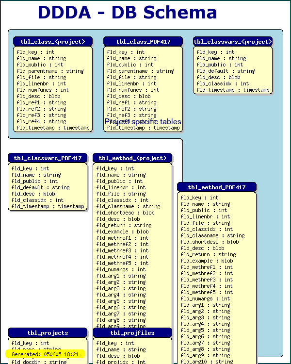
Figure 190: Example of using the canvas graph style together with the imgdbschema.php library to semi-automatically generate a DB schema [src]
Before going on it should be noted that the ImgDBSchema assumes that the DB can be accessed through a DB abstraction layer modeled after the abstraction layer available in the 'jpdb.php' file in the DDDA architecture. This abstraction layer assumes a MySQL database in the bottom. This specific dependency of this particular abstraction layer is the reason why these classes is not included in the generic canvas tools file.
The second thing to note is that this library does not contain a complete automatic-layout engine but rather a very simple automatic system which, if nothing else is specified, just puts the table in a rectangular grid. A complete graph layout engine would simple be to much to write in this context. This is also a very difficult optimization problem and sofar not even any of the available research programs that tries this can achieve a satisfactory layout without manual intervention.
The critical lines in the code to generate the above graph is
 $tblposadj=array($tlo
,0,$tblwidth+
$tlo+2,0
,2*$tblwidth+
$tlo+4,0
,-1,16,-
1,16);

$dbschema
 = new ImgDBSchema
("jpgraph_doc"
,"FormatTblName"
,"FormatFldName"
);

$dbschema
->SetMargin($leftm,
$topm);

$dbschema
->SetTableWidth
($tblwidth);

$dbschema
->Stroke($this->
img,$this->iscale
,$tblposadj);
The rest of the code in the file is just to setup the canvas, add an indented rectangle to group some tables and generate a footer with the date and time this image was generated.
The first line instantiates a new ImgDBSCheme layout engine asking it to draw an image for the database 'jpgraph_doc'. The following two arguments specify two callback functions for formatting the text for header and each field in a table.
The next line specify the top left margin where the drawing of the tables should be started.
The third line specify the width of a single table. The final lines starts the engine and draws all tables in the database to the canvas. The final argument requires some further explanation. This is an offset (x,y) from the top left corner how each individual table should be positioned. If the value is -1 indicates that the default value should be used. If this array is not specified then the tables will simple arranged line by line.
The full source code for drawing this DB schema example is shown below.
 <?php


/*=======================================================================

// File:     DBSCHEMAEX1.PHP

// Description:    Draw a DB schema of the DDDA architecture

// Created:     2002-08-25

// Author:    Johan Persson (johanp@aditus.nu)

// Ver:        $Id: dbschemaex1.php,v 1.1 2002/08/27 20:08:57
 aditus Exp $

//

// License:     This code is released under QPL

//              Copyright (C) 2001,2002 Johan Persson

// Note:        The actual drawing of the tables are
 semi-automatically

//              but you can easily adjust the individual tables
 position

//              with the 'tblposadj' array.

 //


//========================================================================

*/

include
 "../jpgraph.php";

include "../jpgraph_canvas.php";

include "../jpgraph_canvtools.php";

include
 "../utils/misc/imgdbschema.inc";

include "../utils/jpdocgen/jpdb.php";


// Global callback to format the
 table header names

function
 FormatTblName(
$aName) {

    // We want to replace any specifi
 references to the

    // 'JpGraph' project with the generic '<project>'

    return
 str_replace(
'JpGraph',
'<project>',
 $aName);

}


// Global callback to format each
 field name in the table

function
 FormatFldName(
$aName,$aTable) {

    return $aName
;

}


class Driver
 {


    var $ig
, $img, $iscale,
 $ishape;

    var $iymax
,$ixmax;

    var $iwidth
,$iheight;


    function Driver
() {


    // Define Image size and
 coordinate grid space to work within

    $this
->iwidth = 600;

    $this
->iheight= 750;

    $this
->iymax  = 50;

    $this
->ixmax  = 55;


    // Setup a basic canvas

    $this
->ig = new CanvasGraph(
$this->iwidth,$this
->iheight,'auto');

    $this
->img = $this->
ig->img;


    // Define the scale to be used

    $this
->iscale = new CanvasScale(
$this->ig);

    $this
->iscale->Set(
0,$this->ixmax
,0,$this->
iymax);

    $this
->ishape = new Shape(
$this->ig,$this
->iscale);


    // A small frame around the
 canvas

    $this
->ig->SetMargin(
2,3,2
,3);

    $this
->ig->SetMarginColor(
"teal");

    $this
->ig->InitFrame();


    }


    function Run
() {


    $leftm
=1.5;    // Left margin (for table schemes)

     $topm
=5;    // Top margin (for table schemes)

     $tblwidth
=15;    // Individual table width

    $tlo
=1;        // Offset for top line


    // Add the background color for the project specific tables

    $this
->ishape->IndentedRectangle($leftm,
$topm-1,3
*$tblwidth+$tlo+
6,45,

                     $tlo
+2*$tblwidth+
2,30,CORNER_BOTTOMLEFT,

                     'lightblue');


    // Stroke the tables (series of
 x,y offsets, If =-1 then use the

    // automtic positioning

    $tblposadj
=array($tlo,0,
$tblwidth+$tlo+2
,0,2*
$tblwidth+$tlo+4
,

             0
,-1,16,-
1,16);

    $dbschema
 = new ImgDBSchema
('jpgraph_doc'
,'FormatTblName'
,'FormatFldName'
);

    $dbschema
->SetMargin($leftm,
$topm);

    $dbschema
->SetTableWidth
($tblwidth);

    $dbschema
->Stroke($this->
img,$this->iscale
,$tblposadj);


    $tt
 = new CanvasRectangleText
();

    $tt
->SetFillColor
('');

    $tt
->SetColor('');

    $tt
->SetFontColor
('navy');


    // Add explanation

    $tt
->SetFont(FF_ARIAL,
FS_NORMAL,12);

    $tt
->Set('Project specific tables',$tblwidth+
$leftm+3,16
,15);

    $tt
->Stroke($this->
img,$this->iscale
);


    // Add title

    $tt
->SetColor('');

    $tt
->SetFont(FF_VERDANA,
FS_BOLD,26);

    $tt
->Set('DDDA - DB Schema',9,
0.5,30);

    $tt
->Stroke($this->
img,$this->iscale
);


    // Add a version and date

    $tt
->SetFillColor
('yellow');

    $tt
->SetFont(FF_FONT1,
FS_NORMAL,10);

    $tt
->Set("Generated: ".
date("ymd H:i",time
()),1,$this->
iymax*0.96,15
);

     $tt
->Stroke($this->
img,$this->iscale
);


    $this
->ig->Stroke();

    }

}


$driver
 = new Driver
();

$driver
->Run();


?>
11 Anti-Spam Challenges
JpGraph includes a module to easily generate Anti-Spam challenges. With this we mean an image consisting of numbers and letters which are very hard to read for an OCR program. This is often used to secure sign up for bulletin boards, on-line mail system or mailing lists since this very effectively prevent automatic sign up by robots (spam-bots).
The module in JpGraph responsible for this is jpgraph_antispam.php and behaves as a simplified plot module.
The example below illustrates how such an image can look like
Anti spam images have less functionality then the usual images generated with JpGraph in order to keep this utility reasonable small. The primary limitation is that there are now additional formatting options for the images and the image generated will always use the JPEG image format. Hence it is not possible to change this to use, for example, PNG.
11.1 Generating Anti-Spam challenge
There are two basic alternatives on how to generate the content of the anti-spam image
- Submit a string that should be used
- Automatically generate a random string. If this alternative is chosen then the user of the library should save the created string and compare it to what the user enters.
In order to write a script to generate a new challenge there are four steps to be completed.
First include the library file jpgraph_antispam.php. Note that there is no need to include the "jpgraph.php" library since all functionality is included in this library file.
require_once "jpgraph_antispam.php";Secondly a new instance of the class AntiSpam must be created
 $spam = new
 AntiSpam();
Thirdly the string to be used in the challenge must be specified. To automatically generate a suitable string use
 // The argument determines the length of the generated string

$chars = $spam->
Rand(5);
If instead the string to be used should be specified this string should be specified in the initial creation of the AntiSpam() or by calling the Set() method as in
 $spam->
Set("aui8k");
Please note that in order to minimize the risk for confusion the letters 'O' and the number '0' (zero) is not allowed since they are too alike and can be mistaken for each other.
The final and fourth step is to output the image with a call the method Stroke() on the created instance of the AntiSpam class.
 if( $spam->Stroke
() === false )
 {

    die("Illegal or no data to plot");

}
Note that we have put a guard around the output since in the case of an error this method will result a boolean false value. As with the other graph types it is possible to write the generated image to a file by submitting a file name as an argument to Stroke().
12 Code defines in JpGraph
Various settings in JpGraph are controlled by overall DEFINEs in the configuration file "jpg-config.inc". Most of these defines have default values that should be valid for most usage.
In the rest of this chapter all contstants are described with default value and usage.
| Define, default value | Comment |
|---|---|
| "CACHE_DIR", "/tmp/jpgraph_cache/" | The full absolute name of directory to be used as a cache. This directory must be readable and writable for PHP. Must end with '/' |
| "TTF_DIR", "/usr/local/fonts/ttf/" | Directory for JpGraph TTF fonts. Must end with '/' The fonts must follow the naming conventions as used by the supplied TTF fonts in JpGraph. |
| "CSIMCACHE_DIR", "csimcache/" | Directory for cache directory for CSIM graphs. Must end with '/' Cache directory specification for use with CSIM graphs that are using the cache. The directory must be the filesysystem name as seen by PHP and the 'http' version must be the same directory but as seen by the HTTP server relative to the 'htdocs' ddirectory. If a relative path is specified it is taken to be relative from where the image script is executed. Note: The default setting is to create a subdirectory in the directory from where the image script is executed and store all files there. As ususal this directory must be writeable by the PHP process. |
| "CSIMCACHE_HTTP_DIR", "csimcache" | Directory for JpGraph TTF fonts. Must end with '/' Cache directory specification for use with CSIM graphs that are using the cache. The directory must be the filesysystem name as seen by PHP and the 'http' version must be the same directory but as seen by the HTTP server relative to the 'htdocs' ddirectory. If a relative path is specified it is taken to be relative from where the image script is executed. Note: The default setting is to create a subdirectory in the directory from where the image script is executed and store all files there. As ususal this directory must be writeable by the PHP process. |
| "CHINESE_TTF_FONT", "bkai00mp.ttf" | Actual name of the TTF file used together with FF_CHINESE aka FF_BIG5 This is the TTF file being used when the font family is specified as either FF_CHINESE or FF_BIG5 |
| "LANGUAGE_CYRILLIC", false | Special unicode cyrillic language support. |
| "CYRILLIC_FROM_WINDOWS", false | If you are setting this config to true the conversion will assume that the input text is windows 1251, if false it will assume koi8-r |
| 'MINCHO_TTF_FONT', 'ipam.ttf' | Japanese TrueType font used with FF_MINCHO |
| 'PMINCHO_TTF_FONT', 'ipamp.ttf' | Japanese TrueType font used with FF_PMINCHO |
| 'GOTHIC_TTF_FONT', 'ipag.ttf' | Japanese TrueType font used with FF_GOTHIC |
| 'PGOTHIC_TTF_FONT', 'ipagp.ttf' | Japanese TrueType font used with FF_PGOTHIC |
| "INSTALL_PHP_ERR_HANDLER", false | Determine if the library should also setup the default PHP error handler to generate a graphic error mesage. This is useful during development to be able to see the error message as an image instead as a "red-cross" in a page where an image is expected. |
| "CATCH_PHPERRMSG", true | Should the library examin the global php_errmsg string and convert any error in it to a graphical representation. This is handy for the occasions when, for example, header files cannot be found and this results in the graph not being created and just a "red-cross" image would be seen. This should be turned off for a production site. |
| "USE_LIBRARY_GD2",false | Specify if we should use GD 2.x or GD 1.x If you have GD 2.x installed it is recommended that you use it since it will give a slightly, slightly better visual appearance for arcs. If you don't have GD2 installed this must be set to false! |
| 'USE_TRUECOLOR',true | Should the image be a truecolor image? Note 1: Can only be used with GD 2.0.2 and above. Note 2: GD 2.0.1 + PHP 4.0.6 on Win32 crashes when trying to use truecolor. Truecolor support is to be considered alpha since GD 2.x is still not considered stable (especially on Win32). Note 3: MUST be enabled to get background images working with GD2 Note 4: If enabled then truetype fonts will look very ugly => You can't have both background images and truetype fonts in the same image until these bugs has been fixed in GD 2.01 |
| "USE_CACHE",false | Should the cache be used at all? By setting this to false no files will be generated in the cache directory. The difference from READ_CACHE being that setting READ_CACHE to false will still create the image in the cache directory just not use it. By setting USE_CACHE=false no files will even be generated in the cache directory. |
| "READ_CACHE",true | Should we try to find an image in the cache before generating it? Set this define to false to bypass the reading of the cache and always regenerate the image. Note that even if reading the cache is disabled the cached will still be updated with the newly generated image. Set also "USE_CACHE" below. |
| "DEFAULT_GFORMAT","auto" | Default graphic format set to "auto" which will automatically choose the best available format in the order png,gif,jpg (The supported format depends on what your PHP installation supports) |
| "USE_IMAGE_ERROR_HANDLER",true | Determine if the error handler should be image based or purely text based. Image based makes it easier since the script will always return an image even in case of errors. |
| "USE_APPROX_COLORS",true | If the color palette is full should JpGraph try to allocate the closest match? If you plan on using background image or gradient fills it might be a good idea to enable this. If not you will otherwise get an error saying that the color palette is exhausted. The drawback of using approximations is that the colors might not be exactly what you specified. Note1: This does only apply to a palette image, not true color images since they don't have the limitations of maximum number of colors. |
| "ERR_DEPRECATED",false | Should usage of deprecated functions and parameters give a fatal error? (Useful to check if code is future proof.) |
| "BRAND_TIMING",false | Should the time taken to generate each picture be branded to the lower left in corner in each generated image? Useful for performance measurements generating graphs |
| "BRAND_TIME_FORMAT","Generated in: %01.3fs" | What format should be used for the timing string? |
The following defines should very rarely need to be changed
| Define, default value | Comment |
|---|---|
| "CACHE_FILE_GROUP","wwwadmin" | What group should the cached file belong to (Set to "" will give the default group for the "PHP-user") Please note that the Apache user must be a member of the specified group since otherwise it is impossible for Apache to set the specified group. |
| "CACHE_FILE_MOD",0664 | What permissions should the cached file have (Set to "" will give the default permissions for the "PHP-user") |
| "USE_BRESENHAM",false | Decide if we should use the Bresenham circle algorithm or the built in Arc(). Bresenham gives better visual appearance of circles but is more CPU intensive and slower then the built in Arc() function in GD. Turned off by default for speed |
| "_CSIM_SPECIALFILE","_csim_special_" | Special file name to indicate that we only want to calc the image map in the call to Graph::Stroke() used internally from the GetHTMLCSIM() method. |
| "_CSIM_DISPLAY","_jpg_csimd" | HTTP GET argument that is used with image map to indicate to the script to just generate the image and not the full CSIM HTML page. |
